Search Engine

Saturday, 3 September 2011

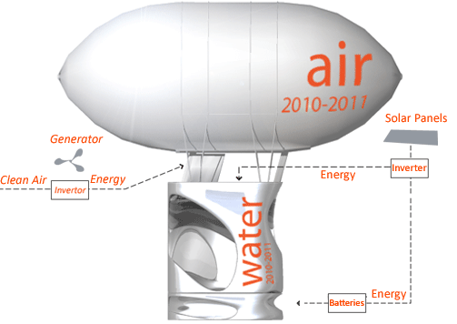
Water Capsule Concept: A Fantastical Dream-Like Living Vessel for Global Flooding

By: admin | September - 2 - 2011

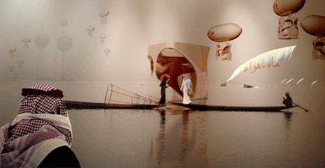
The interest of creating this project was to provoke opposing forces of beauty and darkness – the idea of immersing survivors into their environment of global flooding through an elegant and energetic fusion of floating architecture.
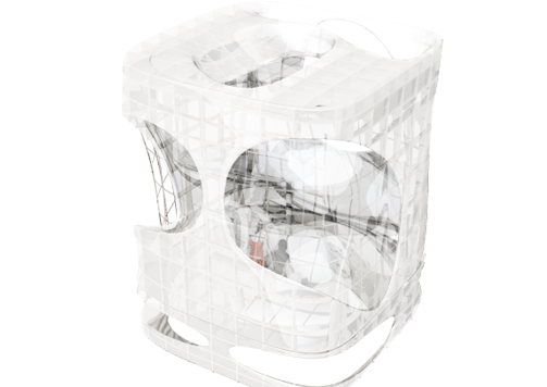
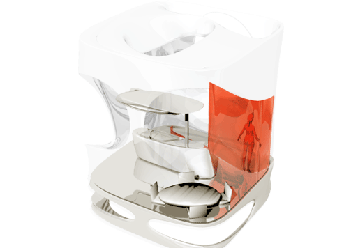
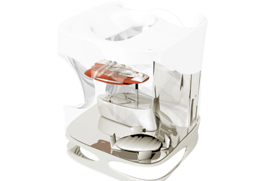
The project has the appearance of a glamorous water cube emerging from billowing cloudscapes to flood location by a hot air dirigible. The Water Capsule is a simple form constructed of highly engineered, gleaming white fiberglass-reinforced panels. The structure folds into a sequence of spaces illuminated by two skylights and a window to the sea below. The project’s overall organization follows the drift of its curving form floating experientially through air and water giving freedom to “one’s” imagination from their loss.
The project’s designer, Jay Stoughtenger, was born in 1975 in New York, USA but currently lives and works in Kuwait. He received a degree in architecture from USA and is a Senior Architect for a progressive office in Kuwait. The designs he develops address urban density and suggest capsule living alternatives which allow him to escape from the reality of his professional practice. Often his designs shifts dramatically – scale with vibrant colors and minimal details, dream-like scenes of the natural world and their inhabitants become an idyllic way of living.


Carbuncle Cup 2011: MediaCityUK is crowned Britain's ugliest new building

The controversial annual award for the country's worst new building goes to the BBC's new Salford home, with the Museum of Liverpool in hot pursuit
MediaCityUK
'A concatenation of anaemic buildings' ... The BBC's £600m MediaCityUK. Photograph: Christopher Thomond for the Guardian
There were other strong contenders, but the 2011 Carbuncle Cup for Britain's "ugliest new building" has been awarded to the £600m MediaCityUK. This concatenation of anaemic buildings is the controversial new regional headquarters of the BBC, and home to the media studies faculty of Salford University. Granada TV also moves in next year, bringing the space a newly reconstructed Coronation Street and the Rovers Return.
From a distance, MediaCityUK looks like one of those sprawling faceless office blocks, shunted alongside bleak city squares, that were common in eastern Europe 50 years ago. Close up, it proves to have less charm than Berlin's Alexanderplatz and, sited at Salford Quays, it also lacks the sunny climate of Dubai, the place whose Media City inspired this Lancashire build by the property company Peel Holdings and its architects, Wilkinson Eyre, Chapman Taylor and Fairhurst Design Group.
One Hyde Park  
The exclusive development One Hyde Park, designed by Richard Rogers for the Candy Brothers, was on the Carbuncle Cup shortlist. Photograph: Linda Nylind for the Guardian The controversial annual award loathed by architects and their clients is compiled by Building Design magazine, a weekly media fix for architects. This year's shortlist, drawn from suggestions by members of the public, included the opulent blocks of flats designed for international multi-millionaires by Richard Rogers for the Candy Brothers at One Hyde Park in London, the Museum of Liverpool by 3XN and AEW, and Newport railway station in South Wales by Nicholas Grimshaw and Atkins.
Several of the schemes, including MediaCityUK, Newport station and the Museum of Liverpool, have been designed by firms of well-known "signature" architects, then executed by much bigger commercial practices that produced the buildings on time and on budget, but without soul and a spirit of place. MediaCityUK might be anywhere from Salford to Shanghai, and the Carbuncle Cup nomination for MediaCityUK reads: "For an organisation with high cultural aspirations, it is hard to see how the BBC could have sunk much lower."
"If you're going to spend £600m on a complete city district that is also the home of one of the nation's leading cultural institutions as well as other high-profile media and university tenants", says Hugh Pearman, editor of the RIBA Journal and one of the Carbuncle Cup judges, "then it's a bit of a shame not to pay more attention to the quality of the architecture. It would have cost very little more to make this place really special."
In today's issue of Building Design, editor Ellis Woodman writes: "Whatever urban aspiration may be indicated by its name, a city is the last thing one would mistake this development for. There is no urban idea to speak of whatsoever – no space that one might recognise as a street; no common architectural language; no difference between the fronts and backs of buildings. There is no distinction made between civic and private buildings either. Visiting MediaCityUK, it is hard to see how the corporation could set their aspirations any lower. How uncreative can a 'Creative Quarter' be?"
Museum of Liverpool  
'Ski-slope roof, glaring white walls and bizarre ramps' ... The new Museum of Liverpool. Photograph: Mills Media Limited The undoubted runner-up this year is the new Museum of Liverpool. "Liverpool secured the Carbuncle Cup two years ago for Hamilton Architects' ferry terminal", says Woodman. "This ridiculous building won in considerable part because of the damage it did to the view of the Three Graces – the trio of early 20th-century buildings that have long provided Liverpool's defining architectural image. Sadly, this vandalism to the city's waterfront was only the start."
With its ski-slope roof, glaring white walls and bizarre ramps making access awkward, the museum defaces the city's famous Pier Head and cocks a snook at its magnificent neighbours. "Our first reaction", Kim Nielsen, director of 3XN, the Danish practice responsible for the original design (and since fired from the job) has said, "was that you shouldn't build here." A lesson, perhaps, for all potential Carbuncle Cup winners, whether this year or next.

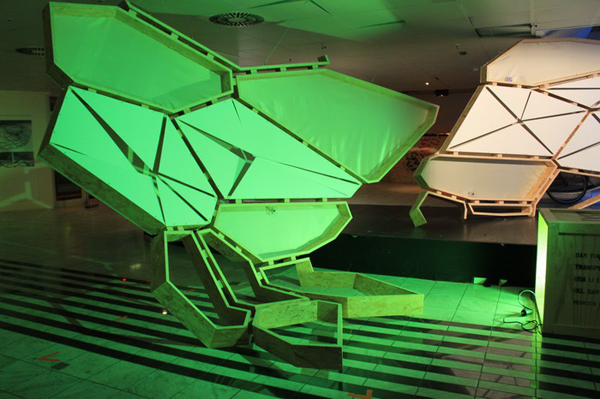
Hybrid Diamantenbörse is a Voronoi installation in Frankfurt

By: Lidija Grozdanic | September - 2 - 2011

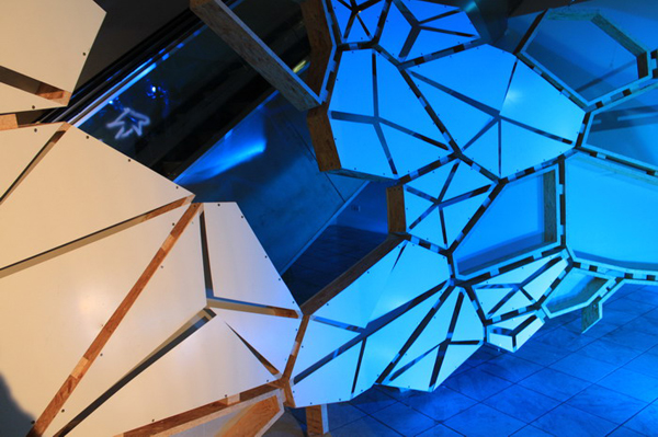
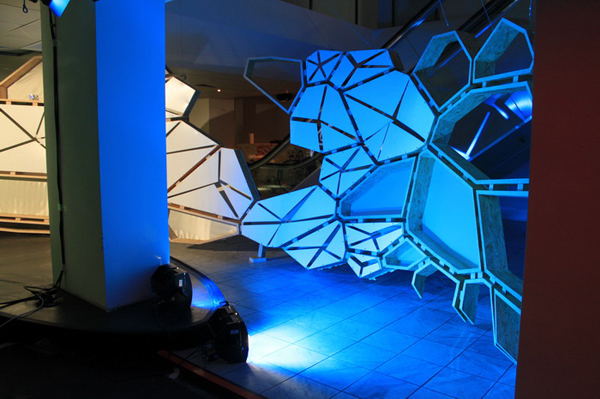
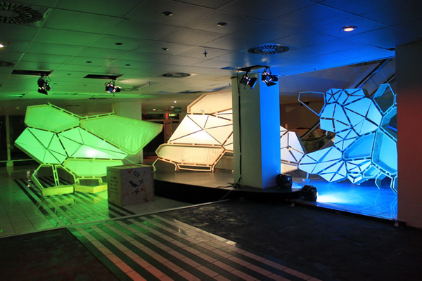
The project was designed by Xing Wang in cooperation with Offenbach Academy of Art and Design. The design team was organized by Prof. Dr. Markus Holzbach and was exhibited in Frankfurt in January 2011. It explores the structure and combinatorics of cellular geometries, completely relying on computational design.
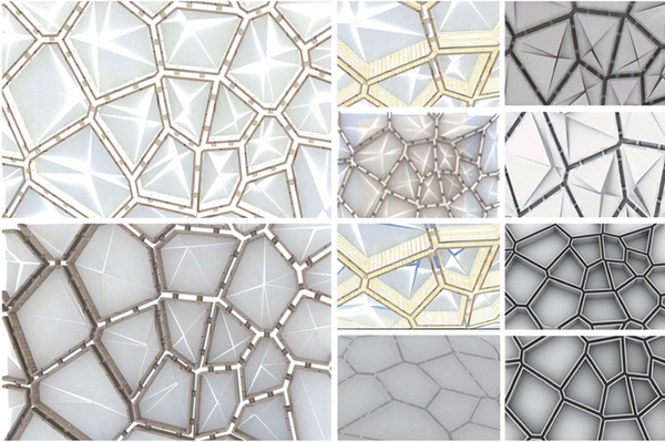
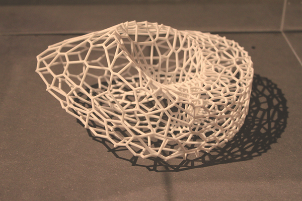
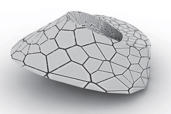
The project’s aim was to build a pavilion inside Diamantenbörse in Frankfurt. It was based on mobius geometry with 3d voronoi pattern structure. It tried to integrate special light effects for the media show during the exhibition. The 3d vronoi pattern structure is manufactured as straight wood panels by 5 axis milling machine and assembled on site. In order to save time and material, most parts of the wood panels were cut under 3 axis cutting method, only the both ends parts of the panels with slope are cut through 5 axis setting.
The task was to generate the complex 3d structure in a parametric way, and also prepare the fully detailed CNC manufacture files for the CNC lab. The parametric solution for this system gave the possibility to adjust the structure many times on different design stages.


Anisotropia: A Frozen Piece of Music – Busan Opera House / Orproject

By: admin | September - 3 - 2011

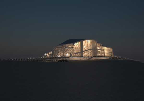
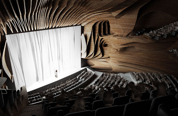
Anisotropia, the design for the new Busan Opera House by Orproject is based on Klavierstück I, a composition for piano by Orproject director Christoph Klemmt. It is based on a twelve tone row which is repeated and altered by the different voices, in order to create complex rhythmic patterns.
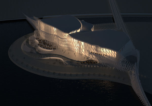
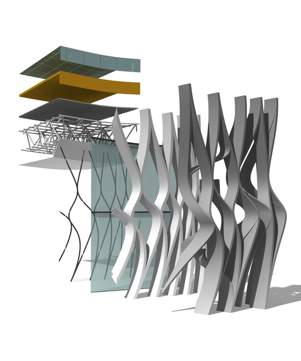
Anisotropia becomes the physical manifestation of Klavierstück I, a frozen piece of music. The design for the Busan Opera House is based on a simple strip morphology instead of a twelve tone row, which creates the facade, structure and rhythm within itself, its repetition happening in space instead of time. Layers of the strips form the façade structure, and the shifting and alteration of these patterns results in the formation of complex architectural rhythms which are used to control the light, view and shading properties of the façade.
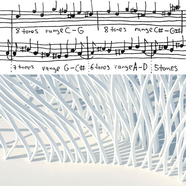
Klavierstück I uses a twelve tone row which starts with the lowest key of the piano. After its first cycle the row gets repeated, though shifted up by a halftone. However rather than translating up every tone by a halftone, only the lowest tone of the row is translated up by one octave. Like this the row remains the same, but its range has been shifted.
In the next repetition this shift continues, but the range now also gets reduced in its size: The lowest tone gets translated up by one octave again, and the second lowest tone gets dropped out, so that only the remaining eleven tones of the row are played. Instead of the twelve tones the range now only covers eleven tones, and also its length is reduced accordingly.
The range of the twelve tone row continues to be reduced and shifted upwards until only one tone is left in each repetition of the original row. Then the range grows again, and still moving upwards goes through further modulations: The different voices of the piece are starting to separate, the size of the different parallel ranges starts to diverge, they move around each other, until finally they grow together again, still moving up and their range fading out with the highest key of the piano.

Piano Piece No.1 is based on a simple row of the twelve tones, but by shifting and translating its range of influence, complex and continuously evolving rhythmic patterns are generated and turned into a floating field of sound.
Structure + Light
The proposed façade structure becomes the physical manifestation of Klavierstück I. Instead of on a twelve tone row, it is based on a strip morphology made from curved steel sections that creates the facade, structure and rhythm within itself. The repetition of the lamella happens in space, instead of the repetition in time of the twelve tone row. Parallel layers of the strips form the façade structure, and the alteration of its patterns results in architectural rhythms which are used to control the light, view and shading properties of the façade.
Flow
The positioning of the façade walls has been developed according to a custom written flow simulation. The algorithm describes a flow that is influenced and altered by a set of deflectors, which each act according to the magnitude of their attraction and the area of their influence.
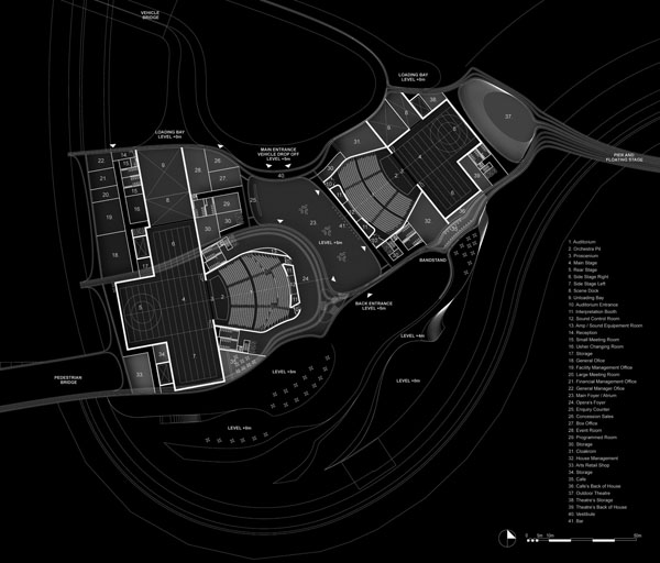
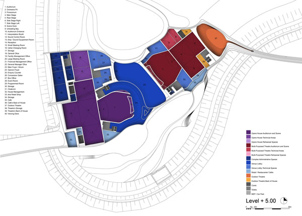
The distribution of the programmatic elements on the site is used as the deflector set that guides the flow of the rhythm lines which originate from the sea. On their way towards the city, the lines flow around the building elements such as the theatre and auditoriums, splitting up and being diverted by the deflectors.
Orproject: Ho-Ping Hsia, Christoph Klemmt, Rolando Rodriguez-Leal, Rajat Sodhi, Natalia Wrzask, Christine Wu
Structural Engineers: Arups Structural Engineering, London
Theatre Consultants: Arups Theatre Consulting, Hong Kong


8 House | Bjarke Ingels Group | Copenhagen, Denmark | Project Portfolio | Architectural Record

8 House | Bjarke Ingels Group | Copenhagen, Denmark | Project Portfolio | Architectural Record

Architecture People and Places


31 August 2011


For a regional government headquarters facility in Salaberry-de-Valleyfield, Quebec, Brière, Gilbert + Associés designed the renovation and expansion of a building dating to 1851. The new wing's double-height board room has commanding views of the St. Lawrence River. Photo: BGA/ Courtesy v2com.biz Extra Large Image Salaberry-de-Valleyfield · 2011.0825
Brière, Gilbert + Associés Architectes of Montreal and Quebec City designed the recent refurbishment and expansion of a former boy's school (1851) in Salaberry-de-Valleyfield, Quebec, Canada, to house the headquarters for the Conférence Régional des Élus de la Vallée-du-Haut-St-Laurent (CRÉVHSL), the area's regional conference of elected officials. After extensive renovation of both the interior and exterior of the stone-clad historic building, it now houses several offices and the main reception functions of the headquarters.
A new three-story addition is connected to the original building by a glass-clad atrium that serves as the main entry and circulation space for the facility. A double-height board room occupies the upper two floors of the addition, while a staff lounge comprises the recessed ground floor. Built with a timber-frame structural system, the addition is clad primarily in glass. The main exception is the cantilevered board-room volume, whose upper half is clad in a wood rain screen, while the cladding of the lower half comprises an outer layer of glazing separated by an air space from an inner layer of composite wood panels.


The main entrance of the art deco-style Martin Luther King, Jr. Federal Building in Atlanta, Georgia, after a restoration project by Lord, Aeck & Sargent. Photo: © Jonathan Hillyer/ Atlanta Extra Large Image
Atlanta · 2011.0830
Atlanta, Georgia-based architecture firm Lord, Aeck & Sargent designed the recent $62 million renovation and restoration of the Martin Luther King, Jr. Federal Building in Atlanta, Georgia. Originally designed by architect A. Ten Eyck Brown and his associates, the building opened in 1933 as Atlanta's main post office. It was assigned its current name in 1988, following its 1981 acquisition by the General Services Administration.
Exterior work on the 350,000-square-foot (32,500-square-meter) building emphasized restoration of its neoclassically themed art deco granite facade, including repair of more than 6,300 individual stones and over 600 original steel-frame windows. Deteriorated steel shelf angles supporting the stone facade were replaced with new stainless steel angles. The interior rehabilitation and adaptive-reuse work focused on the lowest three stories, and included asbestos abatement, upgrades to the electrical and HVAC systems, and a painstaking restoration of the original 1933 lobby.
LEED Silver certification is targeted for the building, which was restored in compliance with the U.S. Secretary of the Interior's Standards for the Treatment of Historic Properties.


Dewberry designed the adaptive reuse of Oklahoma State University's Murray Hall in Stillwater, Oklahoma. Extra Large Image
Stillwater · 2011.0830
On the Stillwater, Oklahoma, campus of Oklahoma State University, a former women's dormitory dating to the 1930s has been adapted for use by the university's College of Arts & Sciences. The Tulsa office of Dewberry, an architecture and engineering firm based in Fairfax, Virginia, designed the renovation and expansion of the brick-clad Murray Hall, which now houses classrooms and offices. On its western side, the four-story, U-shaped building encloses three sides of a student plaza that overlooks a campus green. A new auditorium space is located beneath the plaza.
After serving as a dormitory for many decades, the building had been closed for a number of years due to water damage and other deterioration. The renovation of this Georgian neoclassical building restored many interior gathering spaces and also focused on upgrading the building to meet modern accessibility requirements.


Peter Bohlin designed the new Weyerhaeuser Center for Health Sciences at the University of Puget Sound in Tacoma, Washington. Photo: Courtesy University of Puget Sound Extra Large Image
Tacoma · 2011.0830
The William T. and Gail Weyerhaeuser Center for Health Sciences is a new 42,500-square-foot (3,950-square-meter) building on the campus of the University of Puget Sound in Tacoma, Washington. The four-story, brick-and-sandstone-clad building was designed by Peter Bohlin and the Seattle office of Bohlin Cywinski Jackson in a streamlined style emphasizing simple gable forms and projecting bay windows, in a clear response to the neogothic style that predominates on campus. A grand opening is scheduled for October 28, 2011.
The building houses graduate programs in physical and occupational therapy, along with undergraduate studies in exercise science, psychology, and an interdisciplinary neurosciences program. Organized around a three-story atrium, the building's program includes six laboratories, six clinics, classrooms, meeting rooms, and faculty offices. The grounds include an outdoor "mobility park" with curbs, ramps, and stairs designed for clinic patient therapy work.


At the University of British Columbia in Vancouver, Canada, two wings of the Biological Sciences Complex have reopened after a renovation designed by Acton Ostry Architects. Extra Large Image
Vancouver · 2011.0829
Two newly renovated wings have opened at the University of British Columbia's Biological Sciences Complex in Vancouver, Canada. Acton Ostry Architects of Vancouver designed the major renovation of the South Wing (1957) and West Wing (1970), which had suffered deferred maintenance and required seismic upgrades.
On the West Wing, seismic bracing took the form of three concrete buttresses clad in laminated glass panels. These panels, printed with botanical and zoological imagery, relate to new decorative panels that have been mounted along the entire main facade of the West Wing.
The complex also received a partial building-envelope upgrade; energy-efficient glazing; improvements to lighting, plumbing, and heating and cooling; and a new bioswale. Interior spaces were renovated throughout the complex, with emphasis on increased daylight access and views of campus. The facility's program includes laboratories, aquaria, informal research spaces, classrooms, seminar rooms, and faculty and administrative offices. The renovation project was funded in part by a stimulus program of the Canadian government.

One World Trade Center

Skidmore, Owings & Merrill

New York, New York

A controversial tower rises at ground zero

By Joann Gonchar, AIA


There is no denying that One World Trade Center (WTC), the 104-story tower now rising at the northern end of the Ground Zero site, is a tremendously ambitious commercial real estate venture. The building, owned by the Port Authority of New York and New Jersey with the developer Durst Organization holding a 10 percent stake, will contain 3.1 million square feet of office space when completed in late 2013. Below grade, connected to the WTC site’s vast underground transportation infrastructure, there will be 55,000 square feet of retail, and near the top, the tower will include a two-level observation deck and a restaurant. But when the designers of the $3.19 billion project describe the building, they generally focus first on its potential as a symbol: “It will serve as the marker of the 9/11 memorial on the skyline,” says David Childs, consulting design partner to Skidmore, Owings & Merrill (SOM).

This hybrid of a civic emblem and a speculative office building, which now has framing approaching the 80th floor, will have a stainless steel capped glass parapet whose edges mark 1,362 feet and 1,368 feet. The elevations are the heights of the original Yamasaki & Associates–designed Twin Towers completed in 1972. With the help of a spire that extends 408 feet above the parapet, One WTC will reach 1,776 feet — a height set in Studio Daniel Libeskind’s 2002 Ground Zero master plan, making it the tallest building in the Western Hemisphere.
The building should be immediately identifiable, and not only because of its height: The scheme has a simple, iconic form, much like that of the Washington Monument, says Childs. It includes an 84-story shaft rising from a base that, in plan, measures 187 feet tall and 200 feet wide. Above this almost cubic pedestal, which contains mechanical floors stacked on top of a 50-foot-tall lobby, One WTC’s corners are chamfered back, creating progressively smaller floor plates that gradually shift from a square above the podium to an octagon at midsection. At the top, it is once again square, but 150 feet on a side and rotated 45 degrees from the base.
Although the “twisting” of the floor plates produces a tapering tower with a complex geometry, it is a geometry that is much more straightforward than that of an earlier version designed by SOM in collaboration with Libeskind. Then referred to with the emotionally charged name the “Freedom Tower,” the building had a torqued cable-net exterior and an off-center spire intended to evoke the torch of the Statue of Liberty. This proposal was scuttled in 2005 and the site shifted, after New York City police objected to its proximity to the busy roadway at the western edge of Ground Zero. Both the abandoned scheme and the tower under construction were commissioned by developer Larry Silverstein, who ceded control of the project to the Port Authority in April 2006 (see time line).
Despite One WTC’s adjusted location, some still regard it as an obvious terrorist target. However, its designers point out that it will have enhanced security and life-safety systems, including a robust, reinforced concrete shear-wall core surrounded by a steel moment frame spanning 45 feet to perimeter columns. The building is part of a post–September 11 trend for New York City office towers to move away from all-steel structures toward composite systems. And although concrete shear-wall construction is just one way to design and harden a core, in the case of One WTC, the approach was deemed the most appropriate due to the tower’s height and slenderness, according to Ahmad Rahimian, CEO of WSP Cantor Seinuk, the project’s structural engineer. “For tall and supertall buildings, a reinforced concrete core provides excellent resistance to wind, earthquake, and gravitational loads by virtue of its mass, strength, stiffness, and fire-protection properties,” he says.
If the tower, with its composite structure, were under construction in another locale, pouring of the concrete core would likely have advanced ahead of the surrounding moment frame’s erection. But the sequence at One WTC is reversed, with steel work leading core construction by about 10 stories on any given day due to “union jurisdictional issues” peculiar to New York City, says Mel Ruffini, executive vice president at Tishman Construction. The company, part of AECOM, is the project’s construction manager.
Pouring of the slabs on the floors’ metal deck lags about eight levels behind the top of steel erection, with other trades following core forming, including application of cementitious fireproofing and curtain-wall installation.
When designing the structure, engineers took this sequence into account, incorporating a steel ring beam into the core. Although the surrounding steel superstructure ties into this beam, its primary purpose is to serve as anchorage for erection steel and for the self-climbing concrete formwork that contractors “jump” within the core void using hydraulic jacks. “We needed to consider both temporary and permanent conditions,” says Rahimian.
Surrounding the moment frame, cladding operations are well under way, with installation of the curtain wall’s low-iron insulated glazing units (IGUs) already extending from the top of the cubic podium past the 50th floor. The IGUs are 5 feet wide and 13 feet 4 inches tall — the largest production IGUs available. They have thicker than typical outer lites (3⁄8-inch thick versus the more standard 1⁄4 inches) and laminated inner lites whose thickness varies depending on location (some are thicker than others due to security concerns). Although the IGUs are heavier than standard units, which complicates installation, the panels’ size allows them to span the full floor-to-floor height without intermediate mullions or spandrels. The thickness of the outer lites, along with inner lites’ lamination, should also prevent “oil canning,” or pillowing of the glass panels, says SOM managing director Kenneth Lewis. The goal is to create a “uniform and crystalline” surface — or one that appears to be “shaved and carved,” adds Childs, again alluding to the form of the Washington Monument.
At the ground, each side of the building will have a cable-net-supported glazed portal, 60 feet tall, although the lobby will be otherwise surrounded in concrete. The architects had planned to camouflage the podium with tempered and laminated prismatic glass panels that would reflect, refract, and transmit light, in order to “establish a relationship with the water cascading in the memorial pools,” says Childs. However, after discovering that tempering caused the panels to bow, interfering with the laminating process, the project team devised another solution. The alternate, which sources describe as glass fins projecting from the facade at various angles, is now in the bidding phase but has yet to be finalized.
Many of the life-safety strategies being implemented at One WTC were pioneered at 7 WTC — the 52-story office building that sits just beyond the edge of the Ground Zero site, catercorner to One WTC. Completed in 2006, by an almost identical design and construction team — including SOM, WSP Cantor Seinuk, and Tishman — it has features that exceed the requirements of the New York City Building Code, which are also included in the newer tower. For example, air intakes are located well above grade, which make it difficult to introduce biological or chemical contaminants into the ventilation system. Both towers also have widened egress stairwells for emergency evacuation with doors positioned so that anyone entering easily merges with the flow of exiting people. In addition, the stair landings have designated “areas of refuge” where occupants who are unable to descend on their own can wait for assistance.
The tower’s life-safety features new to New York City skyscraper design include a stair for use only by first responders and a “fireman’s lift” — an elevator used as a service elevator during the building’s day-to-day operations but equipped with water-resistant controls and a second door that opens onto a pressurized, dedicated fireman’s lobby. The other service elevators have water-resistant controls as well, and are contained within a smoke-resistant enclosure, allowing first responders to press them into service if needed.
Tenants have begun to make commitments for space in the building. In May, the Port Authority finalized a deal with magazine publisher Condé Nast for one million square feet on 21 floors. (Last year, the Chinese real estate company Vantone signed a lease for 200,000 square feet on floors 64 though 69.) It’s not clear whether the appeal is in the attractive lease terms, the advanced security features, or the finally visible iconic geometry of the structure. Whatever the lure, New York’s tallest skyscraper is beginning to fill up, a sign of upturn for downtown.