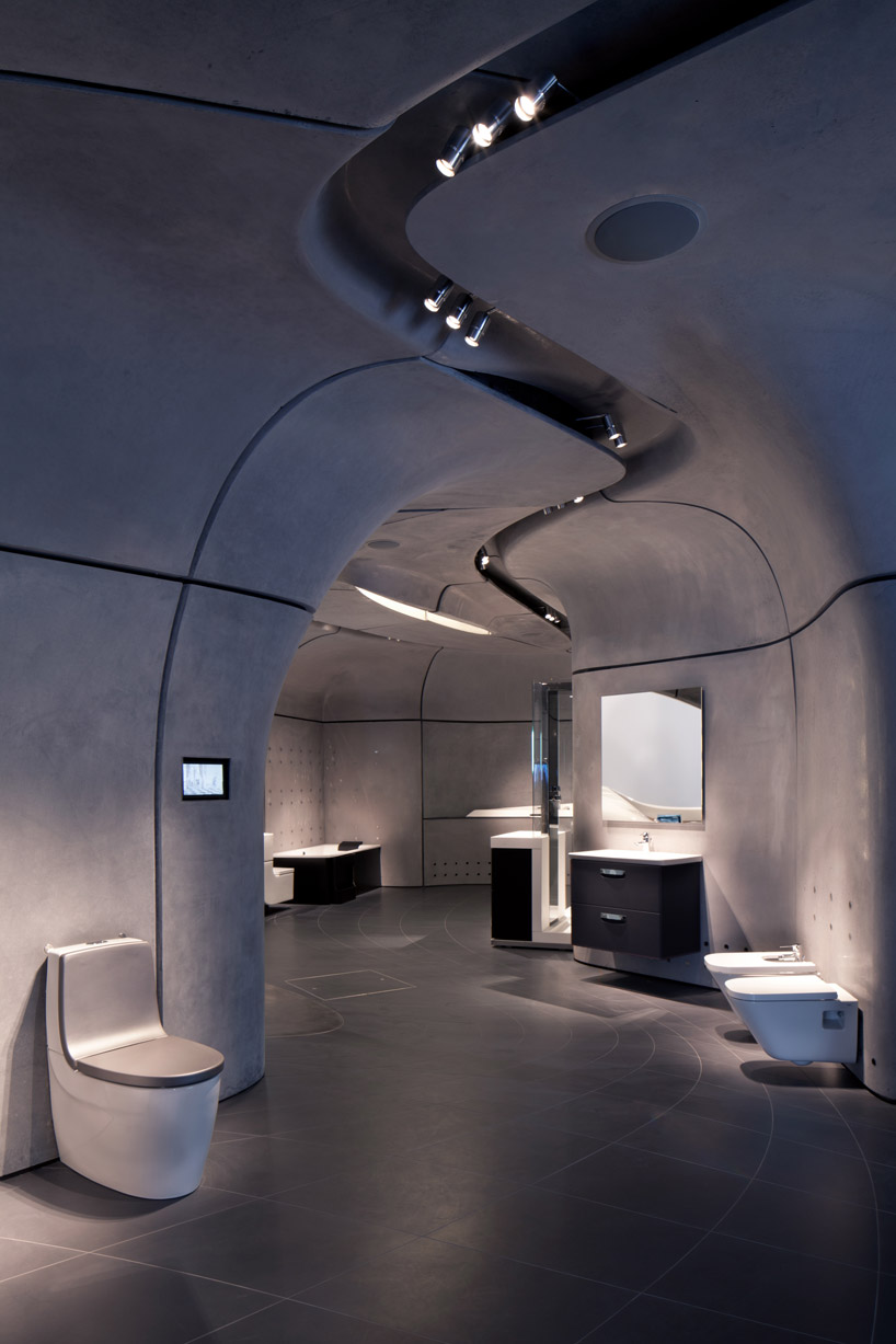
'nursery in sarreguemines' by paul le quernec and michel grasso in sarreguemines, france
all images courtesy paul le quernec and michel grasso
image © paul le quernec
strasbourg-based architects paul le quernec and michel grasso have shared with us images of
'nursery in sarreguemines', a 1350 m2 facility in north-eastern france. organic in form,
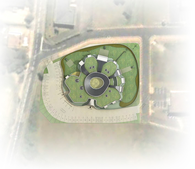
the design mimics the structure of a body cell, placing the nursery at the center of the layout
as the nucleus, surrounding gardens as the cytoplasm, and a circumscribing wall enclosure as
the membrane.
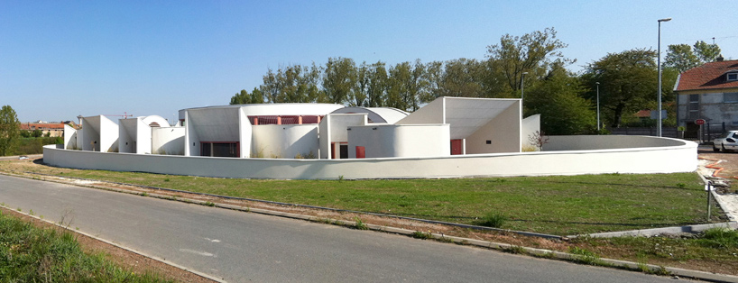
street view
image © michel grasso
situated on a generous plot that is lined by roads, the design focuses on providing a tranquil
setting by landscaping the majority of the grounds as a grassy meadow. a large outdoor play space
is generated through a continuous, curvilinear wall that shapes out the boundaries of the facility.
the building opens up to the yard in a series of rectangular apertures, directly integrating the exterior
with the operations and atmosphere of the interior classrooms.

one of the outdoor play area next to room
image © paul le quernec
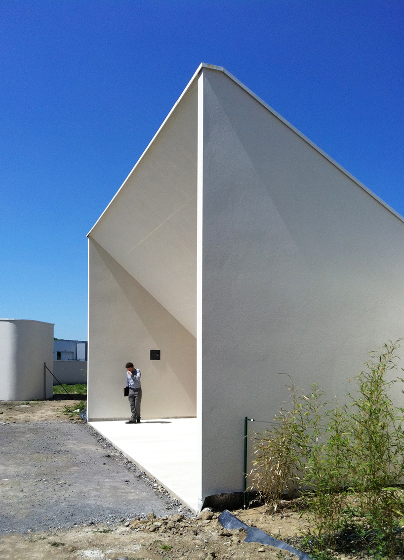
entrance
image © paul le quernec
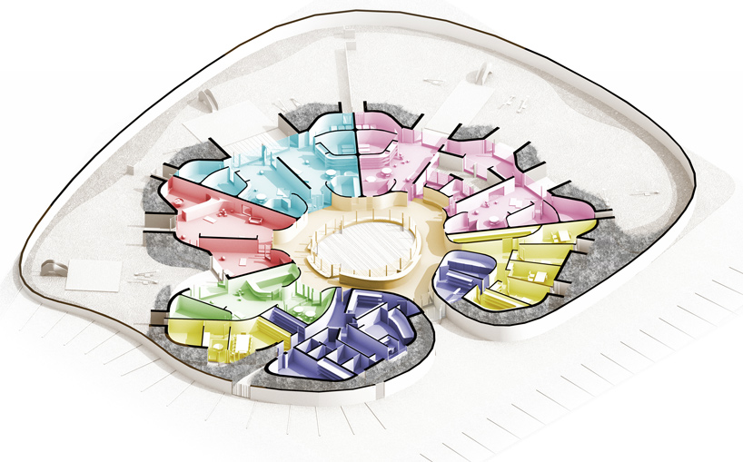
catering to both the children and the parents, the design revolves around providing safety
and comfort within the building. the nursery is positioned at the heart of the facility,
and serves as the central starting point for the rest of the layout. radiating outwards,
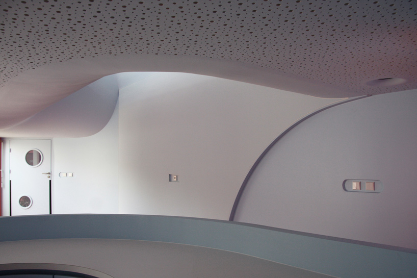
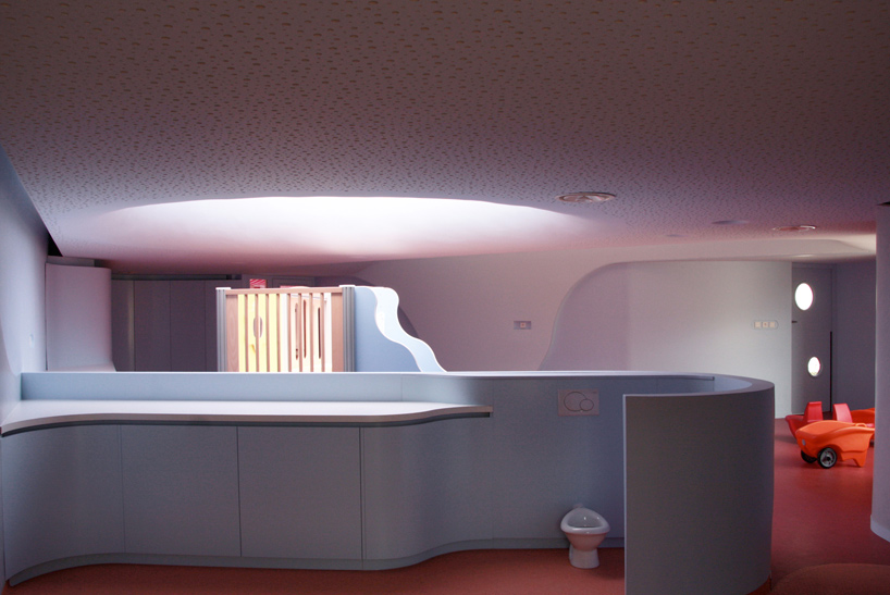
the collection of enclosed rooms feature curved partitions and walls to continue the language of
the organic exterior form. the ceiling is read as an undulating surface that puckers in and out
to open up to clerestories and roof lights. at once dramatic and playful, the result is a naturally-illuminated
interior that is perceived differently from each vantage point.

interior view of reception area
image © guillaume duret
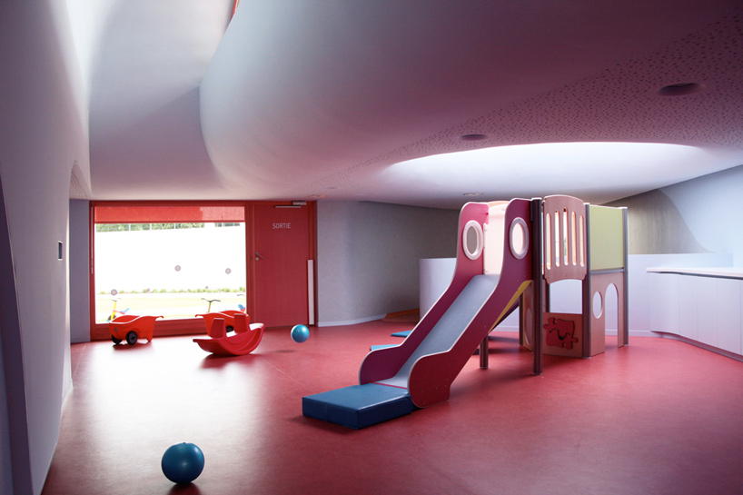
individual room
image © michel grasso
circulation space
image © michel grasso
circular roof light
image © michel grasso

classroom
image © michel grasso
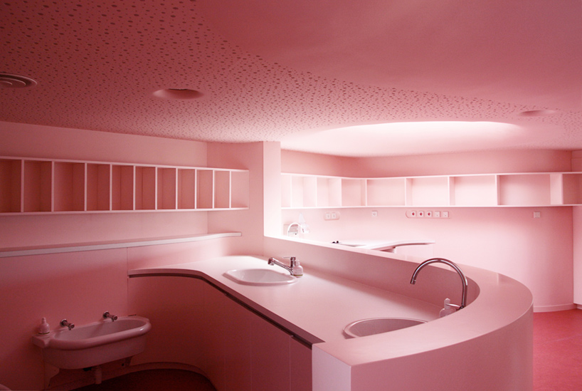
image © michel grasso
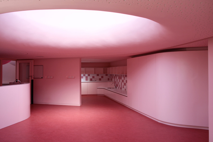
image © michel grasso
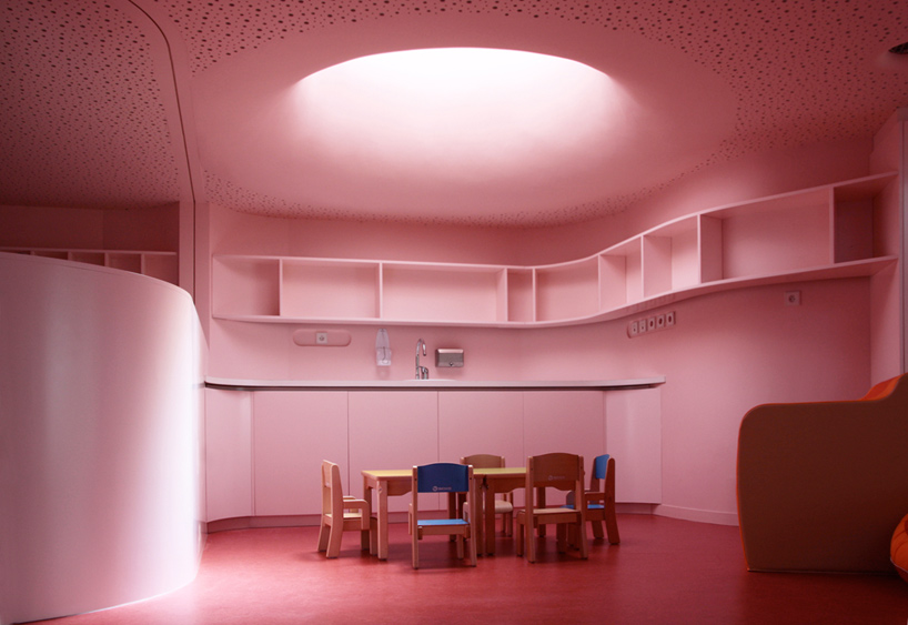
image © michel grasso

during construction
image © paul le quernec

image © paul le quernec
roof and site plan
axonometric

floor plan

section
all images courtesy paul le quernec and michel grasso
image © paul le quernec
strasbourg-based architects paul le quernec and michel grasso have shared with us images of
'nursery in sarreguemines', a 1350 m2 facility in north-eastern france. organic in form,
the design mimics the structure of a body cell, placing the nursery at the center of the layout
as the nucleus, surrounding gardens as the cytoplasm, and a circumscribing wall enclosure as
the membrane.

street view
image © michel grasso
situated on a generous plot that is lined by roads, the design focuses on providing a tranquil
setting by landscaping the majority of the grounds as a grassy meadow. a large outdoor play space
is generated through a continuous, curvilinear wall that shapes out the boundaries of the facility.
the building opens up to the yard in a series of rectangular apertures, directly integrating the exterior
with the operations and atmosphere of the interior classrooms.

one of the outdoor play area next to room
image © paul le quernec

entrance
image © paul le quernec
catering to both the children and the parents, the design revolves around providing safety
and comfort within the building. the nursery is positioned at the heart of the facility,
and serves as the central starting point for the rest of the layout. radiating outwards,
the collection of enclosed rooms feature curved partitions and walls to continue the language of
the organic exterior form. the ceiling is read as an undulating surface that puckers in and out
to open up to clerestories and roof lights. at once dramatic and playful, the result is a naturally-illuminated
interior that is perceived differently from each vantage point.

interior view of reception area
image © guillaume duret

individual room
image © michel grasso

circulation space
image © michel grasso

circular roof light
image © michel grasso

classroom
image © michel grasso

image © michel grasso

image © michel grasso

image © michel grasso

during construction
image © paul le quernec

image © paul le quernec

roof and site plan

axonometric

floor plan

section

