the programmatic functions are sandwiched by two folding skins of opposite natures delineating the two different urban characters beyond the site.
a re-construction of the luk hoi tong building which was well-known as a by-gone cinematic landmark in central hong kong for fifty years,
this new establishment, named the LHT tower is comprised of 29 stores, offering 11,000 square metres of office space
and 3000 square metres of podium, retail and restaurant areas. the re-development of the building was conceived by hong kong-based studio
rocco design architects and is situated at a prominent corner of the queen's road central and pedestrian theatre lane in the bustling city.
and 3000 square metres of podium, retail and restaurant areas. the re-development of the building was conceived by hong kong-based studio
rocco design architects and is situated at a prominent corner of the queen's road central and pedestrian theatre lane in the bustling city.

the angled arrangement of mullions on the street elevation creates a forced perspective that further exaggerates the folding of the curtain wall
the design draws on the surrounding site and its special theatrical history. challenging the standard tower-and-podium
single building development approach, without sacrificing the commercial value of retail floors, the structure features a
dynamic folding façade system on the eastern elongated side of the building that wraps the podium and tower in a formal continuum.
to the west, the ribbed projection, together with the roof component forms the extension of the adjoining wall.
the programme functions are sandwiched by these two folding skins of opposing natures, delineating the two different urban
characters flanking the site.

the curtain wall extends downwards to wrap the podium in a formal continuum
the tower presents itself as an urban landmark that demarcates the start of a series of old attached buildings
with narrow street frontage down the queen's road central to the west, and the freestanding contemporary office buildings to the east.
responding to the busy foot traffic along the theatre lane, the escalator zones at the retail floors are strategically placed
next to the twisting glass skin to form an animated and engaging façade, offsetting the undesirable blank walldrop of the
pedestrianized lane in the past owing to the function of the former cinema building. the non-linear folding of the exterior skin
gives an impression of stage curtain, opening to reveal the office and retail spaces within, creating a subtle reference to the
iconic queen's theatre that previously occupied the site.

vista to the folding skin from the adjacent alley

vista from the pedestrianized theatre lane

a façade that engages the movement of users and the passing foot traffic of the theatre lane

a façade that engages the movement of users and the passing foot traffic of the theatre lane

a link bridge over the foyer bisecting the escalator zone and the main lift lobby on first floor

the strategic planning of podium circulation to form an animated façade

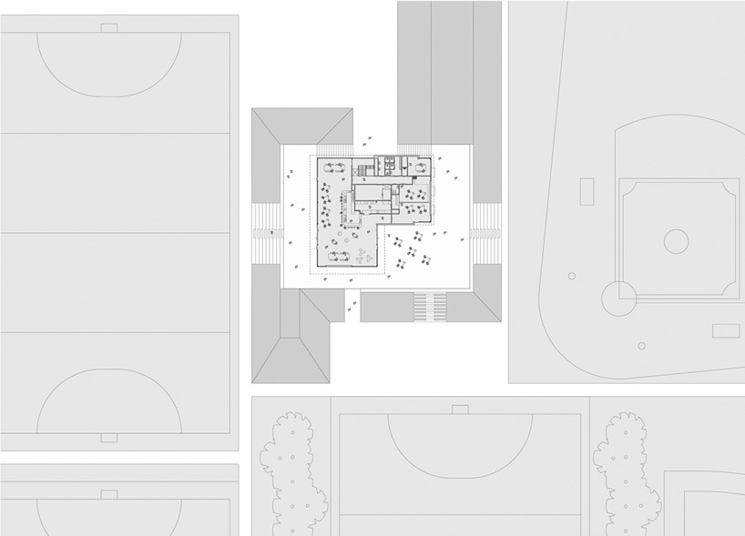
site plan

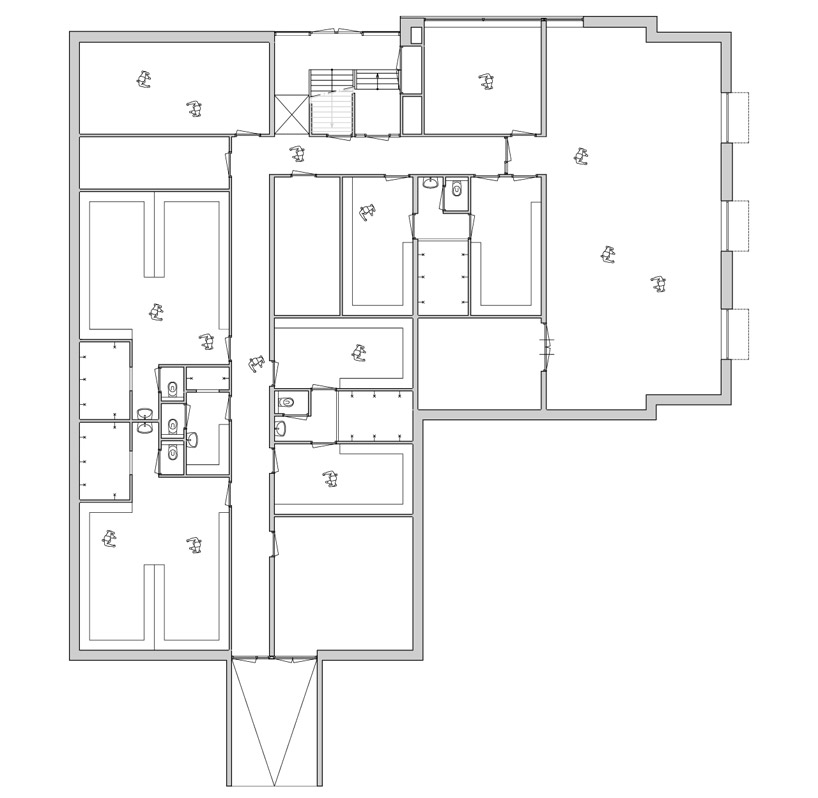
floor plan / level 0

typical floor plan


