Daniel Gillen at the unfinished Wood Sculpture Museum in Harbin, China | photo © Matthew Niederhauser for The New York Times
By Brook Larmer
Daniel Gillen is afraid of heights. The young American architect didn’t think to tell me this until we had already climbed up a construction ladder and started walking gingerly across the curved roof of an unfinished building in northeastern China.
It was a frigid day in late February, with temperatures dropping to 15 degrees below zero, and the roof’s undulating steel surface made it feel as if we were surfing on a frozen ocean wave — one that, at this height, promised a very hard landing.
“We’d never get away with this in the U.S.,” Gillen said with a nervous laugh.
From the roof, Gillen and I gazed out at a vast new city that didn’t exist two years ago. Row after row of 20-story apartment towers radiated out in every direction, in regimented monotony as far as we could see. There were hundreds of towers, almost all of them empty. “When I first came here two years ago, this area was just a bunch of fields covered with construction cranes,” said Gillen, who is 32. Now the farmlands outside Harbin have been transformed into one of the dozens of insta-cities rising around China. “Standing here,” Gillen said, “you just have to be in awe of what China can accomplish.”
The building beneath Gillen’s black leather boots inspired a different sort of wonder. A whimsical, torquing 660-foot-long tube sheathed in stainless steel, the Harbin Wood Sculpture Museum is the architectural fantasy of Gillen’s boss, Ma Yansong, and his team at MAD Architects in Beijing. The building’s design evokes the natural world — an iceberg, say, or a piece of driftwood — but given its backdrop, I couldn’t help thinking that it looked like a shimmering spaceship that had touched down unexpectedly in an alien urban landscape.

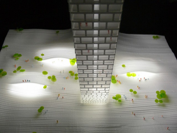
A rendering of the arts complex being designed by MAD Architects in Harbin | photo © MAD Architects
In that respect, it is not so different from Gillen himself, whose shaved head, muscular build and thick silver thumb ring make him something of an oddity in this city on China’s northern frontier. When Gillen was laid off in December 2008 by Asymptote Architecture, a New York firm, he hunkered down in his Brooklyn apartment, trying to stave off the “vibe of hopelessness.” Six months passed. His profession had been flattened by the financial crisis that put an abrupt halt to new construction. Gillen sent out dozens of résumés, but no offers came. Then, in early summer, he spotted a job posting for MAD Architects on a design Web site. The firm’s acronym seemed to sum up the outlandish proposition. “China was not on my radar at all,” he told me. The starting salary at MAD was half of what he earned in New York. Desperate, Gillen jumped.
Up on the museum’s sloping steel roof, his fear under control, Gillen marveled at his good fortune. “This kind of project,” he said, “could not be built anywhere else in the world today.” Nor could Gillen have found such an opportunity if he hadn’t journeyed 6,000 miles from home.
Over the past three years, foreign architects and designers have poured into China, fleeing economic crises at home and pinning their hopes on this country’s explosive growth. It is, after all, a place that McKinsey & Company predicts will build 50,000 skyscrapers in the next two decades, the equivalent of 10 New Yorks. MAD’s staff consisted almost entirely of mainland Chinese when Gillen arrived in mid-2009; today, nearly half of his 50 colleagues are foreigners, with designers from Holland, Germany, Belgium, Spain, Colombia, Japan and Thailand. “The economic crisis,” Gillen says, “is a heavy factor in everybody’s thought process.”
This is the expected global economic formula flipped on its head: instead of American workers losing out to the Chinese, China is providing jobs for foreign architects. Even more surprising is the degree of imaginative license that China offers, even demands of, its foreign building designers. With new cities materializing seemingly overnight, international architects are free to think big, to experiment with cutting-edge designs, to introduce green technologies. All at a frantic pace. In a top-down system that favors political will and connections over regulatory oversight and public debate, large-scale projects in China can be designed, built and put to use in the space of just a few years.
China, of course, is not new terrain for international architects. Many top American firms have run offices inside China for a decade or more. Nearly all of the country’s iconic modern buildings have been designed by foreigners, from the National Stadium, known as the Bird’s Nest, (by the Swiss firm Herzog and de Meuron) and the gravity-defying China Central Television Tower (by the Dutch architect Rem Koolhaas) to the 128-story Shanghai Tower (by San Francisco’s Gensler), which will be the second-tallest building in the world when it’s completed in 2014. The new arrivals, though, come not by invitation or out of curiosity but because they need work. They are, as Michael Tunkey, head of the China office for the North American firm Cannon Design, says, “refugees from the economic crisis.”
The scale and speed of China’s expansion is like nothing these architects experienced in their home countries. Fueled by rising prosperity and the largest rural-to-urban shift in history — some 300 million Chinese became city dwellers over the past two decades — the boom has utterly transformed the eastern seaboard around Beijing, Shanghai and Guangzhou. The fastest growth now is taking place deep in the country’s interior or on its outer edges in cities little known in the West: Harbin, Changsha, Chengdu and dozens of others. “It’s still shocking to me,” says Manuel Sanchez-Vera, a 43-year-old architect who shuttered his own Madrid practice two years ago and joined a midsize Australian firm in Shanghai. “I just got out of a meeting to design a hospital for a city that will grow from 4 million to 10 million in the next few years. How do you design for an explosion like that?”
The answer to that question, in the main, is quickly and cheaply. While some marquee projects — like the Harbin museum Gillen is working on — attract a lot of attention, most foreign architects in China are designing office towers, housing developments, hospitals and shopping malls, projects in which creativity is in constant tension with the bottom line. Despite the excitement over the flow of projects — indeed, the mere existence of work — there is also a deeper concern: all those empty apartment buildings in Harbin and elsewhere suggest that China’s building boom may have passed its peak.
For now, though, Gillen sees no better alternative. “I’m an architect, I like to build,” he says. “And China is a place where things get built.”
In December 2008, right around the time Gillen joined the ranks of the unemployed in Brooklyn, another young American architect lost his job in San Francisco. Adam Mayer, then 26, received his pink slip one year after joining Skidmore, Owings & Merrill.
The rejection stung. Mayer, a glib and gregarious University of Southern California graduate, had long aspired to work at SOM — a blue-chip firm whose San Francisco office was not far from his family’s home in Silicon Valley. Unlike Gillen, though, Mayer saw no point in sending out résumés or nursing the hope of an economic recovery. “I didn’t even bother looking for a job,” he told me. “All my U.S.C. friends were hitting a brick wall, and the only projects on SOM’s drawing boards seemed to be in China. So I just bought a ticket to Beijing. I had nothing to lose.”
Mayer spoke no Mandarin. And, like many designers, he had not yet passed the arduous set of exams needed to obtain an architect’s license in the states. “Legally, in the U.S., I can’t call myself an architect,” Mayer said. “But in China, it doesn’t matter.”

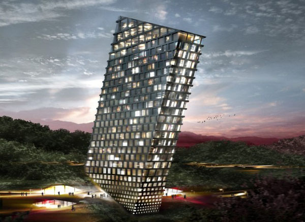
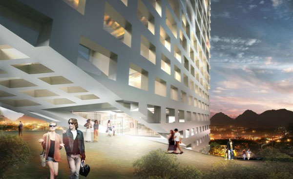
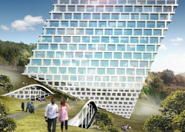
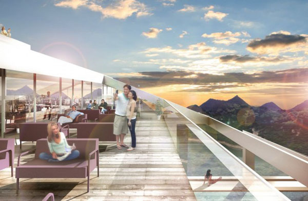
Designed by Steven Holl Architects, this building in Shenzhen is as long as the Empire State Building is high | photo © Iwan Baan/Steven Holl Architects
Four months after arriving in Beijing, Mayer landed a full-time position at a large Singaporean firm with offices around China. The one catch: Mayer had to move to Chengdu, the capital of southwestern Sichuan Province and the front line of the Chinese government’s Develop the West campaign. About 300 Chinese staff members filled the large open space of the company’s Chengdu office. Only a handful, mostly Chinese with overseas passports, spoke English. Besides Mayer, there was just one other Westerner, a young Argentine designer.
During his year at SOM in San Francisco, Mayer worked primarily on one building, and his role was subordinate. But his bosses in Chengdu were asking him to prepare conceptual designs for a series of huge projects: a 1.5-million-square-foot redevelopment zone in central Chengdu, a vast new residential area for China’s biggest housing developer, even a new headquarters for Chengdu’s urban-planning bureau. “I had a ton of creative freedom,” Mayer says. “If you ask architects coming out of grad school, they all say they want to be conceptual designers. So it was great at first.”
The pace was relentless. From designing one or two projects a month, Mayer was soon being pushed to produce one large-scale conceptual design every week. “The deadlines were crazy,” Mayer says. “Sometimes we’d have three days to finish a 250,000-square-meter project.” Even so, his Chinese colleagues churned out even more. “In terms of pure production, the local staff could work faster and more efficiently than anything I’ve ever seen in the U.S.,” Mayer says, even if in some instances they saw no shame in “literally copying designs right out of a book.”
Creativity was supposed to be Mayer’s job. Like most foreign architects in China, he was hired with the expectation that he would give designs an innovative edge — along with the prestige that many Chinese still associate with a foreign name. (More than once, Mayer was invited to sit silently at client meetings, even when he knew nothing about the project under discussion.) Mayer helped create some stunning designs, including a plan for a state-owned publisher’s headquarters that drew inspiration from ancient Chinese scrolls. Still, the mantra was always “Bigger, bolder, flashier.” During one meeting at the urban-planning bureau, Mayer recalls an official who implored them, “Make us a landmark that will stand out and make people notice!”
The question of whether China can innovate looms over the country’s quest to move beyond its role as the world’s factory. In architecture, Mayer says, the problem is not simply an education system that stresses technical skills over abstract thinking but also the pressure cooker that compels developers to build as fast and as profitably as possible. For all the lip service given to creativity, he says, too often the results are cookie-cutter developments that make Chinese cities feel depressingly similar — and surpassingly ugly. “To come up with something new and creative takes time,” he says, “and in China, there’s not the luxury of time.”
One morning in February, Gillen showed me around MAD Architects’ open-plan studio in Beijing, which occupies the top two floors of a defunct printing plant in a narrow alleyway. Rows of Chinese and foreign architects were working in an almost sepulchral silence, surrounded by models of their fanciful projects: on one end of the second floor, there was a twisting, layered skyscraper designed for Chongqing, on the other a swirly cross section of an opera house and a performing-arts center whose construction Gillen was also overseeing in Harbin.

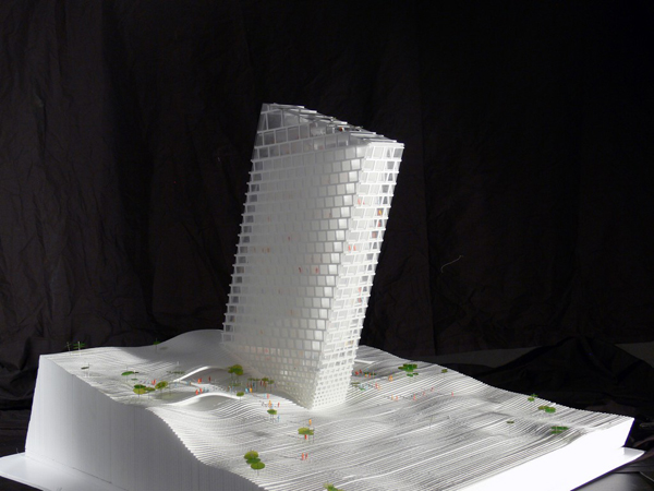
A rendering of MAD Architects’ proposed project in Chongqing | photo © MAD Architects
Occupying the studio’s central space, however, was a common Chinese totem: a Ping-Pong table. Not long ago, Gillen, an avid player himself, organized an officewide tournament, with an iPad going to the champion. It wasn’t quite Ping-Pong diplomacy, but the event served to bring the local and foreign staff members closer together.
When Gillen made his blind leap into China, he knew very little about MAD except that its founder, the 37-year-old Ma Yansong, was a rising talent. Ma, who trained at Yale and apprenticed with the British architect Zaha Hadid, is celebrated as the first Chinese architect to win a foreign competition: the Absolute Towers in Toronto. He was proof that China was coming into its own as a creative architectural force. (Further evidence came recently when the 2012 Pritzker Prize — architecture’s top honor — was awarded to another Chinese architect, Wang Shu.)
Ma and Gillen sit a few feet apart, at identical workstations, but the rolls of blueprints that make a sort of miniature skyline on the American’s desk show the role he has taken on. Hired as a designer, Gillen now oversees the building of Ma’s architectural concoctions. “I am the executioner,” he says with a grin. “I just try to get things done without making either my boss or the client unhappy.”
The client, in the case of the Harbin Wood Sculpture Museum, is the local government, which occupies a glass building with a red Chinese flag next door to the construction site. “The top-down system can make things very simple,” Gillen says. “The leader says, ‘I want it; you make it,’ and it’s done.” Never mind that the projected ticket sales for the museum’s exhibitions, which are anchored by the collected works of a locally renowned wood sculptor, could never match the building’s extravagant price tag.
Such an issue might stop a project in the United States. But in China, the primary concerns are prestige and development for its own sake, and the leaders would move heaven — and lots of earth — to get the museum built. “These projects are the Louis Vuitton bags of architecture,” says one foreign architect, who has worked on several marquee buildings in China. “Every city in China wants one now.”
With all the excitement over architectural possibilities in China, there is a reluctance to address the obvious question: What happens if the social, cultural and economic environment cannot support these cutting-edge designs after they are built? This is already a problem, both for prestige projects and massive urban developments. MAD, for example, has built the voluptuously curved Ordos Museum in a new planned city in Inner Mongolia. But the real estate bubble popped in Ordos last year. The museum now sits forlornly in an empty development, a symbol of architectural achievement as well as the folly of ambition. “These are like the Fields of Dreams,” Gillen says. “Build it, and they will come.” Sometimes, though, they don’t come.
In Harbin, I met two Chinese men in thick coats wandering around the Wood Sculpture Museum. They were trying to decide if it looked more like a whale or a shimmering serpent. “It certainly is unusual,” said one, who identified himself as Mr. Wang and who bought an apartment in one of the high-rises behind the museum two years ago. Did he like the design? “Well, yes,” he said, “because it’s already made my property nearly double in value!”
Gillen is not paid to worry about the museum’s future or its development value — just to ensure that it is built. And that often requires handling shifting demands that would be almost unimaginable back home. When the pit for the wood-sculpture museum’s foundation had already been dug, for instance, the government made a startling request to double the area to 66,000 square feet. The demand meant drafting a new set of designs and digging the foundation several yards larger to create a new underground gallery space. “In the U.S., the contract would’ve been ripped up and renegotiated,” Gillen said. But MAD complied with the request without complaint. It was another lesson in the Chinese art of making guanxi, or cultivating relationships. Who knows what commissions a cooperative attitude might lead to in the future?
Walking through the museum’s cathedral-like interior, with rays of morning sunshine streaming through the skylights, Gillen snapped photos of imperfections: a shattered pane of curved glass, a poorly placed water pipe. He was keenly aware of the shoddy workmanship that has plagued other modern buildings in China. It is one price of excessive speed. “I want to build a monument that lasts,” he says. Even so, he couldn’t get over the pace of progress. “This is a complex project, but we’ve gone from design to nearly finished construction in just two years!” Gillen said. “I’m not saying this system is better than ours back home. But sometimes it seems like the U.S. is sitting on the couch sipping coffee while China is Carl Lewis running as hard as it can.”

Wang Shu, who designed the Ningbo Historic Museum in Zhejiang Province, won the 2012 Pritzker prize, the field’s highest honor | photo © Agence France-Presse/Getty Images
It was nearly 1 a.m. on a weeknight in Chengdu, but a band was playing at China Groove, and the expatriate architects seemed in no hurry to leave. Clustered around a table on a night in mid-February were newly arrived architects from Germany, New Zealand and Britain, as well as a young Iranian construction supplier just in from Tehran. The music was blasting, and the young men (yes, a large proportion of the foreign architects in China are men) had to yell to make themselves heard.
“Have you seen the world’s biggest building yet?” shouted Stephan Wurster, an affable 38-year-old Stuttgart native who moved here in December after three years in Beijing. Both he and Kamaljot Singh Panesar, a goateed British architect at the table, have offices in development zones mushrooming on the plains south of Chengdu, not far from a half-completed behemoth called Ocean Park. Under a single roof covering an area of about 25 football fields, Ocean Park is designed to include hotels, shopping malls, aquariums, amusement parks and a simulated ocean with a white-sand beach. (The ultimate “Truman Show” touch: the 660-foot-wide video screen that will allow beachgoers to enjoy brilliant digital sunsets, even when clouds and pollution block the real thing.)
Wurster takes more than a passing interest in the Chinese-designed building: it stands directly across from the site where he is overseeing construction of a contemporary art center for his bosses at Zaha Hadid Architects. The same Chinese investor behind Ocean Park, in fact, is financing the arts center as a gift to Chengdu. And what city leader wouldn’t be flattered to receive a cultural icon designed by a world-famous architect? Still, Hadid’s firm has had to make compromises — overhauling the sinuous design because local officials thought it looked like a snake, which is considered bad luck. “Even on status projects,” Wurster said with a laugh, “there’s no carte blanche in China.”
The hidden rules and restrictions are felt even more strongly by the vast majority of foreign architects who are not working on high-visibility projects. Consider Panesar. The financial crisis devastated his boutique firm in London in 2009, forcing him and his partner at Urban Hybrid Architecture to lay off most of their 15-person staff and take a gamble on China. Dapper and soft-spoken, Panesar, who is 35, has spent the past 18 months scrambling to get his foot in the door with all kinds of projects in Chengdu: train stations, kindergartens, residential developments. So far, he has pulled in enough design fees to keep his firm afloat. But he’s still waiting for one of the designs to actually be built. “China is not the blank canvas that you imagine,” Panesar said. “We’re just crawling really, but we’re here for the long haul.”
There was one expat missing that night at China Groove. Adam Mayer, now 29, left his job in Chengdu a few weeks earlier and flew back to California to figure out his next move. “I built up a great portfolio of designs,” Mayer told me when we talked by Skype. “But I started to wonder what good it served.” None of his designs were built. For all the creative freedom he enjoyed, Mayer began longing for stronger mentoring and more concrete results. In some cases, clients were using his work to impress officials in hopes of winning a bid or acquiring land for a future project. (In China, all land is owned by the state.) “I feel as though I was more in advertising or marketing than architecture,” he said.
Mayer’s experience is not universal. But many foreign architects in China sense that they are operating in the dark, toiling in a system they dimly understand. Real estate development in China is a murky business. There is little transparency — and lots of horse trading — in everything from the acquisition of land to the awarding of bids and competitions. In all but the highest-profile projects, foreigners are largely sidelined during the building process itself, which by law and tradition is controlled by local design institutes.
As foreign architects continue to arrive, there is also increasing competition for jobs and business. Some international firms have even started lowballing bids to try to buy their way into the market — a development that is “killing Western firms here,” says the Shanghai-based Dutch architect Daan Roggeveen, who is the co-author of a book on China’s new megacities. In the meantime, Chinese and foreign firms alike are moving to localize their staffs — both to cut costs and to cultivate a new generation of Chinese architects, many of whom have trained abroad.
“I’ll definitely go back to China,” Mayer said. For now, though, he is too busy cramming for the exams that will allow him, at last, to call himself an architect in the United States.
A few miles from the wood-sculpture museum near Harbin, a far bigger cultural landmark is rising on the banks of the frozen Songhua River. When it is finished, the Harbin Cultural Island — the MAD-designed opera house and performance center I saw modeled in the office — will look like a trio of snow-swirled mountains. Gillen was checking on the progress. “Three years ago,” he admitted, “I’d never even heard of Harbin.”
As we clambered to the top of this construction site — those heights again — it somehow made sense that Gillen’s planned year in China had extended to almost three. In his previous job at a New York firm, he said, “I spent a year and a half doing concept designs that never got built.” When I asked him how long his China sojourn might last, he smiled: “How’s the New York real estate market doing?” As the winter sun hung over the horizon, Gillen walked around the half-completed opera house — “a baby being born,” he called it — and added: “I’m in a lucky position. I don’t know if the pace of growth in China is sustainable, but I’ll ride it as long as I can.”
By Brook Larmer
Daniel Gillen is afraid of heights. The young American architect didn’t think to tell me this until we had already climbed up a construction ladder and started walking gingerly across the curved roof of an unfinished building in northeastern China.
It was a frigid day in late February, with temperatures dropping to 15 degrees below zero, and the roof’s undulating steel surface made it feel as if we were surfing on a frozen ocean wave — one that, at this height, promised a very hard landing.
“We’d never get away with this in the U.S.,” Gillen said with a nervous laugh.
From the roof, Gillen and I gazed out at a vast new city that didn’t exist two years ago. Row after row of 20-story apartment towers radiated out in every direction, in regimented monotony as far as we could see. There were hundreds of towers, almost all of them empty. “When I first came here two years ago, this area was just a bunch of fields covered with construction cranes,” said Gillen, who is 32. Now the farmlands outside Harbin have been transformed into one of the dozens of insta-cities rising around China. “Standing here,” Gillen said, “you just have to be in awe of what China can accomplish.”
The building beneath Gillen’s black leather boots inspired a different sort of wonder. A whimsical, torquing 660-foot-long tube sheathed in stainless steel, the Harbin Wood Sculpture Museum is the architectural fantasy of Gillen’s boss, Ma Yansong, and his team at MAD Architects in Beijing. The building’s design evokes the natural world — an iceberg, say, or a piece of driftwood — but given its backdrop, I couldn’t help thinking that it looked like a shimmering spaceship that had touched down unexpectedly in an alien urban landscape.

A rendering of the arts complex being designed by MAD Architects in Harbin | photo © MAD Architects
In that respect, it is not so different from Gillen himself, whose shaved head, muscular build and thick silver thumb ring make him something of an oddity in this city on China’s northern frontier. When Gillen was laid off in December 2008 by Asymptote Architecture, a New York firm, he hunkered down in his Brooklyn apartment, trying to stave off the “vibe of hopelessness.” Six months passed. His profession had been flattened by the financial crisis that put an abrupt halt to new construction. Gillen sent out dozens of résumés, but no offers came. Then, in early summer, he spotted a job posting for MAD Architects on a design Web site. The firm’s acronym seemed to sum up the outlandish proposition. “China was not on my radar at all,” he told me. The starting salary at MAD was half of what he earned in New York. Desperate, Gillen jumped.
Up on the museum’s sloping steel roof, his fear under control, Gillen marveled at his good fortune. “This kind of project,” he said, “could not be built anywhere else in the world today.” Nor could Gillen have found such an opportunity if he hadn’t journeyed 6,000 miles from home.
Over the past three years, foreign architects and designers have poured into China, fleeing economic crises at home and pinning their hopes on this country’s explosive growth. It is, after all, a place that McKinsey & Company predicts will build 50,000 skyscrapers in the next two decades, the equivalent of 10 New Yorks. MAD’s staff consisted almost entirely of mainland Chinese when Gillen arrived in mid-2009; today, nearly half of his 50 colleagues are foreigners, with designers from Holland, Germany, Belgium, Spain, Colombia, Japan and Thailand. “The economic crisis,” Gillen says, “is a heavy factor in everybody’s thought process.”
This is the expected global economic formula flipped on its head: instead of American workers losing out to the Chinese, China is providing jobs for foreign architects. Even more surprising is the degree of imaginative license that China offers, even demands of, its foreign building designers. With new cities materializing seemingly overnight, international architects are free to think big, to experiment with cutting-edge designs, to introduce green technologies. All at a frantic pace. In a top-down system that favors political will and connections over regulatory oversight and public debate, large-scale projects in China can be designed, built and put to use in the space of just a few years.
China, of course, is not new terrain for international architects. Many top American firms have run offices inside China for a decade or more. Nearly all of the country’s iconic modern buildings have been designed by foreigners, from the National Stadium, known as the Bird’s Nest, (by the Swiss firm Herzog and de Meuron) and the gravity-defying China Central Television Tower (by the Dutch architect Rem Koolhaas) to the 128-story Shanghai Tower (by San Francisco’s Gensler), which will be the second-tallest building in the world when it’s completed in 2014. The new arrivals, though, come not by invitation or out of curiosity but because they need work. They are, as Michael Tunkey, head of the China office for the North American firm Cannon Design, says, “refugees from the economic crisis.”
The scale and speed of China’s expansion is like nothing these architects experienced in their home countries. Fueled by rising prosperity and the largest rural-to-urban shift in history — some 300 million Chinese became city dwellers over the past two decades — the boom has utterly transformed the eastern seaboard around Beijing, Shanghai and Guangzhou. The fastest growth now is taking place deep in the country’s interior or on its outer edges in cities little known in the West: Harbin, Changsha, Chengdu and dozens of others. “It’s still shocking to me,” says Manuel Sanchez-Vera, a 43-year-old architect who shuttered his own Madrid practice two years ago and joined a midsize Australian firm in Shanghai. “I just got out of a meeting to design a hospital for a city that will grow from 4 million to 10 million in the next few years. How do you design for an explosion like that?”
The answer to that question, in the main, is quickly and cheaply. While some marquee projects — like the Harbin museum Gillen is working on — attract a lot of attention, most foreign architects in China are designing office towers, housing developments, hospitals and shopping malls, projects in which creativity is in constant tension with the bottom line. Despite the excitement over the flow of projects — indeed, the mere existence of work — there is also a deeper concern: all those empty apartment buildings in Harbin and elsewhere suggest that China’s building boom may have passed its peak.
For now, though, Gillen sees no better alternative. “I’m an architect, I like to build,” he says. “And China is a place where things get built.”
In December 2008, right around the time Gillen joined the ranks of the unemployed in Brooklyn, another young American architect lost his job in San Francisco. Adam Mayer, then 26, received his pink slip one year after joining Skidmore, Owings & Merrill.
The rejection stung. Mayer, a glib and gregarious University of Southern California graduate, had long aspired to work at SOM — a blue-chip firm whose San Francisco office was not far from his family’s home in Silicon Valley. Unlike Gillen, though, Mayer saw no point in sending out résumés or nursing the hope of an economic recovery. “I didn’t even bother looking for a job,” he told me. “All my U.S.C. friends were hitting a brick wall, and the only projects on SOM’s drawing boards seemed to be in China. So I just bought a ticket to Beijing. I had nothing to lose.”
Mayer spoke no Mandarin. And, like many designers, he had not yet passed the arduous set of exams needed to obtain an architect’s license in the states. “Legally, in the U.S., I can’t call myself an architect,” Mayer said. “But in China, it doesn’t matter.”

Designed by Steven Holl Architects, this building in Shenzhen is as long as the Empire State Building is high | photo © Iwan Baan/Steven Holl Architects
Four months after arriving in Beijing, Mayer landed a full-time position at a large Singaporean firm with offices around China. The one catch: Mayer had to move to Chengdu, the capital of southwestern Sichuan Province and the front line of the Chinese government’s Develop the West campaign. About 300 Chinese staff members filled the large open space of the company’s Chengdu office. Only a handful, mostly Chinese with overseas passports, spoke English. Besides Mayer, there was just one other Westerner, a young Argentine designer.
During his year at SOM in San Francisco, Mayer worked primarily on one building, and his role was subordinate. But his bosses in Chengdu were asking him to prepare conceptual designs for a series of huge projects: a 1.5-million-square-foot redevelopment zone in central Chengdu, a vast new residential area for China’s biggest housing developer, even a new headquarters for Chengdu’s urban-planning bureau. “I had a ton of creative freedom,” Mayer says. “If you ask architects coming out of grad school, they all say they want to be conceptual designers. So it was great at first.”
The pace was relentless. From designing one or two projects a month, Mayer was soon being pushed to produce one large-scale conceptual design every week. “The deadlines were crazy,” Mayer says. “Sometimes we’d have three days to finish a 250,000-square-meter project.” Even so, his Chinese colleagues churned out even more. “In terms of pure production, the local staff could work faster and more efficiently than anything I’ve ever seen in the U.S.,” Mayer says, even if in some instances they saw no shame in “literally copying designs right out of a book.”
Creativity was supposed to be Mayer’s job. Like most foreign architects in China, he was hired with the expectation that he would give designs an innovative edge — along with the prestige that many Chinese still associate with a foreign name. (More than once, Mayer was invited to sit silently at client meetings, even when he knew nothing about the project under discussion.) Mayer helped create some stunning designs, including a plan for a state-owned publisher’s headquarters that drew inspiration from ancient Chinese scrolls. Still, the mantra was always “Bigger, bolder, flashier.” During one meeting at the urban-planning bureau, Mayer recalls an official who implored them, “Make us a landmark that will stand out and make people notice!”
The question of whether China can innovate looms over the country’s quest to move beyond its role as the world’s factory. In architecture, Mayer says, the problem is not simply an education system that stresses technical skills over abstract thinking but also the pressure cooker that compels developers to build as fast and as profitably as possible. For all the lip service given to creativity, he says, too often the results are cookie-cutter developments that make Chinese cities feel depressingly similar — and surpassingly ugly. “To come up with something new and creative takes time,” he says, “and in China, there’s not the luxury of time.”
One morning in February, Gillen showed me around MAD Architects’ open-plan studio in Beijing, which occupies the top two floors of a defunct printing plant in a narrow alleyway. Rows of Chinese and foreign architects were working in an almost sepulchral silence, surrounded by models of their fanciful projects: on one end of the second floor, there was a twisting, layered skyscraper designed for Chongqing, on the other a swirly cross section of an opera house and a performing-arts center whose construction Gillen was also overseeing in Harbin.

A rendering of MAD Architects’ proposed project in Chongqing | photo © MAD Architects
Occupying the studio’s central space, however, was a common Chinese totem: a Ping-Pong table. Not long ago, Gillen, an avid player himself, organized an officewide tournament, with an iPad going to the champion. It wasn’t quite Ping-Pong diplomacy, but the event served to bring the local and foreign staff members closer together.
When Gillen made his blind leap into China, he knew very little about MAD except that its founder, the 37-year-old Ma Yansong, was a rising talent. Ma, who trained at Yale and apprenticed with the British architect Zaha Hadid, is celebrated as the first Chinese architect to win a foreign competition: the Absolute Towers in Toronto. He was proof that China was coming into its own as a creative architectural force. (Further evidence came recently when the 2012 Pritzker Prize — architecture’s top honor — was awarded to another Chinese architect, Wang Shu.)
Ma and Gillen sit a few feet apart, at identical workstations, but the rolls of blueprints that make a sort of miniature skyline on the American’s desk show the role he has taken on. Hired as a designer, Gillen now oversees the building of Ma’s architectural concoctions. “I am the executioner,” he says with a grin. “I just try to get things done without making either my boss or the client unhappy.”
The client, in the case of the Harbin Wood Sculpture Museum, is the local government, which occupies a glass building with a red Chinese flag next door to the construction site. “The top-down system can make things very simple,” Gillen says. “The leader says, ‘I want it; you make it,’ and it’s done.” Never mind that the projected ticket sales for the museum’s exhibitions, which are anchored by the collected works of a locally renowned wood sculptor, could never match the building’s extravagant price tag.
Such an issue might stop a project in the United States. But in China, the primary concerns are prestige and development for its own sake, and the leaders would move heaven — and lots of earth — to get the museum built. “These projects are the Louis Vuitton bags of architecture,” says one foreign architect, who has worked on several marquee buildings in China. “Every city in China wants one now.”
With all the excitement over architectural possibilities in China, there is a reluctance to address the obvious question: What happens if the social, cultural and economic environment cannot support these cutting-edge designs after they are built? This is already a problem, both for prestige projects and massive urban developments. MAD, for example, has built the voluptuously curved Ordos Museum in a new planned city in Inner Mongolia. But the real estate bubble popped in Ordos last year. The museum now sits forlornly in an empty development, a symbol of architectural achievement as well as the folly of ambition. “These are like the Fields of Dreams,” Gillen says. “Build it, and they will come.” Sometimes, though, they don’t come.
In Harbin, I met two Chinese men in thick coats wandering around the Wood Sculpture Museum. They were trying to decide if it looked more like a whale or a shimmering serpent. “It certainly is unusual,” said one, who identified himself as Mr. Wang and who bought an apartment in one of the high-rises behind the museum two years ago. Did he like the design? “Well, yes,” he said, “because it’s already made my property nearly double in value!”
Gillen is not paid to worry about the museum’s future or its development value — just to ensure that it is built. And that often requires handling shifting demands that would be almost unimaginable back home. When the pit for the wood-sculpture museum’s foundation had already been dug, for instance, the government made a startling request to double the area to 66,000 square feet. The demand meant drafting a new set of designs and digging the foundation several yards larger to create a new underground gallery space. “In the U.S., the contract would’ve been ripped up and renegotiated,” Gillen said. But MAD complied with the request without complaint. It was another lesson in the Chinese art of making guanxi, or cultivating relationships. Who knows what commissions a cooperative attitude might lead to in the future?
Walking through the museum’s cathedral-like interior, with rays of morning sunshine streaming through the skylights, Gillen snapped photos of imperfections: a shattered pane of curved glass, a poorly placed water pipe. He was keenly aware of the shoddy workmanship that has plagued other modern buildings in China. It is one price of excessive speed. “I want to build a monument that lasts,” he says. Even so, he couldn’t get over the pace of progress. “This is a complex project, but we’ve gone from design to nearly finished construction in just two years!” Gillen said. “I’m not saying this system is better than ours back home. But sometimes it seems like the U.S. is sitting on the couch sipping coffee while China is Carl Lewis running as hard as it can.”

Wang Shu, who designed the Ningbo Historic Museum in Zhejiang Province, won the 2012 Pritzker prize, the field’s highest honor | photo © Agence France-Presse/Getty Images
It was nearly 1 a.m. on a weeknight in Chengdu, but a band was playing at China Groove, and the expatriate architects seemed in no hurry to leave. Clustered around a table on a night in mid-February were newly arrived architects from Germany, New Zealand and Britain, as well as a young Iranian construction supplier just in from Tehran. The music was blasting, and the young men (yes, a large proportion of the foreign architects in China are men) had to yell to make themselves heard.
“Have you seen the world’s biggest building yet?” shouted Stephan Wurster, an affable 38-year-old Stuttgart native who moved here in December after three years in Beijing. Both he and Kamaljot Singh Panesar, a goateed British architect at the table, have offices in development zones mushrooming on the plains south of Chengdu, not far from a half-completed behemoth called Ocean Park. Under a single roof covering an area of about 25 football fields, Ocean Park is designed to include hotels, shopping malls, aquariums, amusement parks and a simulated ocean with a white-sand beach. (The ultimate “Truman Show” touch: the 660-foot-wide video screen that will allow beachgoers to enjoy brilliant digital sunsets, even when clouds and pollution block the real thing.)
Wurster takes more than a passing interest in the Chinese-designed building: it stands directly across from the site where he is overseeing construction of a contemporary art center for his bosses at Zaha Hadid Architects. The same Chinese investor behind Ocean Park, in fact, is financing the arts center as a gift to Chengdu. And what city leader wouldn’t be flattered to receive a cultural icon designed by a world-famous architect? Still, Hadid’s firm has had to make compromises — overhauling the sinuous design because local officials thought it looked like a snake, which is considered bad luck. “Even on status projects,” Wurster said with a laugh, “there’s no carte blanche in China.”
The hidden rules and restrictions are felt even more strongly by the vast majority of foreign architects who are not working on high-visibility projects. Consider Panesar. The financial crisis devastated his boutique firm in London in 2009, forcing him and his partner at Urban Hybrid Architecture to lay off most of their 15-person staff and take a gamble on China. Dapper and soft-spoken, Panesar, who is 35, has spent the past 18 months scrambling to get his foot in the door with all kinds of projects in Chengdu: train stations, kindergartens, residential developments. So far, he has pulled in enough design fees to keep his firm afloat. But he’s still waiting for one of the designs to actually be built. “China is not the blank canvas that you imagine,” Panesar said. “We’re just crawling really, but we’re here for the long haul.”
There was one expat missing that night at China Groove. Adam Mayer, now 29, left his job in Chengdu a few weeks earlier and flew back to California to figure out his next move. “I built up a great portfolio of designs,” Mayer told me when we talked by Skype. “But I started to wonder what good it served.” None of his designs were built. For all the creative freedom he enjoyed, Mayer began longing for stronger mentoring and more concrete results. In some cases, clients were using his work to impress officials in hopes of winning a bid or acquiring land for a future project. (In China, all land is owned by the state.) “I feel as though I was more in advertising or marketing than architecture,” he said.
Mayer’s experience is not universal. But many foreign architects in China sense that they are operating in the dark, toiling in a system they dimly understand. Real estate development in China is a murky business. There is little transparency — and lots of horse trading — in everything from the acquisition of land to the awarding of bids and competitions. In all but the highest-profile projects, foreigners are largely sidelined during the building process itself, which by law and tradition is controlled by local design institutes.
As foreign architects continue to arrive, there is also increasing competition for jobs and business. Some international firms have even started lowballing bids to try to buy their way into the market — a development that is “killing Western firms here,” says the Shanghai-based Dutch architect Daan Roggeveen, who is the co-author of a book on China’s new megacities. In the meantime, Chinese and foreign firms alike are moving to localize their staffs — both to cut costs and to cultivate a new generation of Chinese architects, many of whom have trained abroad.
“I’ll definitely go back to China,” Mayer said. For now, though, he is too busy cramming for the exams that will allow him, at last, to call himself an architect in the United States.
A few miles from the wood-sculpture museum near Harbin, a far bigger cultural landmark is rising on the banks of the frozen Songhua River. When it is finished, the Harbin Cultural Island — the MAD-designed opera house and performance center I saw modeled in the office — will look like a trio of snow-swirled mountains. Gillen was checking on the progress. “Three years ago,” he admitted, “I’d never even heard of Harbin.”
As we clambered to the top of this construction site — those heights again — it somehow made sense that Gillen’s planned year in China had extended to almost three. In his previous job at a New York firm, he said, “I spent a year and a half doing concept designs that never got built.” When I asked him how long his China sojourn might last, he smiled: “How’s the New York real estate market doing?” As the winter sun hung over the horizon, Gillen walked around the half-completed opera house — “a baby being born,” he called it — and added: “I’m in a lucky position. I don’t know if the pace of growth in China is sustainable, but I’ll ride it as long as I can.”
Source: New York Times


