Search Engine

Saturday, 16 June 2012

Peter Kunz Architektur: Garagenatelier in Herdern

'garagenatelier' by peter kunz architektur, herdern, switzerland
all images © peter kunz architektur
all images courtesy peter kunz architektur


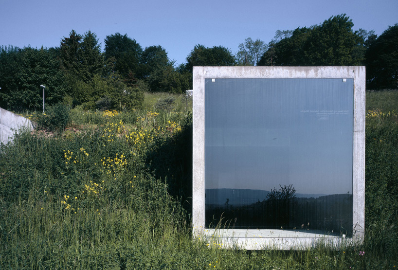
In the mountains of herdern, switzerland is 'garagenatelier', a parking structure by swiss practice
peter kunz architektur. Five concrete cubes are embedded into the landscape, partially revealing the 
solid enclosure by the sloping terrain.The structural material frames a glass pane offering outward views
from the parked cars. a driveway leads visitors down the hillside to enter through one of the end units.
A sliding glazing panel allows entry into the facility.


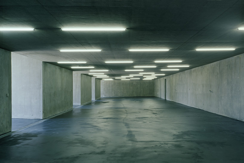
The five slots which are visible from the exterior project from the footprint of the unified interior
which is capable of containing eight vehicles. natural daylight enters the cave-like space through the windows. 
A stairway leads individuals to the roof top of the structure and consequently back up to the level of the road.


glass fronted parking spaces are embedded into the landscape


interior


floor plan / level 0


section


via iGNANT

Wednesday, 13 June 2012

Busan Opera House

 
As the second largest city in Korea, Busan maintains a crucial place in one of the most prosperous and admired countries in Asia. With its forward thinking leadership and strong cultural identity Busan is right in transforming distressed areas into what will surely be viewed as a miracle of urban redevelopment. Endowed with striking natural beauty and an abundance of good weather, the City of Busan by building the Opera House and the other visionary projects underway is posed to emerge as a leader in a global community of cities that is admired and visited for its blending of new and old, its vision and history and ultimately the strength of its character.
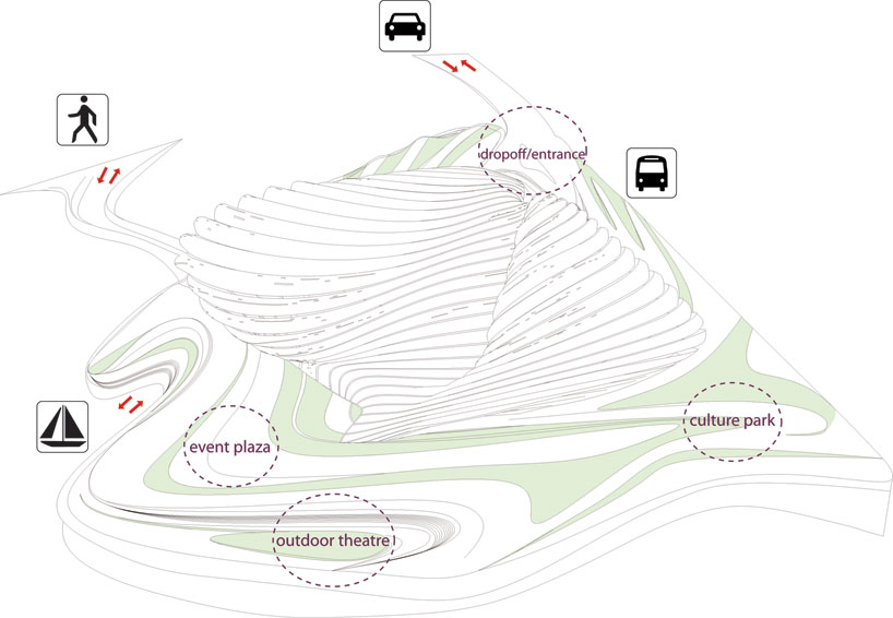
Given the very specific context and the aspirations that the City of Busan Opera House required, we looked intently at how the city might use and ultimately benefit from a grand proposal. From the standpoint of the additional uses and functions proposed for the area, but more importantly for the impact a design would have on the site, we approached the City of Busan Opera House as a collector for people and activities. As such the Opera House is ultimately a node. Situated on an island within very close proximity to an arterial thoroughfare and transit hub that will bring people to the site. With two pedestrian bridges and one vehicular bridge, the project site has very good access while still maintaining a prominent location within the entire redevelopment proposal. This is further reinforced with the prominent location and visibility of the Opera House from the City of Busan.
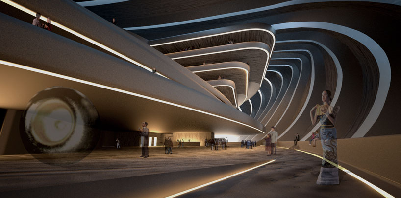
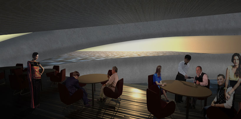
Once people make their way to the City of Busan Opera House, they are presented with a prominent structure, one that in a single volume contains all the necessary elements with three distinct areas that are merged seamlessly within the Opera House: a performance spaces, a service component and a leisure component. The performance spaces are the most important and accessible spaces within the complex. Located atop each other the Multi-Purpose Theatre and Opera both make use of a Grand Atrium for collecting and distributing people within the building. In addition to the performance spaces, the service component allows for the Opera House to function as a Convention Center, with a large open space and Banquet Hall. A leisure component, with Shops and a casual Restaurant is located on the lowest level for access to the adjacent Performance Plaza, Multi-Purpose Theatre and Opera. On one of the uppermost levels, within the Grand Atrium is a Sea View Restaurant and Café that provides formal and informal dining.
The City of Busan Opera House is an iconic structure. The importance and impact can not be under represented for the City of Busan. Therefore we approached the design as one that required a novel and progressive approach, one that would have a lasting and global impact. Incorporating the idea of Sea waves, we applied across the building’s façade a series of metal fins that gather and flow around the building. So not to disrupt the formality of the façade treatment, we blended the a multi-colored metal with glass allowing for an abundance of light to enter into the building, illuminating all the spaces and connecting the Opera House with the City of Busan by opening up the building. On the far South façade and roof an expansive glass wall brings light and presents the Opera and Theatre attendees with wonderful views of the Sea and landscape.
LOCATION:
Busan, South Korea
PROJECT TEAM:
Armando Araiza
Andrew De La Garza
Kevin McClellan
Luis Quinonez
SIZE/AREA:
Height: 35 m
Length: 120 m
Width: 60 m
Total Floor Area: 55,000 m2

Tuesday, 12 June 2012

OODA: Busan Opera House

'busan opera house' by OODA, busan, south korea images courtesy of OODA
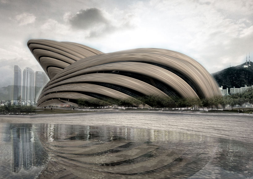
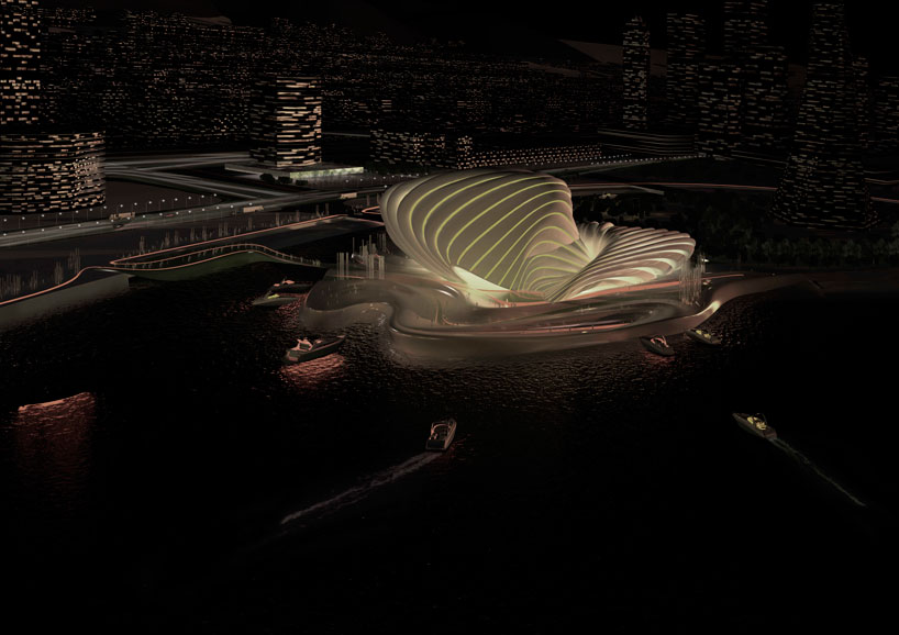
Portuguese firm OODA has sent images of their design proposal for the 'busan opera house' in busan, 
south Korea. the iconic building reminiscent of a seashell is positioned on the edge of the sea symbolically
projecting harmonious sounds to the world. the exterior undulates to engage the existing topography while
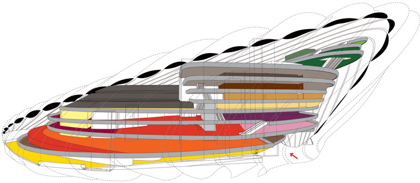
creating a subdivided interior for cultural activities that integrates necessary program requirements for operas,
musical venues, theater and sporting events. 
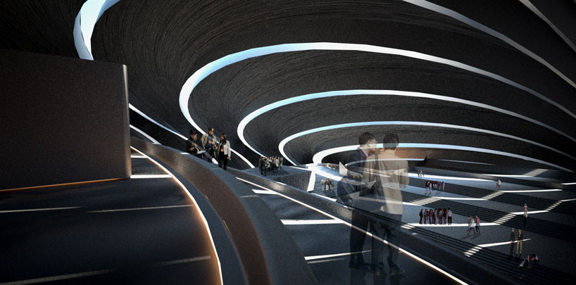
Fluid bands wrapping the structure blur the boundaries between internal and external environments while
introducing natural light and cross ventilation.


view from the river


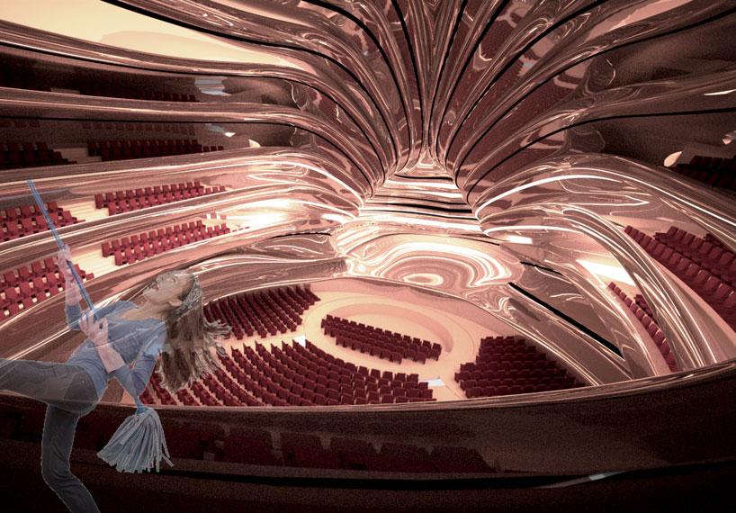
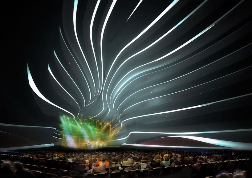
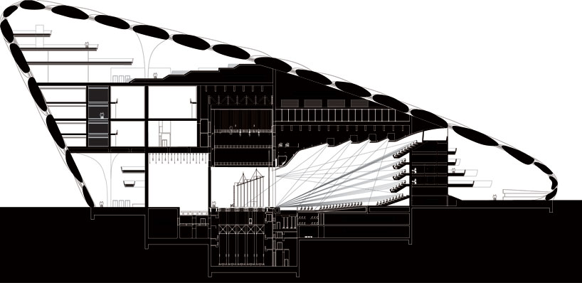
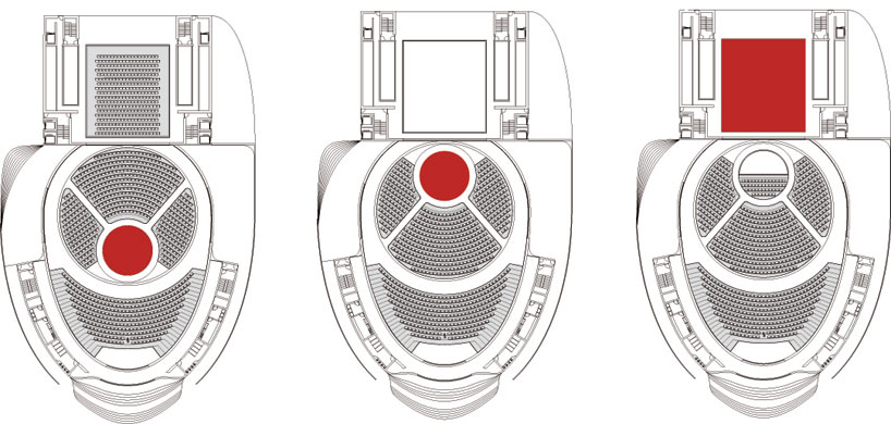
The grand opera auditorium features flexible stage locations and seating arrangements with rotating platforms
enabling large and small scale events to occur within the space. accommodating the needs of different concerts,
visitors may have a variety of perspectives to view performances with a central stage and perimeter seating or
a single view with all seating oriented in the same direction. a secondary multipurpose theater within the
smaller volume is interconnected with a banquet hall, convention center, shopping, cafes and restaurants. 


entrance


perimeter corridor


cafe


opera theater


concert


ballet stage


theater


sporting event


at night


floor plan / level 0


floor plan / level 1


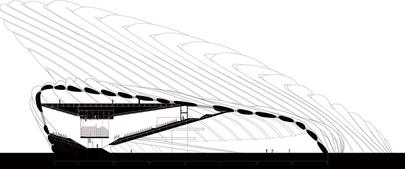
section


section


programmatic plan


programmatic section


seating layout flexibility for music venues, theater, sporting events and cinema


theater arrangements for opera


landscape diagram


conceptual diagram
Published with Blogger-droid v2.0.4

FREE: mexic-arte museum, austin


'mexic-arte museum' by FREE, austin, texas
all images courtesy of FREE


Conceived by the mexican and US based firm, FREE (Fernando Romero EnterprisE) have designed a new museum that 
will showcase mexican art in downtown austin, texas. the mexic-arte museum has presented the design of its future venue. 
the new art center aims to uphold a mexican presence and sense of identity by representing itself as a world-class cultural institution.


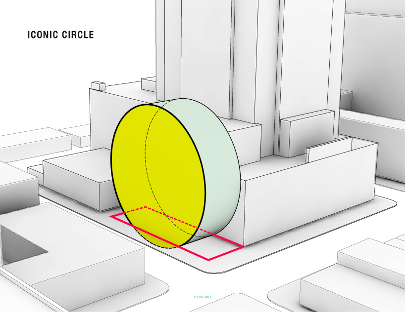
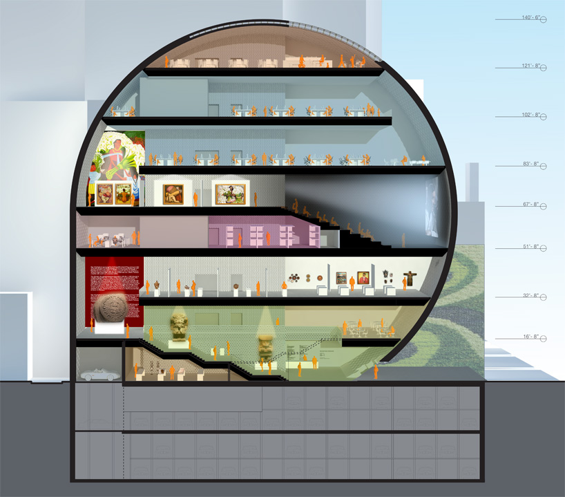
The design is derived from elements of circularity found in mexican culture such as the aztec calendar and the pelota game. 
the circular structure is anchored by a central plaza that serves as the main entry. this iconographic silhouette shapes the building's identity without compromising the structural and programmatic efficiency of the floor plans. the rear of the structure is extended to contain the service entries and loading docks.

The dynamic facade allows perforations to become smaller in exhibition spaces to promise an optimal lighting environment 
for displayed items. the skin of the museum is equipped with LED light system that can be use as projection wall for images,
institutional advertisements or specific art projects.


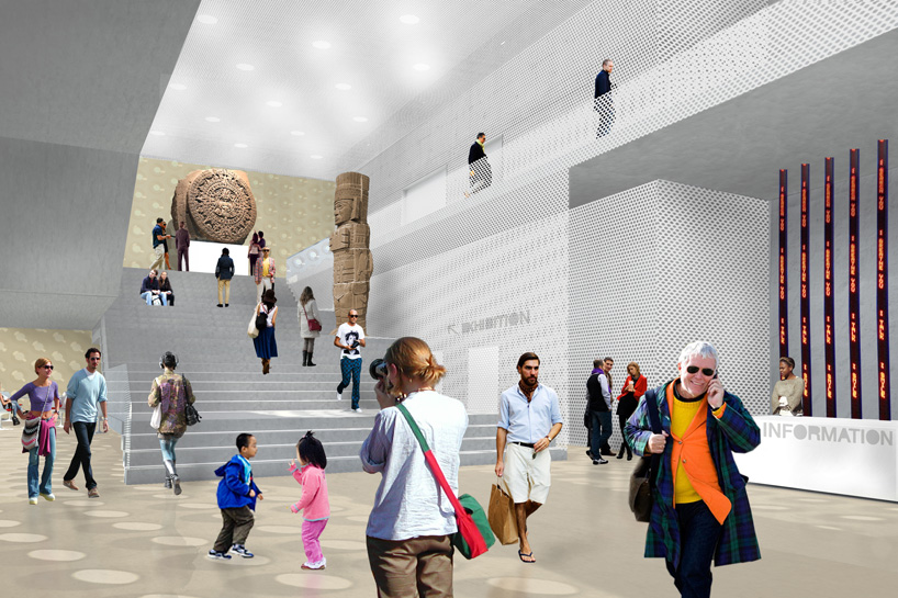
visualization of the lobby area


visualization of the exhibition area


section


floor plan / level 0-1


floor plan / level 2-3


floor plan / level 4-5


floor plan / level 6-7

Architectural Animation

NL architects: NUKII library, ljubljana


'NUKII library' by NL architects, ljubljana, slovenia
all images courtesy of NL architects


Amsterdam-based practice NL architects have produced their proposal for the 'NUKII library' competition in ljubljana, slovenia.
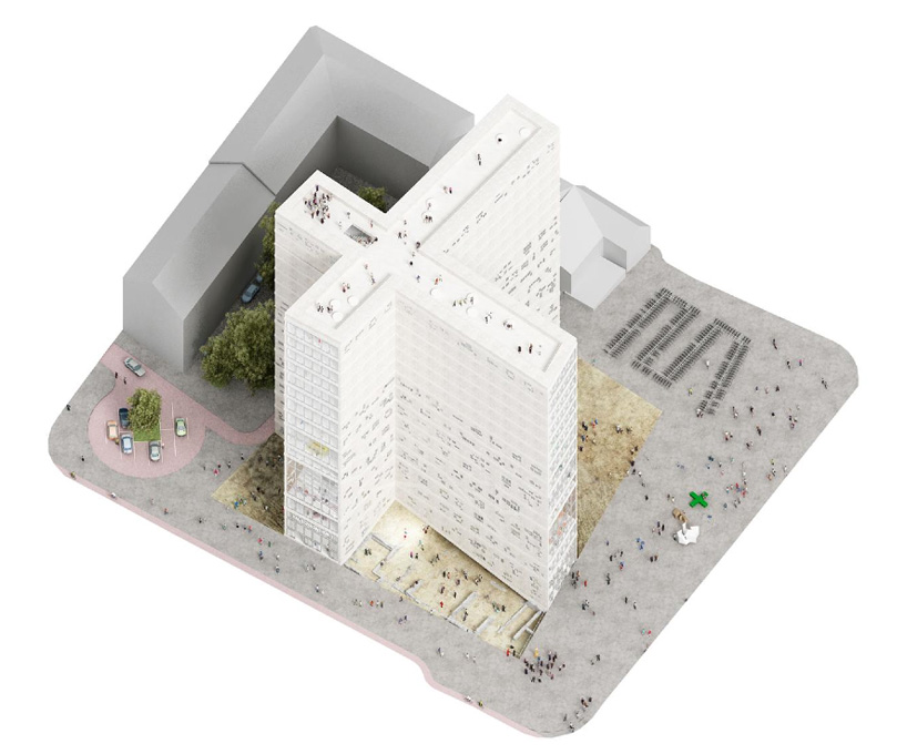
the building will be placed on top of the site of a former roman town, emona and is also conveniently located adjacent to the existing library designed by slovenian architect, plecnik. the structure's requirements called for a large program upon the tight plot, leading the firm to dismiss one to fulfill their innovative idea.

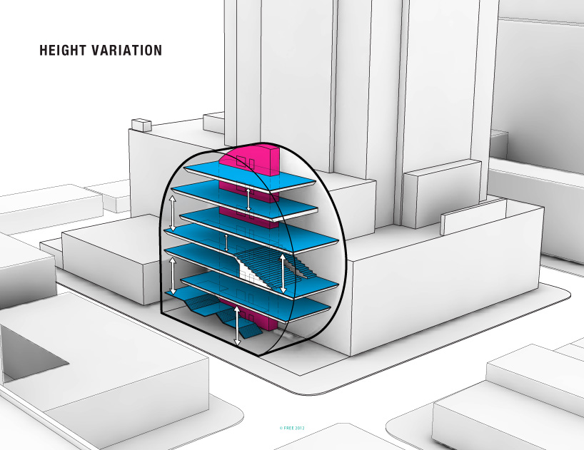
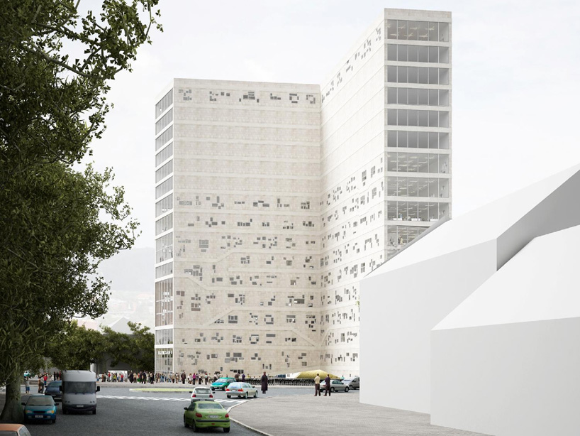
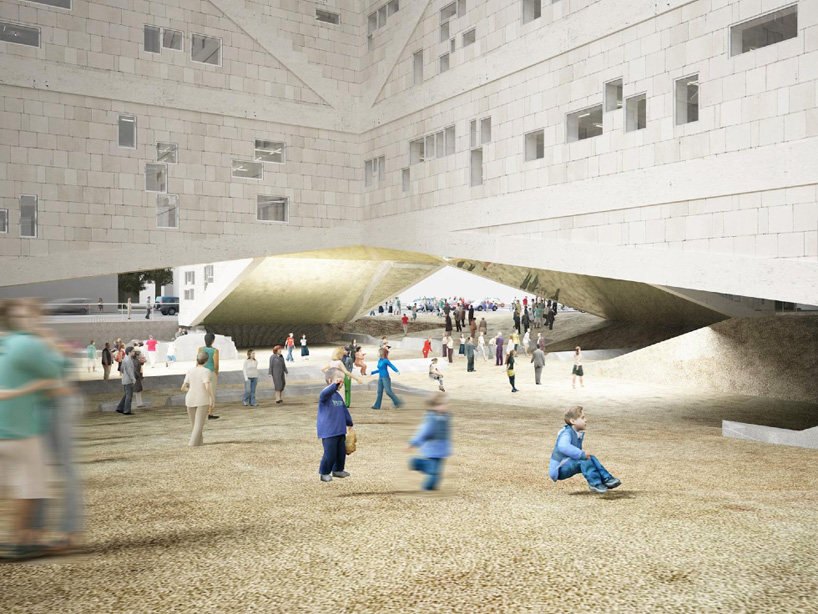
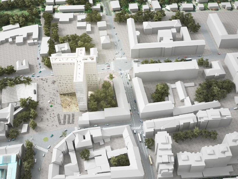
the design intentionally disregards the delineated maximum height, using a cross-form footprint to minimally impact the historical remnants and express by extrusion the former public space. the height is exceeded to accommodate the slender profile. the mass of the building fills a previous void, creating an urban inversion. excavation of the ground will reveal the ongoing network beneath the pavement, showing the relationship between the modern city layered upon the antiquated artifacts. the underside of the structure is arched, bridging over the opened earth, leaving the building to touch the site in four landings. a pedestrian path passes through the opening, framing views of the encompassing context.


view from the surrounding context

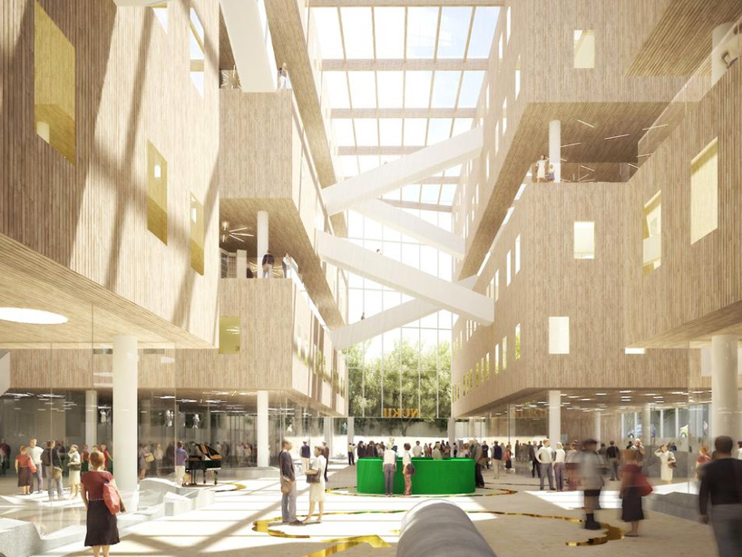
the common functions are positioned with direct access to the street. the public levels are connected with stairs which span 
the full width of the floor plate. the proportions of the steps double as seating to meet, relax and lounge. these elements are articulated 
within the facade, displaying the internal organization to onlookers. a multipurpose hall features a central space with
seating viewing the area from all four directions. the upper tier contains the enclosed storage levels while a cafe, restaurant,
exhibition spaces, conference rooms and terrace top the solid block to overlook the city.
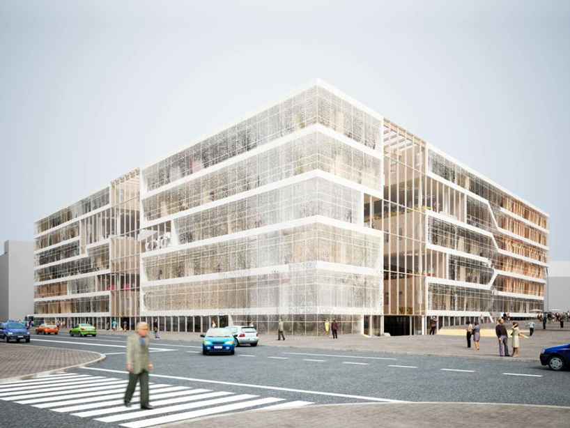
a second proposal has since been generated and included below which respects the vertical limits of the project.


aerial view of the pedestrian path leading into the excavation site


pedestrian path leading into the excavation site


building lifts up to minimize impact upon the roman ruins below


floor plates and stairs of the public floors are expressed within the facade


facade detail


main entrance to the library


view of the facade of the auditorium


view from the auditorium


auditorium


aerial view of the site and context


context plan


site plan


axonometric


floor plan / level 1


floor plan / level 2


floor plan / level 3


floor plan / level 9


floor plan / level 15


elevation


elevation


elevation


section


program diagram


model


second library proposal which complies with height limits


six levels of program


atrium atmosphere from original proposal is maintained


lobby and atrium


aerial view of lobby

project info:

project title: NUKII - national and university library II
location: ljubljana, slovenia
status: competition 2012
client: ministry of higher education, science and technology republika slovenija
architects: NL architects, pieter bannenberg, walter van dijk, kamiel klaasse
team: genyamamoto with arminas sadzevicius, milda naujalyte, and matthew davis, giulia pastore, adrien mans
with: yong cui, michal krejcik, michaela dlouha and zhongnan lao, yinglin cao