Search Engine

Saturday, 31 March 2012

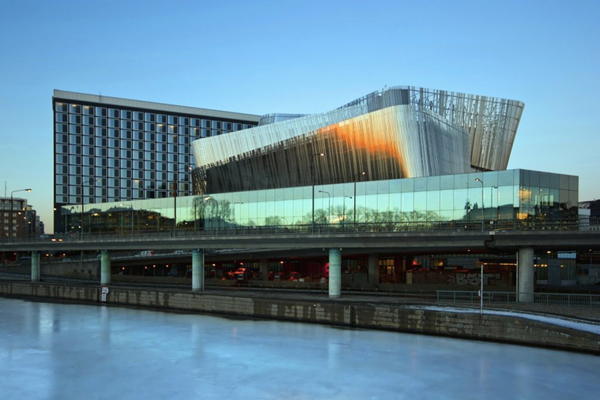
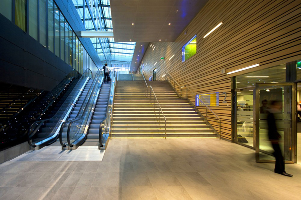
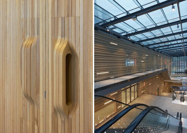
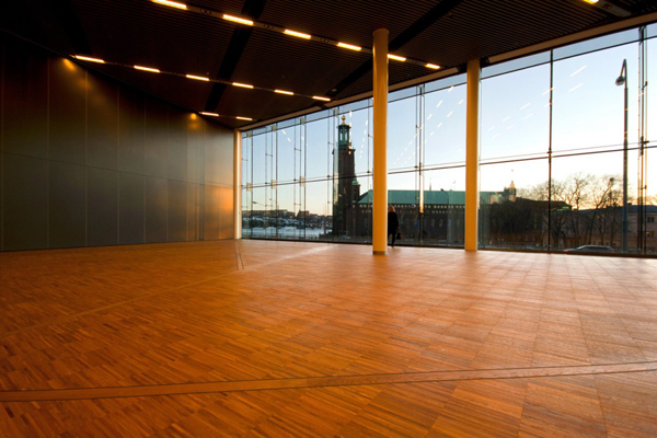
Stockholm Waterfront / White Arkitekter

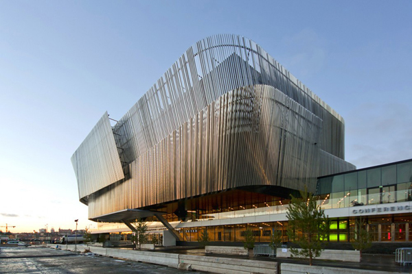
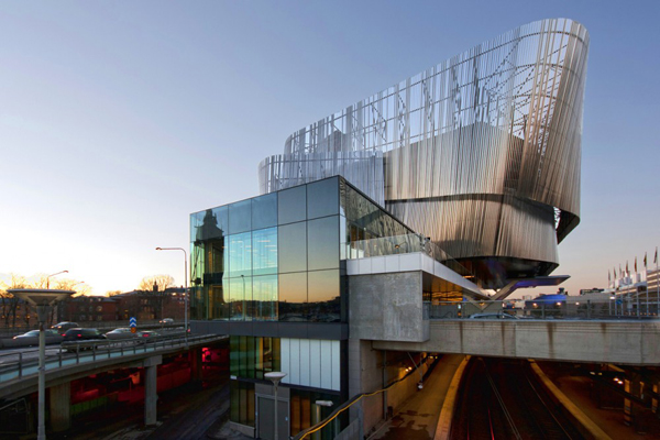
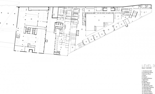
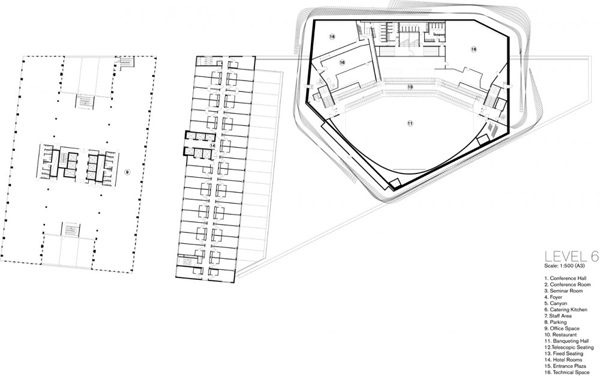
The Congress Center located in Stockholm was recently competed. Positioned near the Central Station and along the Riddarfjärden bay, the design had to accomplish a high level of integration and introduce new trajectories which would connect the building with the city center.
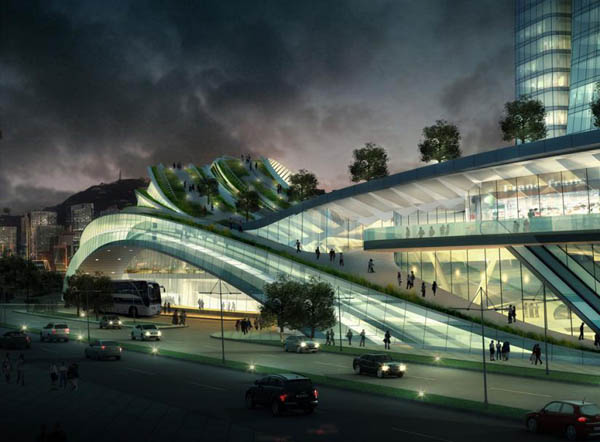
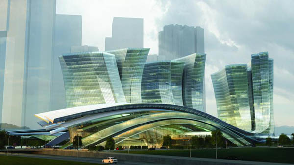
Consisting of three separate buildings, the Congress Center aims to respond to the adjacency of the water, as well as offer diverse public content. The lower congress and concert section are closest to the water, while the office building and a 400-room hotel are directly connected to the congress building. Moveable seating dual-use spaces and a large section of the congress hall suspended beyond the confines of the site were introduced in order to accommodate the requirement for a 3,000-seat congress hall and a 2,000-seat dining room.
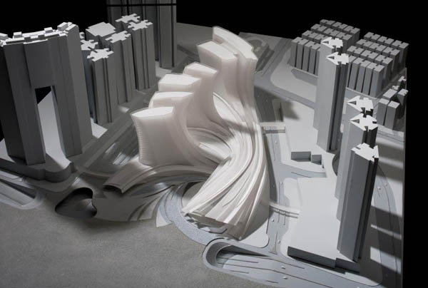
Ribbon-like sheets encircle and enclose the main unit, implementing a sense of movement with the static form. Suspended over the entrance, the organic form which houses a congress hall, becomes the primary focus of the entire facility. Wrapped in a reflective veil of stainless steel strips, the outer shell hovers away from the structure.


Express Rail Link West Kowloon Terminus / Aedas


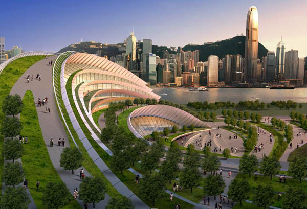
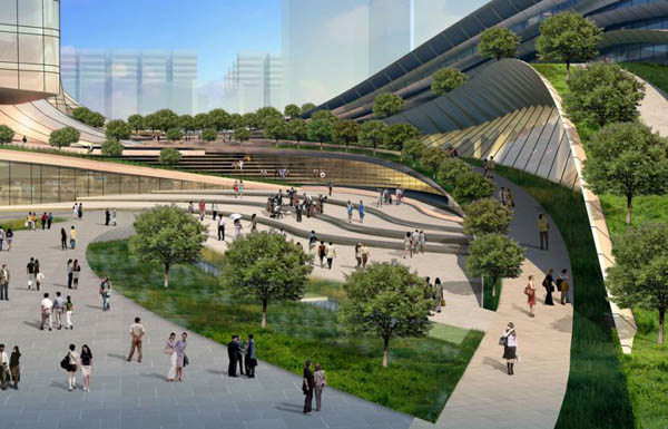
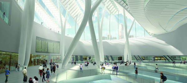
Designed by Andrew Bromberg of Aedas, the Terminus is a 430.000 square meter structure, equipped with 15 high speed rail tracks that connect Hong Kong to Beijing. The project won the Best Futura Mega Project in MIPIM Awards 2012. Construction will be completed in 2015.It will be the largest bellow groundterminus station in the world. Situated in Hong Kong, the building acts more like an international airport, as it includes custom and immigration controls for departing and arriving passengers.
“Being a gateway to Hong Kong, the Terminus was designed to be an architecture that connects with the surrounding urban context as much as it makes visitors aware of the city’s character whether arriving or departing. To achieve this, the design efficiently compacted all of the supporting space to allow for a large void down into the departure hall below, with added apertures going down to the track platforms. The outside ground plane bends down to the hall and the roof structure above gestures toward the harbor. The result is a 45 meter high volume which focuses all attention to the south façade with views of the Hong Kong Central skyline, Victoria Peak and beyond.”

Green Cast / Kengo Kuma

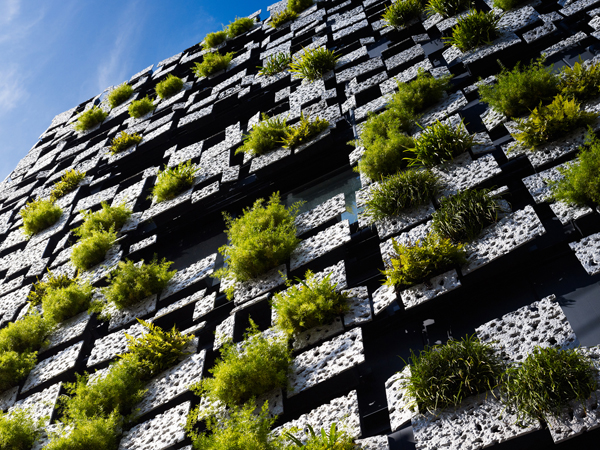
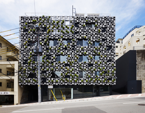
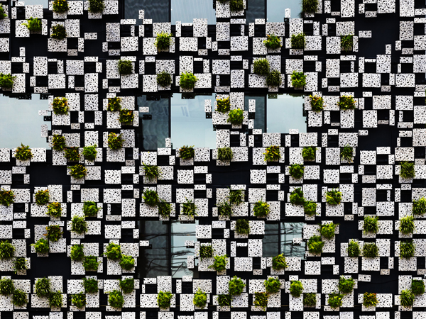
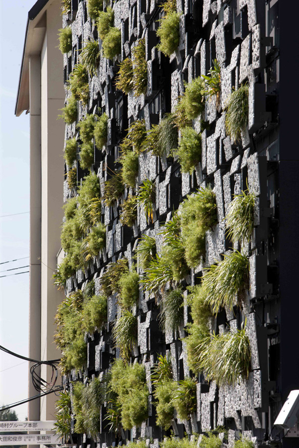
Here is another Kengo Kuma’s project that speaks of the continuous interest in reconnecting architecture with nature or, to quote the architect, the need “to recover the place”. Using architecture as a frame of nature, the project seems to echo a need for experiencing built space through its interaction with the elements and transformations affected by the passage of time. The faceted wall is populated with plants, creating an impression of two tectonic forces, the natural and the artificial, fighting for supremacy.
The multi-purpose building is located near the railway station in Odawara, Japan.The façade, achieved by using decayed styrene foam, encompasses the building, leaving the ground floor transparent and accessible. The first floor facilitates a clinic and pharmacy while the upper floors are used for offices. The planters are comprised of aluminium die-cast panels, made in monoblock casting. Each panel is slanted, and its surface appears to be organic, of which cast comes from decayed styrene foam. Equipment such as watering hose, air reservoir for ventilation and downpipes are installed behind the panels so that the façade can accommodate a comprehensive system for the building. The piping delivers rain water to the aluminum die-cast planters, keeping the whole structure organic and alive.

Tuesday, 27 March 2012

FOR THE FREEDOM OF SYRIA .....


School of the Arts / WOHA

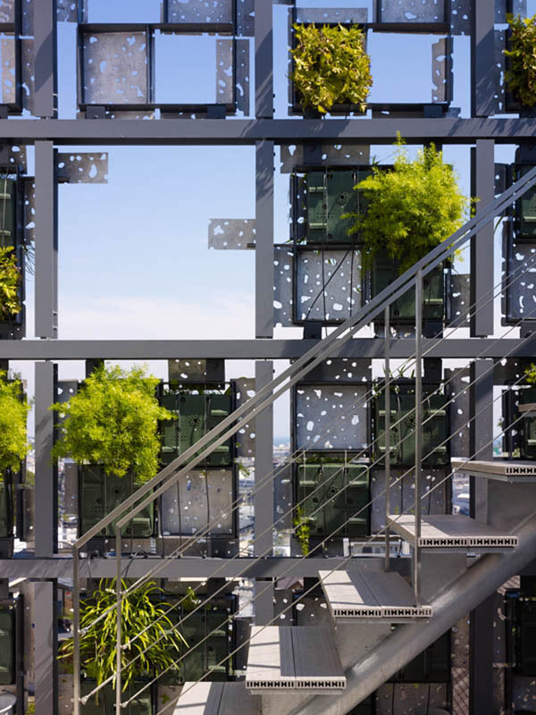
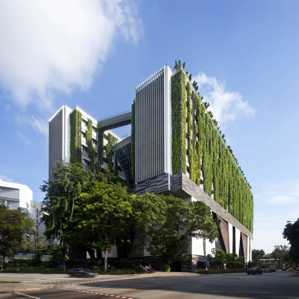
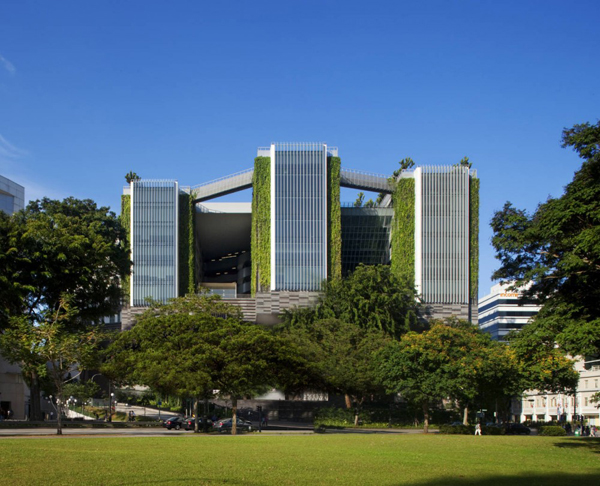
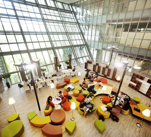
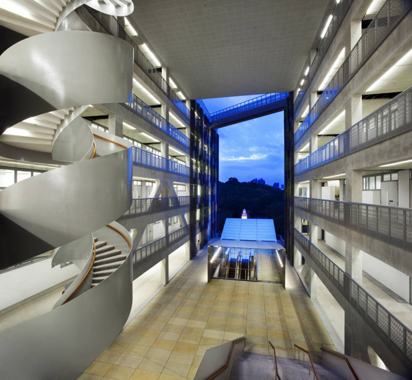
The School of the Arts in Singapore marries two distinct design tendencies: the existence of a safe and tranquil learning environment and the idea of stimulating communication with the public and wider arts community within the city. Two visually connected spaces encompass a public communication area, achieving a functional porosity that encourages interaction between different types of users. The two parts are called “the Backdrop” and “the Blank Canvas”.
The backdrop is the podium that contains a concert hall, drama theatre, black box theatre and several small informal performing spaces. It is envisioned as a heavy pedestal, a gargantuan mass of stone which has been carved out and chiseled to reveal volumes in various proportions. This exciting multi level space will be open to public as a tropical urban plaza, covered yet breezy.  Stairs and platforms create a diverse set of spaces where spontaneous and planned performances can occur.
The blank canvas, the secure upper stratum is where Making, Interpreting and Communicating happens between individuals and groups within the school. This level is controlled through a single point of access, yet is visually connected to the public areas below. The academic blocks are three long rectangular blocks with class rooms and studios. The rooms are designed in a module with adjustable end walls for flexibility. Other facilities such as gymnasium and resource library are suspended between these blocks. The pockets gardens are provided to link the blocks together and encourage interaction between students.

Devoid Tower for Chicago / Daniel Caven

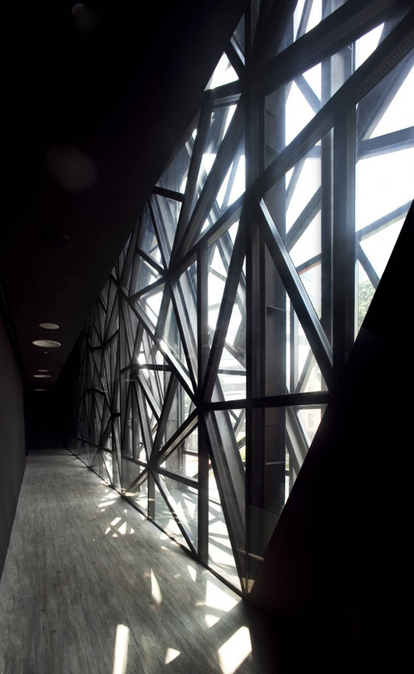
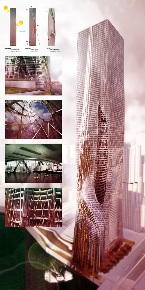
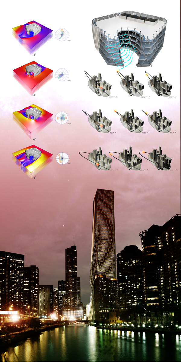
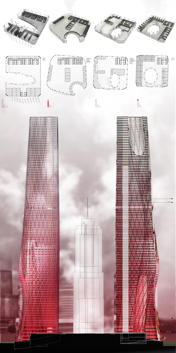
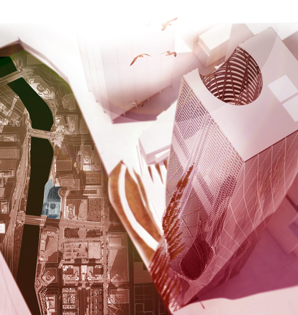
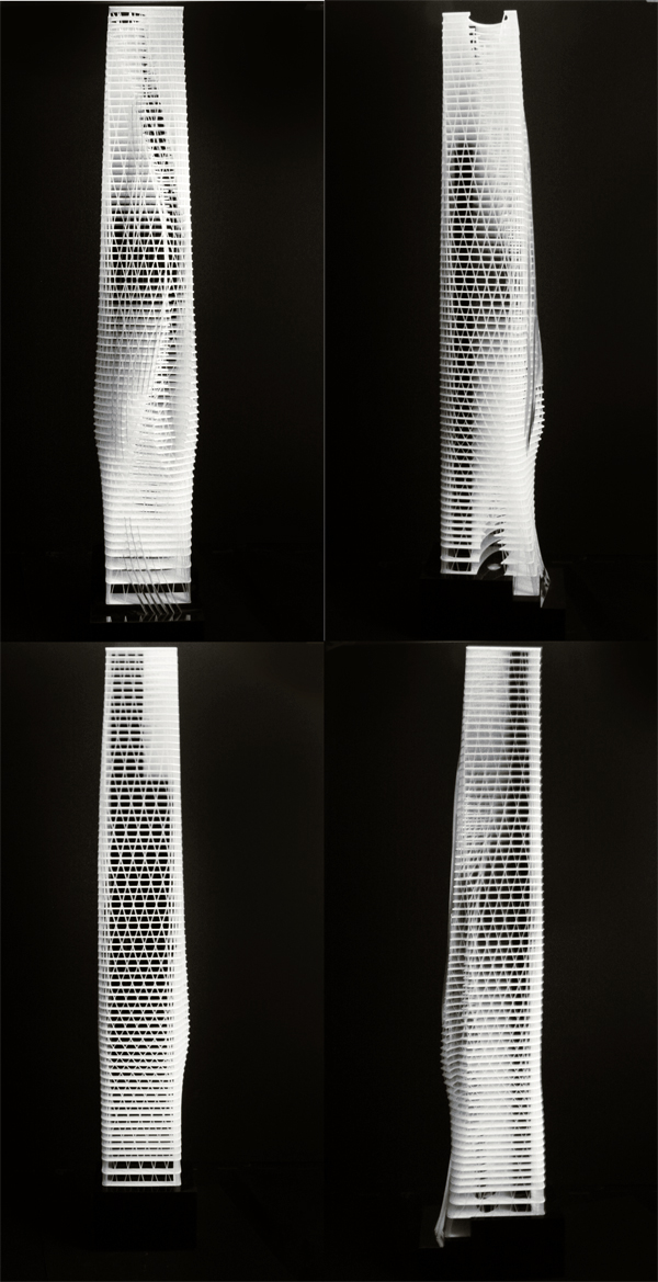
The Devoid Tower, design by Daniel Caven at the Illinois Institute of Technology, Chicago, explores thepassive systems that can be incorporated into high-rise design. The design is influenced by a set of design rules, and tested using parametric and environmental analysis.
The tower is composed of a central volume that is pierced by a void. The void’s placement and movement is designed around Chicago’s environmental conditions, i.e. wind speeds and sunlight. Energy and wind testing had shown that the void slows down wind speeds, giving the tower the option for natural ventilation through each of the floor-plates. Through the use of the void, the tower also allows for maximum sunlight onto floor plates as well as allowing for even more scenic views to the exterior.
Located in the River North area of Chicago, the tower is graced with a large of amount views (Loop, Lake Michigan, Chicago River), and pedestrian activity. The void extends to the entry way presenting a experiential view up through the tower and framing a view to the sky. On the interior users are greeted with an openness to the space and an open floor plate due to the dia-grid structure suspending the floor-plates. The tower’s form is derived and translated by the movement and form of the void.
The tower’s program includes: Retail space on the bottom three stories looking off towards the river/lake, as well as restaurant space incorporated into the walkway along the river. The larger portion of the tower is programmed for office space. The office floor-plates are arranged for an open plan and operable spaces. The top portion is a five star hotel with a sky lobby disconnecting the office space and hotel, as well as an observation deck near the top of the tower.

Elevated Market and Culinary School in Paris

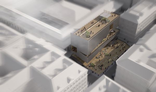
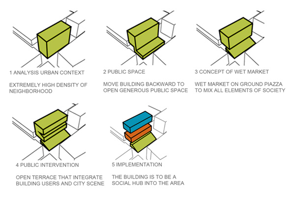
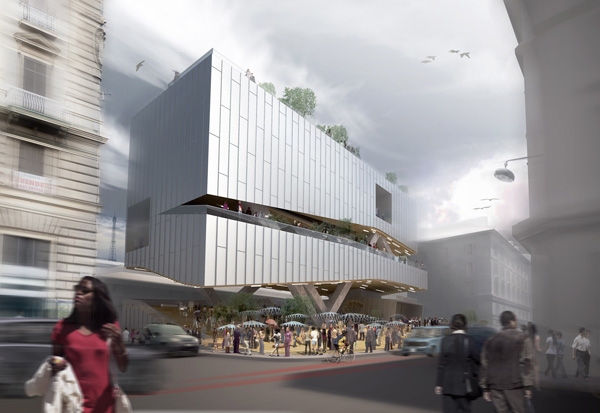
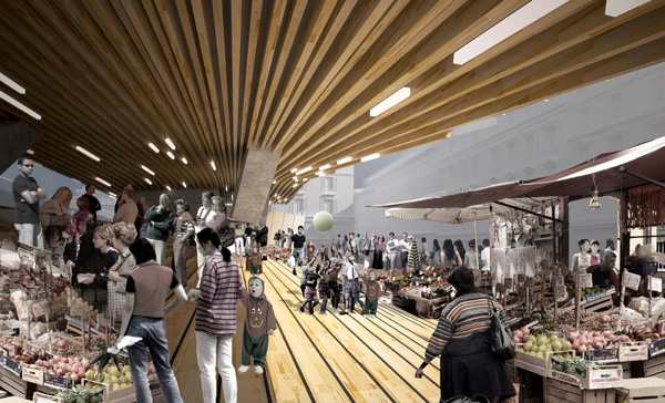
Located in the heart of fashion and branded boutiques of Paris, the approach of this project designed byAyrat Khusnutdinov and Gemawang Swaribathoro “you buy we cook ~ enjoy!” provides a unique chance to create not just another restaurant but a vibrant social hub fused with a possibility to transform a regular visit to an adventure. At the day-time, the wet market on the ground piazza gives a freedom for the customers to purchase raw food ingredients which they can offer to the students of the school as an assignment in order to try knowledge and improvise their skills by cooking with a random menu.
The ground piazza is also allowed the neighborhood to interact and gather. This idea can be of a mutual system not only for the users/ customers of the building itself, but for all elements around the neighborhood area in particular and Paris in general.

Mixed-use Bridge for Amsterdam / Laurent Saint-Val

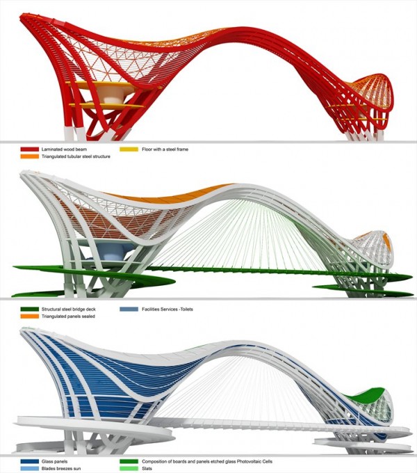
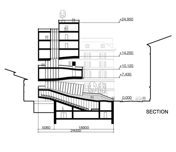
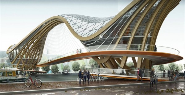
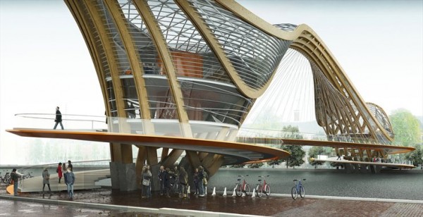
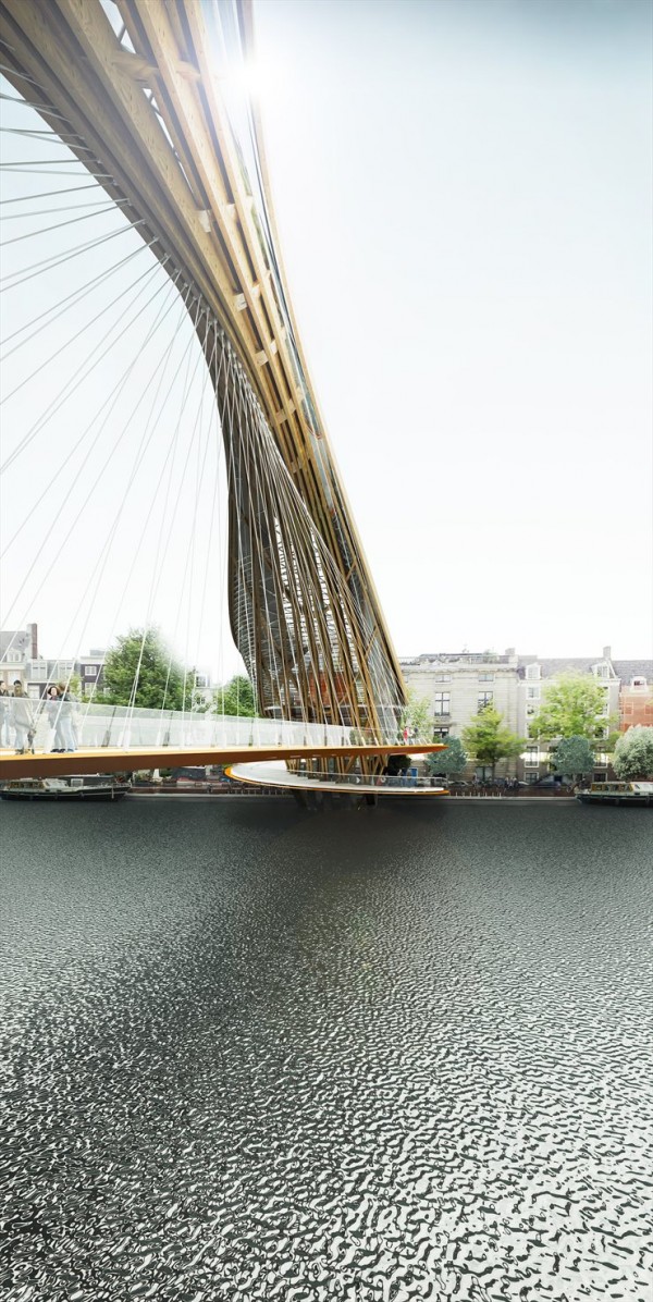
Architect Laurent Saint-Val proposes a new inhabitable bridge for Amsterdam.  Fascinating mix of architecture with its 17th century’s canals registered at UNESCO World Heritage, AMSTERDAM, capital of Netherlands is the largest city of the country with a population of nearly 740 000 inhabitants (1.5 million with the periphery) and the most visited one with more than 3.5 million foreign visitors each year. It’s in the 12th century that the Dutch first settled in this marshy and inhospitable region that would become Amsterdam. 500 years later, during the 17th century, Amsterdam became the center of the world’s economy. Today, the Batavian capital is known worldwide for its openness to the rest of the planet, its tolerance and its bustling cultural life. Adventurer’s city, fishermen’s town, city of excess and extremes ; from a huge mansion to the narrowest house, modern architecture is developing between the historic building’s facades, giving a particular outcome and amazement for tourists. Due to the small size of the city, all interesting sites are within in a small area, making the visit even more agreeable. This is probably one of the reason why Amsterdam is so popular amongst poetry and architecture lovers. Wherever you walk in Amsterdam, you will notice that all constructions are made of brick. Never the less, it has not always been so, the houses were originally made of wood. Following the devastating fires of 1421 and 1452, it was forbidden to build with wood. In 1669, wooden construction was completely banned and only two examples are left standing. Undoubtedly, a knowledge and an architecural wealth slumber in the heart of the true Amsterdammers, ready to wake and be materialized in modern projects. It is with a strong motivation and a desire to pay homage to wood that I made the choice to use this modern material, ecological but also traditional and universal throughout centuries ; a material occupying a leading position with its qualities of sustainability, flexibility, adaptation to other materials, efficiency and finaly its esthetics. Wood, a traditional and universal material throughout centuries, has found the past few years a leading place, thanks to ecology. Therefore, every project today and particularly in Amsterdam cannot ignore the use of wood for new structures or ornament. Interior and exterior designs of this bridge are intended descriptive, while highlighting the natural material. Associated with steel and aluminium it gains enormous advantages, since these metals generate extremely light structures, representing a vital aspect regarding the soil’s quality.
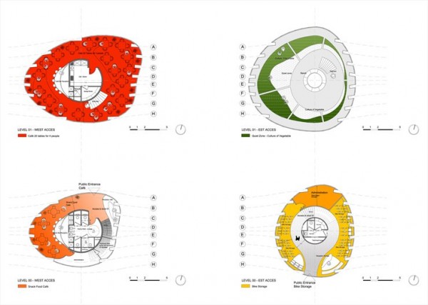
Remarkable building material, steel can withstand heavy loads and can cover larger litters with smaller sections. For a simple mounting of bolts, rivets or welding corresponds a consequent simple removal system that facilitates additions, transformations, amputations, adaptations or even partial moves of a structure. As for glass, it allows me to play with shapes with elegance and give way to my creativity. In addition, we have access to multiple choices of glass : toughened, laminated, anti-burglary, insulation and many more… Large windows let in light and allow to have beautiful views of the outside ; not feeling trapped, able to blend with old or new constructions. Enjoy light and make the best use of it while meeting safety requirements. The easy access for all of this gateway open on each bank should revitalize this neighborhood and create an attractive link for this museum, slowly linking visitors towards this place of “culture” while also being a place of exchanges between populations, of casual conversations, of relaxation, of escapes and walks for every age. Closer to the museum, on the first floor is the bike shop and on top a garden. The garden accompanies man in all civilizations and does not start its history in a house. Space giving free rein to imagination, space for reflection and meditation, a sort of passive confrontation between mortals and continuous rebirth of nature. The philosopher Foucault saw in the garden a “space of located utopia”. Today, especially in this town, we talk more and more about bicycle as a gentle mean of transportation and an alternative to automobile for commuting. Bicycle escapes the ravages of time and despite the development of locomotion techniques, it retains its appeal if not its magic. This characteristic primarily applies itself in urban areas. In traffic that invades large cities, the major problem is pollution. Bikes don’t pollute and create a subtle relationship between man and his environment. Hence the value of this bike shop open to anyone who wants to introduce to his house the necessary practice to maintain a physiological balance for a city life more and more hectic. On the other bank a cozy cafe and its restaurant at the top level should in my opinion attract customers wishing of meetings and make these moments exceptional. To me, it seemed that a strong idea is a form of enchantment through the building and to what it can bring inside or from the outside. This gateway strong of its own identity, its European and contemporary character would be a welcoming site for all, a place of openness for today and tomorrow’s world with men and women that travel more and more, that became experts and can compare, that want excellence and should be seduce all the time.
Monday, 26 March 2012

ludwieg mies van der rohe (1886-1969)


was born in aachen, germany, on march 27, 1886.
after having trained with his father, a master stonemason.
at 19 he moved to berlin, where he worked for bruno paul,
the art nouveau architect and furniture designer.
at 20 he received his first independent commission,
to plan a house for a philosopher (alois riehl).
in 1908 he began working for the architect
peter behrens. he studied the architecture of the
prussian karl friedrich schinkel and frank lloyd wright.
he opened his own office in berlin in 1912,
and married in 1913.
---
after world war I, he began studying the skyscraper
and designed two innovative steel-framed towers
encased in glass. one of them was the friedrichstrasse
skyscraper, designed in 1921 for a competition.
it was never built, although it drew critical praise and
foreshadowed his skyscraper designs of the late 40s and 50s.
---
in 1921, when his marriage ended, he changed
his name, adding the dutch 'van der' and his mother’s
maiden name, 'rohe': ludwig mies became ludwig mies
van der rohe.
---
in the 20’s he was active in a number of the berlin
avant-garde circles ( the magazine 'G' and organizations such
as the 'novembergruppe', 'zehner ring', and 'arbeitsrat für kunst')
that supported modern art and architecture along with artists
like hans richter, el lissitzky, and theo van doesburg,
among others. major contributions to the architectural
philosophies of the late 1920s and 1930s he made as
artistic director of the werkbund-sponsored weissenhof
project, a model housing colony in stuttgart.
the modern apartments and houses were designed by
leading european architects, including a block by mies.

---
in 1927 he designed one of his most famous buildings,
/ the german pavilion at the international exposition in barcelona
in 1929. this small hall, known as the barcelona
pavilion (for which he also designed the famous chrome
and leather 'barcelona chair'), had a flat roof supported by
columns. the pavilion’s internal walls, made of glass and marble,
could be moved around as they did not support the structure.
the concept of fluid space with a seamless flow between
indoors and outdoors was further explored in other projects
he designed for decades to come.
mies began working with lilly reich, who remained his
collaborator and companion for more than ten years.

---
in 1930, mies met new york architect philip johnson,
who included several of his projects in
MoMA’s first architecture exhibition held in 1932, 'modern
architecture: international exhibition', thanks to which
mies’s work began to be known in the united states.
---
in the30s, none of his designs were built due to the
sweeping economic and political changes overtaking
germany. he was director of the bauhaus school from
1930 until its disbandment in 1933, shut down under
pressure from the new nazi government.
he moved to the united states in 1937.
from 1938 to 1958 he was head of the architecture
department at the armour institute of technology in
chicago, later renamed the illinois institute of technology.
in the 40s, was asked to design a new campus for the
school, a project in which he continued to refine his
steel-and-glass style. he had also formed a new relationship
with chicago artist lora marx that would last for the rest of his
life.
---
by 1944, he had become an american citizen and was
well established professionally.
in this period he designed one of his most famous
buildings, a small weekend retreat outside chicago,
a transparent box framed by eight exterior steel
columns. / the ‘farnsworth house’ is one of the most
radically minimalist houses ever designed.
its interior, a single room, is subdivided by partitions
and completely enclosed in glass.
---
in the 50s he continued to develop this concept of open,
flexible space on a much larger scale:
in 1953, he developed the convention hall, innovative was
the structural system that spanned large distances.
during this period he also realized his dream of building a
glass skyscraper.
/ the ' twin towers' in chicago were completed in 1951, followed
by other high-rises in chicago, new york, detroit, toronto...
culminating in 1954 with / the 'seagram' building in new york,
hailed as a masterpiece of skyscraper design.
---
for his career he achieved in 1959 the
'orden pour le merite' (germany) and in 1963 the
'presidential medal of freedom' (USA).
---
in 1962, his career came full-circle when he was invited to
design the 'new national gallery' in berlin.
his design for this building achieved his long-held vision of
an exposed steel structure that directly connected interior
space to the landscape.
he returned to berlin several times while the gallery was under
construction, but was unable to attend the opening in 1968.
he died in chicago on august 17, 1969.


mies van der rohe in his apartment on
east pearson street, chicago, 1964
© werner blaser
courtesy whitney museum of american art


mies over model of crown hall
cortesy the illinois institute of technology


mies van der rohe sketching, 1960s
© hedrich-blessing
courtesy chicago historical society


mies 1955
courtesy the illinois institute of technology
see mies van der rohe

exhibitions

the barcelona pavilion

the farnsworth house

the twin towers

the seagram building
..........................................................................................................................................................................................................

for more info on the work of mies van der rohe:
---
http://www.tu-harburg.de/b/kuehn/lmvdr.html
http://www.werkbundarchiv-berlin.de
http://www.germangalleries.com/MiesVanDerRoheHaus
the illinois institute of technology (IIT) http://www.iit.edu
IIT's college of architecture http://www.iit.edu/colleges/arch/
www.elmhurstartmuseum.org
new york skyscrapers http://www.greatgridlock.net/NYC
http://www.GreatBuildings.com
http://www.vitruvio.ch/arc/biography/biomies.htm
http://www.archINFORM.net/start.htm
---