Search Engine

Saturday 3 September 2011

Aggregated Porosity Workshop explores dynamically changing densities

By: Lidija Grozdanic | August - 29 - 2011

Held in Changsha, China, and supported by Hunan University’s School of Architecture, the ‘Digital Architecture Laboratory’ (DAL) is designed as an intensive workshop, led by invited design and architecture professionals to expose students to the integration of computationally-driven fabrication techniques. The program was organized around the concept of ‘aggregated porosity’, an exploration of dynamically changing density and the lines of intersection between skeletons and solids.
The invited tutors for ‘Aggregated porosity’ are Suryansh Chandra of Zaha Hadid Architects and Shuojiong Zhang of UN Studio, who were asked to propose a design scheme aligned with the workshop’s theme and that could provide shade and fit in a volume of 3 x 3 x 6 meters. Students in the program shared the same brief, and created their own design prototypes at 1:1 scale in addition to assisting in constructing ‘DAL canopy’.
The canopy’s foundation is a 40x40mm L-section steel frame anchored to a wall, to which a grid of laser-cut plywood pieces are secured. steel cable mesh is attached to this grid, and custom joints are used to affix the individual wooden hexagonal panels (also laser-cut) to the mesh, where they can be adjusted by hand and gravity into their desired position.
The design of the canopy itself involved manipulation and refinement in modeling programs. Using an orthogonal grid, the basic L-shape of a structure that could provide shade was curved to build in a bench for seating and then modified to offer an organic-like form. This original surface grid is then used to generate a hexagonal array of panels, each diverse in form as determined by the computer model, and each constrained at three of their points but open at three others, permitting the creation of opening and curves. The largest panels are inset with triangular holes to preserve the continuity of the wooden mesh.


Taipei Museum of Contemporary Art / OTA+

By: admin | August - 30 - 2011

This building proposal for the Taipei Museum of Contemporary Art by OTA+ challenges the traditional definition of a museum and the conventional relationship between building and site. The ground floor of the building is reduced to a nominal footprint, enclosing only enough space for basic services, structure and ticketing functions. The ground plane is primarily reserved for exterior public space, including an art park, Hall of Fame, and garden walk. The bulk of the program and building mass are split by the open ground floor. Half of the building is coupled with the earth while the other half hovers in the air. The purpose is two-fold; to minimize the damaging effects of extreme local weather by harnessing environmental flows toward productive outcomes and to re-conceptualize the identity of a modern art museum. The manicured roof plane of the below ground program is pocketed with water absorbing vegetation and catchment systems, while the hovering museum above expands to form open atriums, allowing diffuse light to brighten the space and passive airflow to comfortably condition the building.
The program of the museum is interconnected. The Contemporary Museum of Art, Children’s Museum of Art and Administration are located within the floating mass. The lecture hall, parking, art resource center, library and classrooms are located below ground. The programs below ground are easily accessible and directly connected through vertical circulation tubes, providing both structural support for the floating mass above and space for movement systems, such as escalators, stairs and elevators between levels. All of the below ground programs are flooded with diffuse light passing through skylights that penetrate the landscape.
The Contemporary Museum of Art and Children’s Museum of Art are protected from harsh direct sunlight. Though the legs of the floating expanded mass open to large glazed windows, framing views of the surrounding context, the glazing is recessed and deep overhangs protect the art. Additionally, a series of large fin diffusers scatter light and wash the walls evenly. The diffusers are also equipped with sensor-driven controls that circulate fresh air throughout the space.
The positioning of the museum on the site allows for easy access regardless of how one arrives. All paths lead to the center of the site and to a lobby for each museum. The existing road is kept and further augmented to provide access to subterranean parking and the tour bus drop-off. The design of the landscape spreads across the road and bike paths, becoming a flat, patterned inlay. The visual presence of vehicular traffic fades while the meandering pedestrian pathways dominate the ground plane.
The design of the landscape includes a field of elevated berms, meandering paths, and bench seating, all of which wrap around pockets of different land patches. Some patches are filled with natural vegetation that collect rainwater that is reused to irrigate the site. Other patches are filled with sand and gravel, covering a more substantial overflow and catchment system. Finally, where program lies below, large skylights provide diffuse light into the space. By freeing the ground plane of enclosed semi-public space, the interface between the museum and the site offers a new experience of a museum; one that is open, friendly, and welcoming.


New Gateway structure for Brunel University / Minimaforms

By: Lidija Grozdanic | August - 30 - 2011

London-based design studio Minimaforms (brothers Stephen and Theodore Spyropoulos) questions how architecture can facilitate new forms of communication.Through experimental architecture, they explore these questions in hopes to open up a dialogue about social and material interaction.
Through an invitation from world renowned performance artist Stelarc, Minimaforms was asked to develop a gateway structure for Brunel University. The Gateway proposal conceived a threshold space suspended above an existing reflection pool as an exterior room and sanctuary. This structure is an open-cell system that operates as a perceptual framing device.
Deployed through an open-cell network are a series of operable convex and concave lenses, amplifying and collapsing the experiential relationships between users and their context. Developed through a parametrically controlled cellular deployment system, these lenses are distributed with both optical and structural parameters at play. The underbellies of these lenses extend as part of a three-dimensional fibre-field in which structural fibres and optic hairs are set out. The access plane hovering over the water surface of the reflection pool is constructed as a series of walkable lily pads that enable users to experience a complete sensorial displacement as one moves through this architecture of interface.


Flat Tower

By: admin | March - 7 - 2011
Second Place
2011 Skyscraper Competition
Yoann Mescam, Paul-Eric Schirr-Bonnans, Xavier Schirr-Bonnans
France

The construction of skyscrapers has been an architectural solution for high-density urban areas for almost a century for its ability to combine height with a small footprint. Today there is a constant race between large metropolises and nations to build the tallest structure, but it has been proven that this typology is sometimes not desirable for medium-size cities where skyscrapers destroy the skyline and disrupt the infrastructure of a specific location.
The Flat Tower is a new high-density typology that deviates from the traditional skyscraper. It is based on a medium-height dome structure that covers a large area while preserving its beauty and previous function. The dome is perforated with cell-like skylights that provide direct sunlight to the agricultural fields and to the interior spaces. The dome’s large surface area is perfect to harvest solar energy and rainwater collection.
Community recreational facilities are located at ground level while the residential and office units are in the upper cells. An automated transportation system connects all the units, which are different shapes according to their program. It is also possible to combine clusters of cells to create larger areas for different activities.
Although this proposal could be adapted to any medium-size city around the world, it has been designed for the city of Rennes, France, in an old industrial area.

James Stirling: visionary architect, and a very naughty boy

Tate Britain reappraises James Stirling – who gave his name to Britain's premier architectural prize – and shows he could be good, and bad… but never dull
    stirling stuttgart
    Potent: Stirling's 1984 Staatsgalerie in Stuttgart, Germany. Photograph: Marco Weiss/Alamy
    Did the great British architect James Stirling kill architecture in Great Britain? The question has to be asked since, as well as being an original and internationally admired talent, who is sometimes said to be the Francis Bacon of British architecture, he also designed some of the most notoriously malfunctioning buildings of modern times. Worse, two of these buildings were in the ancient universities of Oxford and Cambridge, wherein opinion formers spent their formative years. If you want to annoy as much of the establishment as possible, there are few more effective ways than this.
    In particular he and his partner James Gowan designed the history faculty and library at Cambridge, completed in 1968. Here, as they struggled to study in this alternately freezing/boiling greenhouse, with dodgy acoustics, frequent leaks and falling cladding tiles, future columnists and editors incubated a deep loathing of the building, of Stirling, and by extension all forms of ambitious modern architecture. In the 1970s the young critic Gavin Stamp made his name with a remorseless hatchet job on the history faculty. In the 1980s it narrowly escaped demolition.
    In 1984 the pro-Stirling critic Reyner Banham wrote that "anyone will know who keeps up with the English highbrow weeklies (professional, intellectual or satirical), the only approvable attitude to James Stirling is one of sustained execration and open or veiled accusations of incompetence."
    history faculty university of cambridge 
    The ‘loathed’ Cambridge history faculty (1968) Photograph: Neil Grant/Alamy Behind most broadsheet tirades against modern architecture in the last 40 years stands the figure of James Stirling. And, when architects are now subjected to the most elaborate forms of control and project management, squeezing out invention in the interests of reducing risk, it is in order to avoid mishaps much like the Cambridge history faculty. Stirling was seen as the very type of the award-winning architect whose buildings don't work. He was, to boot, arrogant, lecherous and sometimes boorish. At a party in the apartment of the New York architect Paul Rudolph, he chose to express himself by urinating against its huge window, from the terrace outside, facing into the crowd of guests.
    Yet he continues to hold an honoured place. The Stirling prize, inaugurated shortly after his death in 1992, is named after him. Now, as the wheel of fashion grinds inevitably round, his work is up for reappraisal. Next month Tate Britain will honour him with an exhibition based on the impressive archive of his work owned by the Canadian Centre for Architecture. These drawings will reveal him as a more subtle, complex and even charming character. They are skilful, sometimes refined, sometimes informal. Some drawings, composed as presentation pieces after a design was complete, have an abstract elegance. At other times he would cover sheets of writing paper, diary pages and the backs of plane tickets and telegrams with thickets of sketches, as he worked ideas over and over. They might be plans, diagrams or three-dimensional views. They have energy, with much-repeated lines or brisk hatching or Klee-like arrows scurrying through them.
    They are signs of thinking with his hands, of trying things out, of exploring and excavating. These are not the disdainful doodles that some architects dash off, hoping that it will be taken as a sign of genius that they can be done so thoughtlessly. They show complete faith that the design of buildings is a serious business, to be pursued with time, testing, consideration and debate. He might try several versions of an elevation, with differences that would not be obvious to a casual observer.
    Stirling’s student drawing  
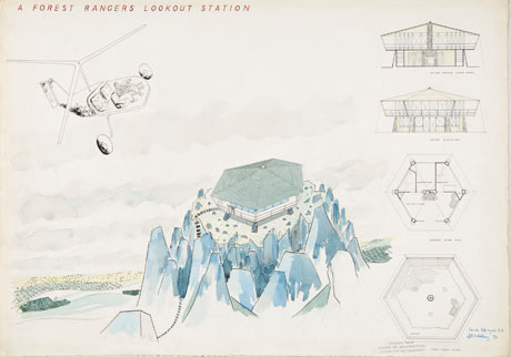
    Stirling’s student drawing, Forest Ranger’s Lookout Station, 1949. Photograph: James Stirling/Michael Wilford fonds/CCA They also show faith that architecture is something like music or painting or literature, that it is something to be composed, with tensions and harmonies to be resolved within its overall structure. Stirling kept considering his art in relation to that of others, both 20th-century figures like Le Corbusier and the Russian constructivists, and architects of the Italian renaissance, or the grand industrial architecture of Liverpool, where he grew up. His designs and drawings set up multiple dialogues with other works. And, like artists and writers, he wanted to be provocative. He wanted to wake people up.
    These tensions and elaborations, these interplays of forces and allusions, should make it hard to dismiss his work as mere leaky showmanship. His Florey building for Queen's College Oxford is a sort of inhabited viaduct turned into theatrical U-shaped court, a distant derivation of the Oxford quad, facing the river Cherwell. It is Oxonian and constructivist at once. It is perverse but you would have to be a dullard not to see its drama. Students there now comment on its faults but also on the atmosphere generated by this extraordinary hemi-cauldron.
    His later work is more likeable and less leaky, as Stirling became slightly less reckless, and as he started building in Germany, where the building industry seemed better equipped to realise his ambitious ideas. His 1984 Staatsgalerie in Stuttgart, for example, was one of the biggest tourist attractions in the country, on account of the force of the building. In this it was a prototype of the Guggenheim in Bilbao.
    At its centre is a great circular stone court, like an inside-out mausoleum or a new-built ruin, with vines falling down its walls. A system of ramps takes you through the building, as if you were climbing a hillside and, at the moments when it might become too monumental, bright curves of steel and glass lighten the mood. It is romantic, potent and playful at once, and perfectly captures the balance between monumentality and motion, between eternity and perambulation, which is the essence of museums.
    The Staatsgalerie wouldn't work without the pushing and pulling of ideas you can see in the drawings. It is worked and wrought in a way few buildings are nowadays. Architects still work hard, and test different ideas, but they search more for a magic formula in the cladding or the form which will make the whole building smoothly beautiful and consistent. There is less sense that a building is composed like a painting, and that the architect should leave some of his sweat and brushmarks on the canvas. Stirling's drawings bring on a nostalgia for a way of designing – among other things, without a computer in sight – that has gone the way of dodos and drafting boards.
    Does his art justify the malfunctions? There is, to be sure, more than one side to the argument: Stirling's defenders always said that his projects were victims of poor construction, cost-cutting and clumsy clients. It can also be said that time casts a rosy glow over the faults of more distant architects. The shoddiness of Nash, the impracticality of Vanbrugh and the budget-busting of many great architects in history are now almost forgotten and forgiven. The same will probably happen to Stirling.
    Stirling was a very naughty boy. The pleasures of his successes came at an exorbitant cost, not only in technical failures but also artistic ideas that didn't quite come off. The number of his works that are unequivocally admirable are few. Architects are mostly more careful and responsible now, which is mostly a good thing. But, at his best, Stirling showed what powerful and moving things buildings can be, and the world would have been poorer without him.

A Meditation on the Beauty of Zaha Hadid's Door Handle


Hadid's design issues a challenge: define beauty by lyrically playing with illusion.

By Norman Weinstein
October 28, 2010


“Beauty is the most difficult of all things.” – Aubrey Beardsley to W.B. Yeats

Beauty must be the most difficult of all things to analyze architecturally. And that might explain the term’s long banishment from the halls of architecture schools. “I was heckled at Harvard by a critic for saying that it was beauty that I’m always going for,” Victoria Meyers, a founding partner of New York City-based hanrahanMeyers architects, recently wrote to me. And on the other hand, neo-conservatives aesthetes like Roger Scruton and John Silber want to own their cozy corner of beauty with impunity, rigid as a steel beam in “knowing” absolutely what they mean by beauty in design, neo-Palladianism with clotted cream, so who’s to doubt?

Adding to the carnivalesque verbiage about architectural beauty, I stumbled across this description of a door handle (for Valli & Valli) by Zaha Hadid that warrants attention:

CONCEPT:
“A door handle that captures the seamless beauty which is synonymous with the work of Zaha Hadid. It was designed expressly for the communal spaces and the rooms of the floor she created for the Puerta America Hotel in Madrid, characterized by a dynamic and strongly customized architecture.

“The coldness of the material fuses effortlessly with the sensual fluidity of the design. The spatial formation defies a beginning and an end. Pure lines merge organically into a harmonious link creating a spatial journey of beauty and intricacy. On the occasion of the forthcoming marketing launch of this series, the rose has been specially designed as an irregular form characterized by symmetrical lines that unequivocally recall the grip’s pattern.”

The marketing hype language is too easy a target to critique. So let’s delve under the heated hyped copy and consider the implicit description of beauty in design by Hadid’s spokesperson(s), assuming it has her blessing, or might possess the tang of her talking directly:

The handle is seamless, as most handles thankfully have been for millennia, so functionality is assured. The explicit reference to “beauty” occurs in “Pure lines merge organically into a harmonious link creating a spatial journey of beauty and intricacy.” Although much of the copy avoids elucidation – the handle is beautiful because ultimately it is described in terms saying so – there’s food for thought in “spatial journey” as an attractively evolving definition of design beauty. Spatial journey harks back to Le Corbusier who emphasized the beauty of a building surfacing only as an observer walked past it, a kinetic aesthetic experience bypassed by virtual “walk-throughs” since we’re sitting stock still in front of a computer monitor supposedly experiencing a walk-through in the age of high-tech BIM-bling.

Now if Hadid’s handle is a spatial journey, hence beautiful, then it follows that the door handle is a microcosm of the equally beautiful Puerta American Hotel. In fact, to get a handle on this, the door handle, literally and symbolically, begins the journey toward architectural beauty, as Z’s zig-zag.

Rather than beauty being a thing, a quality an architectural design encodes, embodies, materializes with finality, then architectural beauty is perpetually a journey toward what multi-dimensional, multi-sensory pleasures emerge during the architecture’s lifespan. So any attempt to discuss architectural beauty might need to treat it as a time-released energy flow. If John Silber wants to deal with his “architecture of absurdity,” he should examine his fixed images of immortal architecture floating in some Platonic realm far from Boston. Absurdity indeed. Real architecture ages without the miracle of Botox. It even becomes dated, even for Stalinist preservationists in rare instances, its beauty finally faded beyond redemption.

But back to the description of Hadid’s handle: note the reference to thermal delight: “The coldness of the material fuses effortlessly with the sensual fluidity of the design.” Can design beauty ever materialize effortlessly? My guess is that’s her marketer’s rhetoric. But the implication of a dialectical play between warmth and iciness in her vision could be Hadid talking. So might the Zen-koan-ness of “The spatial formation defies a beginning and an end.” Of course it doesn’t literally. It’s a bloody door handle for a hotel conference room, not a handle bigger than the earth. But I love the futuristic ambitiousness and lyrical play with illusion, the poetics of beauty, that would make any door handle the stuff of an Oz-world defying conventional beginning or end.

Here’s a challenge for students currently working in the studio. Spend a day or week meditating on Hadid’s handle. Design your own home that would seamlessly integrate her handle. Make it as beautiful as the handle. Make a model of your domicile with Hadid handles. Defend your design at a crit beginning with “Beauty is the most difficult of all things.” Just don’t blame me if you find yourself in the future driving a cab for a living instead of designing for the stars. Defending beautiful architecture in front of certain academic personalities can’t be any less difficult than creating it.

Norman Weinstein writes about architecture and design for Architectural Record, and is the author of “Words That Build” – an exclusive 21-part series published by ArchNewsNow.com – that focuses on the overlooked foundations of architecture: oral and written communication. He consults with architects and engineers interested in communicating more profitably; his webinars are available from ExecSense. He can be reached at nweinstein@q.com.