Search Engine

Saturday, 3 December 2011

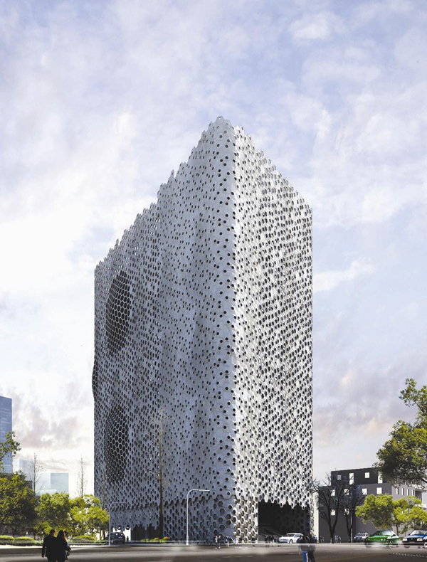
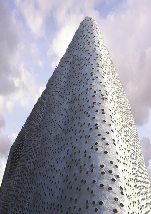
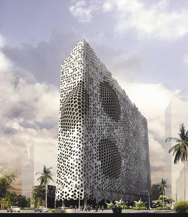
Parametric Designed Transformative Facade for Mumbai School / Sanjay Puri


The building is located in a densely populated residential part of Mumbai, with hight desity ranging from 7 to 15 stories. This height regulation governs the development of the entire neighborhood, including the school site. In order to create privacy in the school spaces and make the building more efficient, designers at Sanjay Puri Architects introduced a second skin of hexagonal modulesencompassing the entire building. The modules have small openings on the southern side to reduce heat gain into the building while providing cross ventilation since the sun during most of the year is on the southern side in this location while southwest breeze blows throughout the year. Towards the northern side, with indirect sunlight, the hexagons are like truncated pipes moving in and out and creating additional usable spaces for sitting, playing or reading as extensions to the open spaces on each floor.
Due to several design constrains, the project had to use up the entire available height of 45 m, leaving only marginal open spaces on all sides. Lack of free ground level space influenced the programmatic distribution; the school is planned with a sheltered open space below the footprint of the building, a large auditorium space in the basement and sporting facilities planned in the topmost level and the terrace. At each floor, classrooms occupy the periphery with a central circulation spine that is punctuated connecting a few levels vertically while opening out on the northern side.
The modular façade design transforms the school in a self-contained environment, sheltered from the densely populated neighborhood.

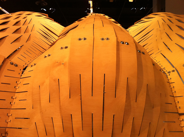
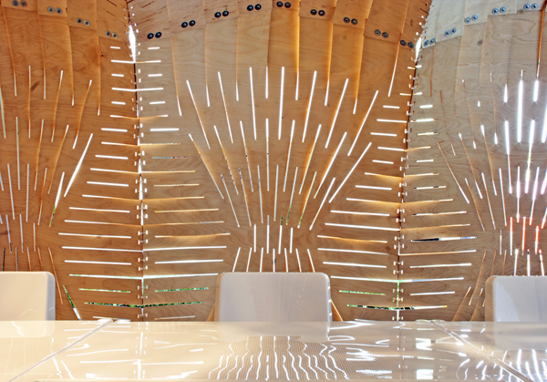
Expandable Surface Pavilion


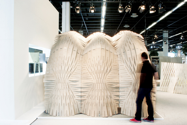
The project was created for the recent SPOGA furniture design exhibition in Cologne, Germany and is part of an ongoing research into Expandable Surface Systems, which began in collaboration with theEmergent Technologies and Design Programme at the Architectural Association. The project was designed, fabricated and mounted by the designers.
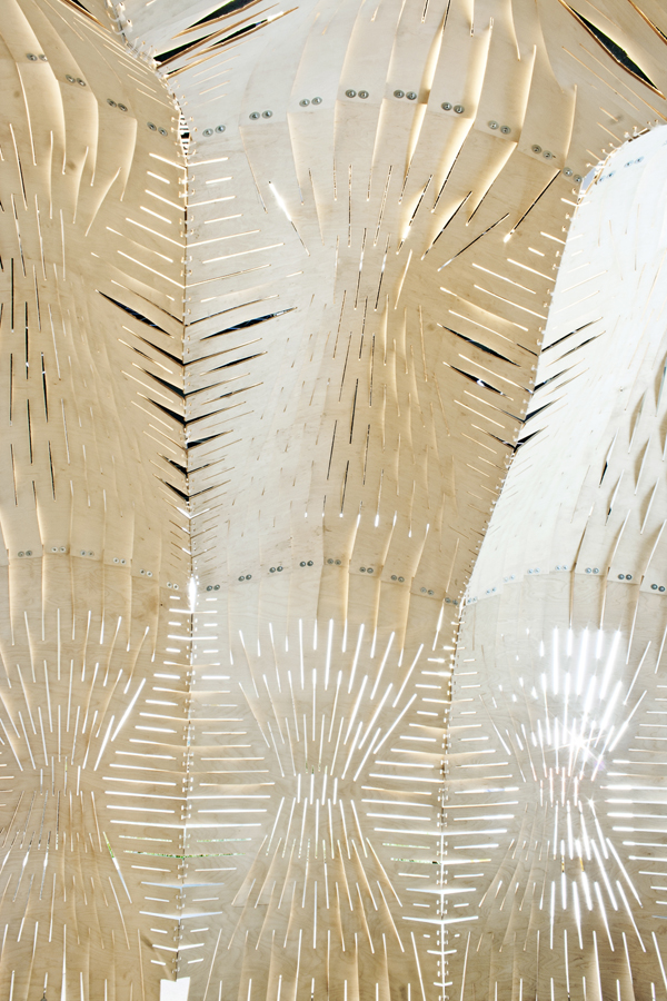
The design manifested into an exhibition and meeting room pavilion that explores complex geometries generated by simple cut patterning in sheets.
To realize the built structure, the team underwent extensive structural and geometric digital analysis to understand and anticipate the reaction between the material and pattern. A system of mathematical relationships were derived to control found material properties digitally. This iterative process was then scrutinized and revised by findings resulted from structural analysis. The ability to understand material properties from the standpoint of geometry lead to the success of the project.  It was a great lesson for the designers to learn from the material – this feedback was the guiding factor in the design process.
The success of the design was contingent on questions of fabrication, minimal waste, and deployabilit. The fabrication process is down to less than 2 percent waste. The system logic and geometric design is embedded in the material directly, rendering no need for excessive explanation to a contractor.
Location: Cologne, Germany
Client: RESOL
Project Year: 2011
Size: 16M2
Design Team: Pablo Zamorano, Nacho Martí, Jacob Bek.

Yucca Center: Synthetic Earthwork / Ball-Nogues Studios


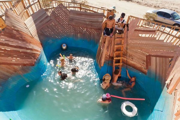
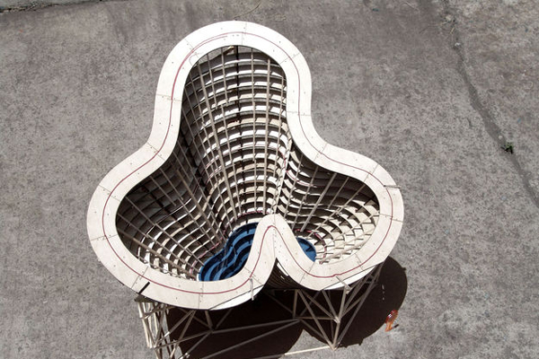
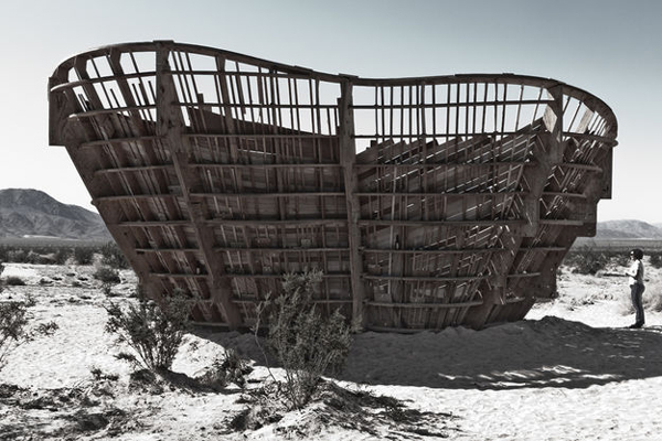
Using the desert near Joshua Tree as a backdrop Ball-Nogues Studios have installed what they call a synthetic earthwork which hides a swimming pool inside. The project is part of High Desert Test Sites, an art project which “generates physical and conceptual spaces for art exploring the intersections between contemporary art and life at large.” The parametric bowl Yucca Center is 30 feet tall and egressed by ladder. Visitors transverse the swimming hole, which bottoms out 10 feet below grade, by a series of rock climbing hand holds.
The wooden frame was re-claimed from a previous art project’s form work which was originally intended to be supplies for this piece, something the artists termed as “cross-designed”. The plywood is stacked and cut in sections, slotted into the ribs to create a bowl. Plywood strips skin the interior, like a ship hull in reverse.
Inspired by both aesthetic land art and abandoned swimming pools and buildings of the Southwest the piece is also very much about the human experience. Open on October 15th and 16th 2011 the work was a playground for a lucky few who spent an afternoon playing in the temporary oasis. The piece is abandoned to the elements.

Two Towers Proposal in Shenzhen / Saraiva + Associados


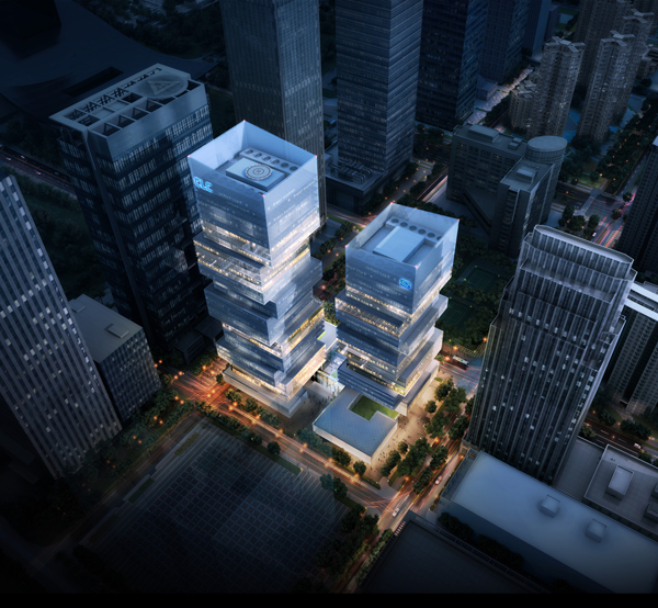
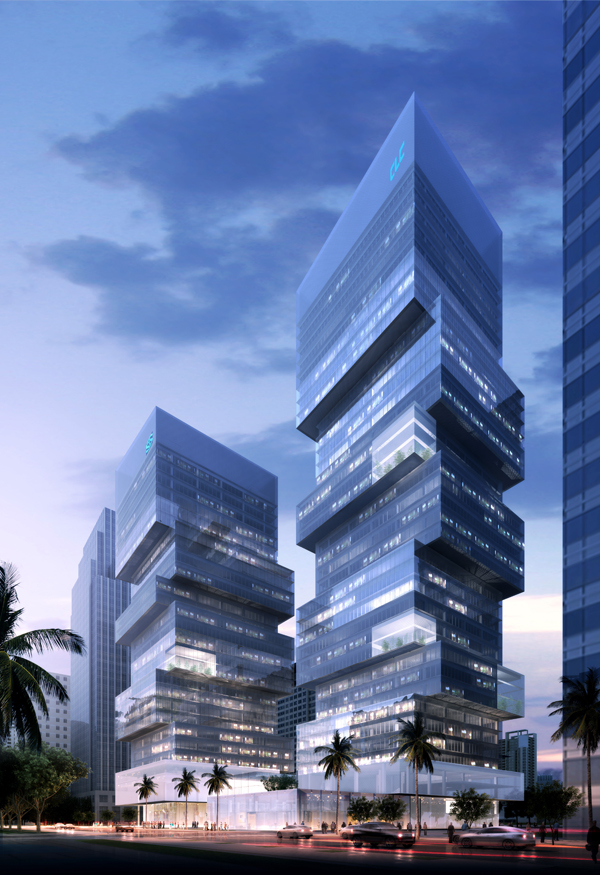
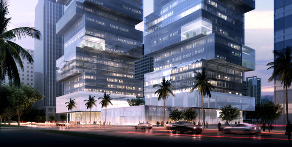
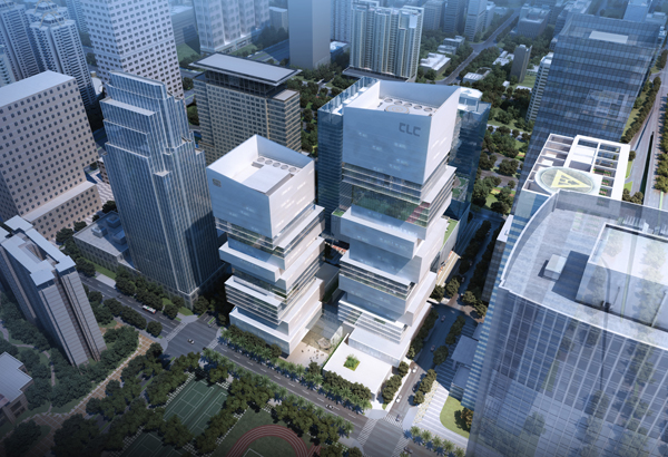
“The Two Towers” proposal by Saraiva + Associados in partnership with IDU (International Design Union) and Tianhua aims to resolve in an equal form all the variables in this intervention, creating a strong landmark building that is generous and practical in is form and that can fully embodies modernity, strength, development and eco-friendly. The main idea was to give the two towers a strong sense of responsibility and a modern language – both financial institutions well differentiated yet sharing a common global image.
Sitting in the CBD and administrative/cultural center of Shenzhen, this project reflects the study of the city’s history, geography and ecology in an integrated development, respecting both urban planning and the stipulated program. As a response, the design reunites two different buildings that would combine into one unique and harmonic force, materialized in an architectural built mass that is fragmented into several blocks. These combined groups of blocks arise from the podium, the strongest piece that connects the buildings to the ground and surrounding environment. Furthermore, the external square highlights the unique entrance to a main, shared, lobby that will then connect to two different lobbies for each company.
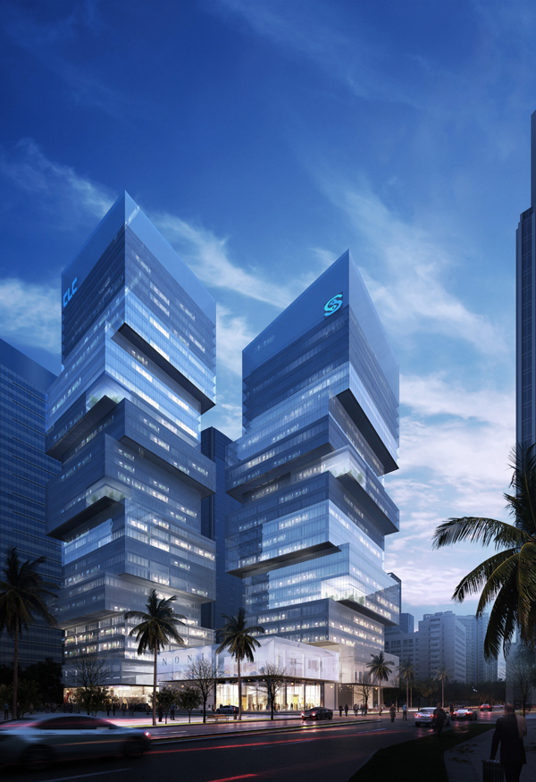
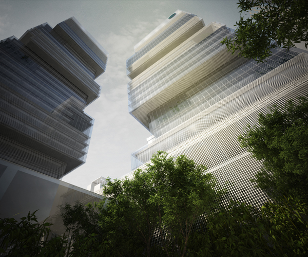
Its exterior image follows the idea of a modern, sober and contemporary group of buildings with ample glazed surfaces, interspersed with mesh elements, in a balanced composition of volumes and surfaces.
A simple system of transparency and the introduction of several green spaces on the towers upper floors will give to the overall image of continuity, innovation and modernity, avoiding the impression of main and secondary buildings. On the other hand, the transparency of the facades with the light control elements and the green spaces helps controlling the light on the interior, giving the overall construction the benefits of an apparently discontinuous texture, providing an independent image to the two clients.
Globally, the proposal presents a total construction area of approximately 100.000 sqm, divided by 60.000 sqm for Parcel A (CLC) and 40.000 sqm for the Parcel B (MSFL).

UNstudio: ponte parodi


'ponte parodi' by UNstudio, genoa, italy
all images courtesy of UNstudio


aspiring to revitalize the industrial waterfront of genoa, italy, 'ponte parodi' is a residential, retail and cultural center 
designed by amsterdam-based firm UNstudio. replacing one of the many currently vacant sites due to the gradual relocation 
of industrial activity from the coastline, the masterplan will attract visitors and residents to the harbor creating an extension 
of the city center. positioned between porto antico and the historical district, the area will become a location for gathering of
students and inhabitants as well as tourists from cruises. a combination of indoor and outdoor spaces, the development 
will create 130,000 square meters of public venues within a 20-meter tall structure which responds to the scale of the nearby 
urban fabric.


northern piazza

the three-story building contains an amphitheater, cruise terminal, cafes and restaurants accessible through carved
corridors and rooftop park. pedestrians are circulated through and atop the complex via branching paths which begin 
at the site boundary and ends at the water with a sea-side promenade. plazas on the ground and upper levels create
points of interest amidst the occupiable volumes and gardens.


elevated promenade overlooking central piazza


retail center


lower gallery


view from the harbor


complex visually integrates into the industrial character of the coastline


aerial view of the complex


interior circulation diagram


rooftop circulation diagram


public spaces circulation diagram


study models

project info:

client: altarea italia progetti s.r.l.; (competition) porto antico di genova spa
programme: public attractor with a 3-dimensional piazza and mixed use: cruise terminal, wellness experience, 
knowledge experience, commercial experience, public park with amphitheatre.
gross floor surface: 76.000m²

volume: 160.000 m³

site: 36.000 m²
total project area: 132,200 m2
internal activities: 49553.82 m2
public urban park on roof: 18838.04 m2
parking area: 36437.08 m2
technical areas: 8356.81 m2
outdoor areas (quays, north piazza): 18929.94 m2


unstudio: ben van berkel, caroline bos, astrid piber with nuno almeida and (design development/building permit) 
mirko bergmann, margherita del grosso, veronica baraldi, kristin sandner, abhijit kapade, chiara marchionni, 
cristina ferreira, casper damkier, rainer schmidt, adrien leduc, lorenzo vianello; (schematic design) cristina bolis, 
paolo bassetto, alice gramigna, michaela tomaselli; (competition) cristina bolis, peter trummer, tobias wallisser,
olga vazquez-ruano, ergian alberg, stephan miller, george young, jorge pereira, mónica pacheco, tanja koch, ton van den berg

advisors:
structure: d'appolonia, genoa
building services: manens, verona
traffic: systematica, milan
project coordination: studio augusti, genoa
(competition) infrastructure and structure: arup, london; off-shore construction: grootint b.v.
visualisation: rendertaxi, aachen

Manthey kula architects: roadside reststop akkarvikodden


'roadside reststop akkarvikodden' by manthey kula architects, lofoten, norway
image © paul warchol
all images courtesy of manthey kula architects


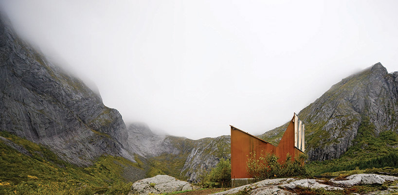
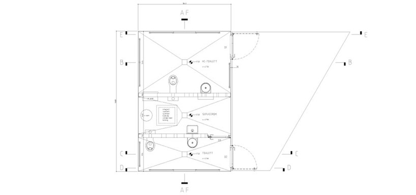
along a scenic tourist route in lofoten, norway, is 'roadside reststop akkarvikodden', a toilet facility completed by 
oslo-based manthey kula architects. part of an initiative to install observation platforms, stopping points and connections
to existing points of interest, this structure creates a hybrid experience of nature and design. a replacement to a previous
restroom which was destroyed in a coastal storm, the weight of the 10mm corten steel walls are cast into concrete foundations
and welded together with steel plate reinforcements. 

the clerestory windows provide views of the mountains through 12-20mm thick glass panes while the doors are comprised 
of 5mm stainless steel plates. glass panels surface the interior preventing any discoloration to clothes due to rust. the metal piping 
for mechanical and plumbing systems are exposed since insulation is not necessary as the building is only open in the summer.


wood and glass exterior
image © paul warchol


clerestory window for natural daylight and outward views of the landscape
image © steiner skaar


smaller restroom
image © paul warchol


larger restroom
image © paul warchol


at night
image © paul warchol


floor plan / level 0


section


sketch


Michael Maltzan architecture + Tom leader studio: st. petersburg pier competition shortlist


'the lens' by michael maltzan architecture + tom leader studio, st. petersburg, florida
all images © michael matlzan architecture
all images courtesy of 
the st. petersburg design competition

los angeles-based practice michael maltzan architecture and berkeley-based landscape architecture practice tom leader studio 
have collaborated to produce 'the lens' a shortlisted proposal for the st. petersburg pier international design competition for the 
bayside city of st. petersburg, florida. the masterplan hope to generate a central and iconic element which connects the city 
with the waterfront creating a relationship with the bay. similar to a magnifying glass upon the water's surface, the sail-like 
structure rises from the water creating a framed view of the sky and horizon. two pedestrian paths cross each other at varied 
elevations provide alternative experiences for walking and bicycling.


pedestrian paths


interior docks


view of the water within the lens structure


sculpture walk


water park


aerial view of the pier


aerial view of the pier masterplan from the bay


aerial view of the pier masterplan from the bay


aerial view of the waterfront parks