The controversial
annual award for the country's worst new building goes to the BBC's new
Salford home, with the Museum of Liverpool in hot pursuit
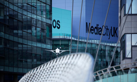
'A concatenation of anaemic buildings' ... The BBC's £600m MediaCityUK. Photograph: Christopher Thomond for the Guardian
There were other strong contenders, but the 2011 Carbuncle Cup for Britain's "ugliest new building" has been awarded to the £600m MediaCityUK.
This concatenation of anaemic buildings is the controversial new
regional headquarters of the BBC, and home to the media studies faculty
of Salford University. Granada TV also moves in next year, bringing the
space a newly reconstructed Coronation Street and the Rovers Return.
From a distance, MediaCityUK looks like one of those sprawling faceless office blocks, shunted alongside bleak city squares, that were common in eastern Europe 50 years ago. Close up, it proves to have less charm than Berlin's Alexanderplatz and, sited at Salford Quays, it also lacks the sunny climate of Dubai, the place whose Media City inspired this Lancashire build by the property company Peel Holdings and its architects, Wilkinson Eyre, Chapman Taylor and Fairhurst Design Group.
From a distance, MediaCityUK looks like one of those sprawling faceless office blocks, shunted alongside bleak city squares, that were common in eastern Europe 50 years ago. Close up, it proves to have less charm than Berlin's Alexanderplatz and, sited at Salford Quays, it also lacks the sunny climate of Dubai, the place whose Media City inspired this Lancashire build by the property company Peel Holdings and its architects, Wilkinson Eyre, Chapman Taylor and Fairhurst Design Group.

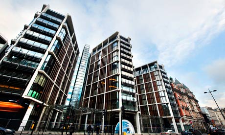
The exclusive development One Hyde Park, designed by Richard Rogers
for the Candy Brothers, was on the Carbuncle Cup shortlist. Photograph:
Linda Nylind for the Guardian
The controversial annual award loathed by architects and their clients is compiled by Building Design magazine,
a weekly media fix for architects. This year's shortlist, drawn from
suggestions by members of the public, included the opulent blocks of
flats designed for international multi-millionaires by Richard Rogers for the Candy Brothers at One Hyde Park in London, the Museum of Liverpool by 3XN and AEW, and Newport railway station in South Wales by Nicholas Grimshaw and Atkins.
Several of the schemes, including MediaCityUK, Newport station and the Museum of Liverpool, have been designed by firms of well-known "signature" architects, then executed by much bigger commercial practices that produced the buildings on time and on budget, but without soul and a spirit of place. MediaCityUK might be anywhere from Salford to Shanghai, and the Carbuncle Cup nomination for MediaCityUK reads: "For an organisation with high cultural aspirations, it is hard to see how the BBC could have sunk much lower."
"If you're going to spend £600m on a complete city district that is also the home of one of the nation's leading cultural institutions as well as other high-profile media and university tenants", says Hugh Pearman, editor of the RIBA Journal and one of the Carbuncle Cup judges, "then it's a bit of a shame not to pay more attention to the quality of the architecture. It would have cost very little more to make this place really special."
In today's issue of Building Design, editor Ellis Woodman writes: "Whatever urban aspiration may be indicated by its name, a city is the last thing one would mistake this development for. There is no urban idea to speak of whatsoever – no space that one might recognise as a street; no common architectural language; no difference between the fronts and backs of buildings. There is no distinction made between civic and private buildings either. Visiting MediaCityUK, it is hard to see how the corporation could set their aspirations any lower. How uncreative can a 'Creative Quarter' be?"
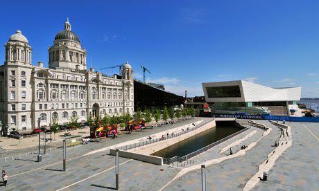

'Ski-slope roof, glaring white walls and bizarre ramps' ... The new Museum of Liverpool. Photograph: Mills Media Limited
The undoubted runner-up this year is the new Museum of Liverpool. "Liverpool secured the Carbuncle Cup two years ago for Hamilton Architects' ferry terminal", says Woodman. "This ridiculous building won in considerable part because of the damage it did to the view of the Three Graces – the trio of early 20th-century buildings
that have long provided Liverpool's defining architectural image.
Sadly, this vandalism to the city's waterfront was only the start."
With its ski-slope roof, glaring white walls and bizarre ramps making access awkward, the museum defaces the city's famous Pier Head and cocks a snook at its magnificent neighbours. "Our first reaction", Kim Nielsen, director of 3XN, the Danish practice responsible for the original design (and since fired from the job) has said, "was that you shouldn't build here." A lesson, perhaps, for all potential Carbuncle Cup winners, whether this year or next.
With its ski-slope roof, glaring white walls and bizarre ramps making access awkward, the museum defaces the city's famous Pier Head and cocks a snook at its magnificent neighbours. "Our first reaction", Kim Nielsen, director of 3XN, the Danish practice responsible for the original design (and since fired from the job) has said, "was that you shouldn't build here." A lesson, perhaps, for all potential Carbuncle Cup winners, whether this year or next.

No comments:
Post a Comment