Search Engine
Monday, 31 December 2012
Wednesday, 28 November 2012
Wednesday, 24 October 2012
Superkilen urban park by BIG architects, topotek1 + superflex
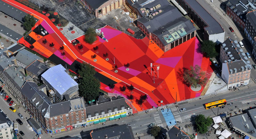
'supekilen' by BIG architects, topotek1 and superflex
all image courtesy of BIG architects
'superkilen' is a kilometer long park situated through the nørrebro area just north of copenhagen's city centre,
considered one of the most ethnically diverse and socially challenged neighborhoods in the danish capital as it is home to
more than 60 nationalities. the large-scale project comes as a result of an invited competition initiated by the
city of copenhagen and the realdania foundation as a means of creating an urban space with a strong identity on a local
and global scale.
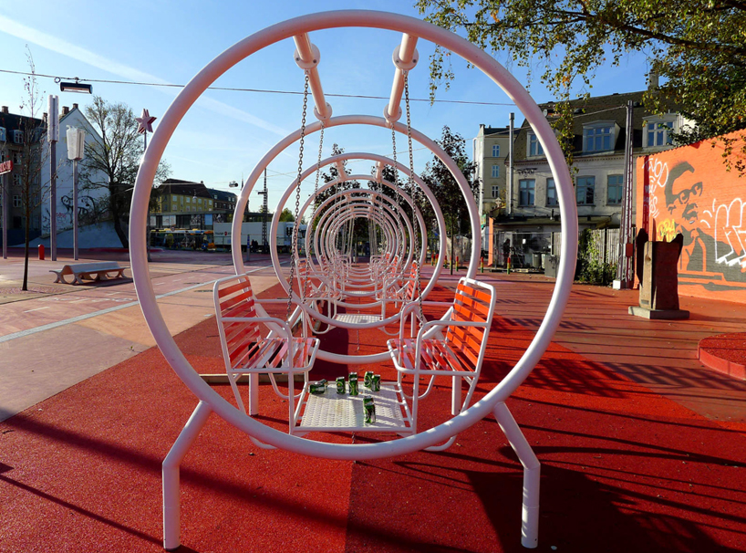
street furniture is integrated into the space offering a place to relax and enjoy a drink
designed by BIG architects, landscape architecture studio topotek1 and artist collective superflex, 'superkilen' is defined by
three color-coded areas, each offering distinctive functions and atmospheres, and stands as a vehicle of integration for the cultures
represented by the area, which meant involving the inhabitants within the design process. conducting public meetings as well as
providing a 'suggestions box' for the public to submit their ideas for the urban proposal.

playground infrastructure offers spaces of more physical interaction
an expansive square - established by large blocks of red, orange and magenta geometric squares - serves as an extension
of an adjacent sports hall which hosts a range of recreational and cultural activities as well as playground infrastructure to engage the community.
a plaza marked in black stands at the heart of 'superkilen' is where locals are met by a large moroccan fountain or game of chess.
a green space caps off the park and is the backdrop for a surrealist collection of more than 100 objects from the 60 plus cultures represented, a true reflection of the nature of the local neighbourhood. these pieces were carefully curated in close collaboration with the public and include exercise gear, to work-out machines seen LA's venice beach, to sewage drains from israel, palm trees from china and neon signs from qatar and russia, each one accompanied by a small plate describing what it is and its origin.

there are signs throughout the park indicating the various cultures represented in the neighbourhood
'rather than a public outreach process towards the lowest common denominator or a politically correct post rationalization of preconceived ideas navigated around any potential public resistance – we proposed public participation as the driving force of the design leading towards the maximum freedom of expression. by transforming public procedure into proactive proposition we curated a park for the people by the people – peer to peer design – literally implemented.' -bjarke ingels, founding partner, BIG

large blocks of reds, magentas and oranges define the 'red' square of 'superkilen'
'when our team was invited to propose a project in this neighborhood we realized that we had to do more than just urban design. rather than plastering the urban area with danish designs we decided to gather the local intelligence and global experience to create
a display of global urban best practice comprising the best that each of the 60 different cultures and countries have to offer when it comes to urban furniture.' -nanna gyldholm møller, project leader, BIG

'our mission was to find the big picture in the extreme detail of a personal memory or story, which on the surface might appear insignificant, but once hunted down and enlarged became super big. a glass of palestinian soil in a living room in nørrebro serving as a memory of a lost land, enlarged to a small mountain of palestinian soil in the park. a distant mediterranean flirt in the seventies symbolised by a great iron bull, hunted down and raised on a hill in the park.' - SUPERFLEX

each cultural object on hand is accompanied by a metal plate which indicates what it is and its origins
'while the romantic gardens of the 19th century attempted to give the visitors an exotic experience of the world that was still big and hard to travel around – allowing people to witness a chinese pagoda or a greek temple – the super park in copenhagen
does the opposite. rather than perpetuating a perception of denmark as a mono-ethnic people, the super park portrays a true sample of the cultural diversity of contemporary copenhagen.' -martin-rein cano, topotek1

general view of the urban space

bench seating which utilizes the wall of an adjacent building as its back

sewage plates from israel adorn the ground

as well as ones from france

construction in progress

bright neon signs from qatar and russia mark the space
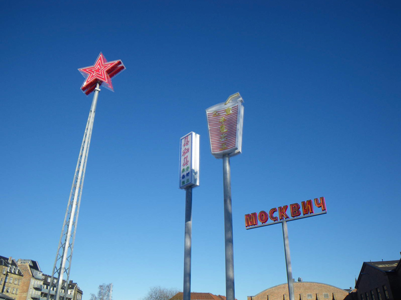

neon signs by night

bus signs in arabic can also be found

the 'black square' by night
a bike path runs through the park as a means of connecting each of the individual areas of the park, while at the same time integrating the urban space on a larger citywide context. red maples, japanese cherry trees, larix, palm trees from china and lebanese cedar trees have been planted to provide shade during warmer summer months, as well as visual interest with the range of different vegetation represented. this diversity in tree and plant life complements the diversity of the site's furniture.

bold white graphic lines offer visual movement

an octopus of slides perhaps?


a large moroccan fountain can be found centrally located within the black square

'black square'
here are a look at some conceptual renderings of 'superkilen' before its conception...

'red square'


'green space'

plan of the way the three spaces are divided

a graphic indicating the cultures represented within the park

progressive diagrams of the 'red square'

progressive diagrams of the 'black square'
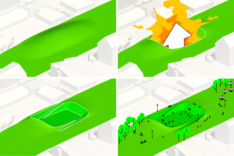
progressive diagrams of the green space
project info:
client: copenhagen municipality, realdania
location: nørrebro, copenhagen / from norrebrogade to tagensvej
function: public space
site area: 33.000 m2 / 322917 sq.ft / 750 m long public space
building area: no buildings
total floor area: no buildings
completion: spring 2012
authorship: BIG, topotek1, superflex
collaboration: lemming & eriksson, help pr & communication
budget: ca. 58,5 million DDK / 7.7 million euro / 11 million USD
partner in charge: bjarke ingels
project leader: nanna gyldholm møller, mikkel marcker stubgaard
team: ondrej tichy, jonas lehmann, rune hansen, jan borgstrøm, lacin karaoz, jonas barre, nicklas atoni rasch, gabrielle nadeau,
jennifer dahm petersen, richard howis, fan zhang
Busan Opera House winning proposal by snohetta
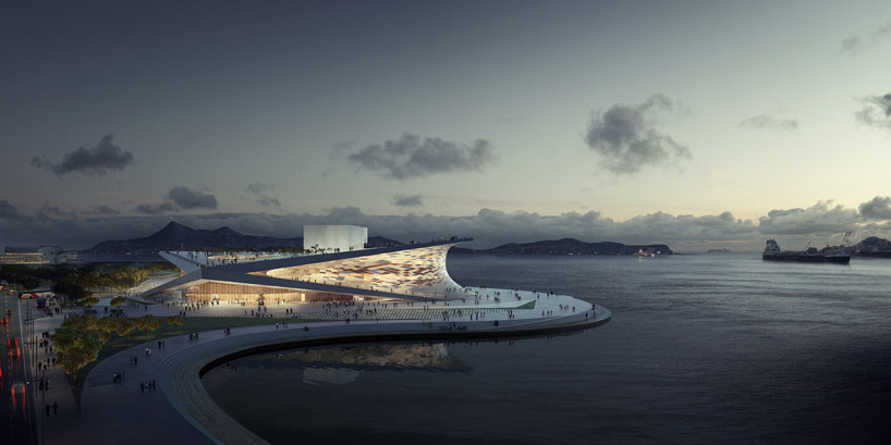
'busan opera house' by snohetta, busan, south korea
image © snohetta
international firm snohetta has recently won the competition for the busan opera house in south korea. the project maintains the firm's preferred one-floor typology as the most efficient means of connecting the building to the site and optimizing the flow of circulation.
the general form is rooted in the korean philosophy of kun (heaven) meeting kon (earth) meeting kam (water), comprised of two
contrasting curves; one embraces the sky while the other sets the construct firmly into the earth, next to the sea. the subtle curves in
the structure conceptually strengthen the ideology, as each separate element reaches to meet each other in specific moments.
the heart of the opera house holds the auditorium, considered to embody the spirit of a musical instrument in itself, wrapped in solid cherry panels to differentiate its function from the public zones surrounding it, with special attention to perfect the resonance of each performance. the wood sections along the walls can be angled to modify and enhance the acoustics for each individual event.
an exterior skin wraps the core, made up of a two-way system of cables that hold glass and marble sections creating a light-filled interior and transparency to the exterior, as a largely public space and also integrates it into it's unique context.
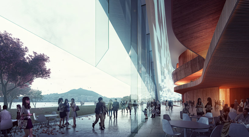
public space
image © snohetta
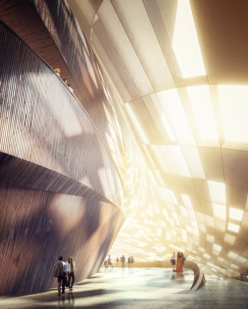
semi transparent lobby
image © snohetta
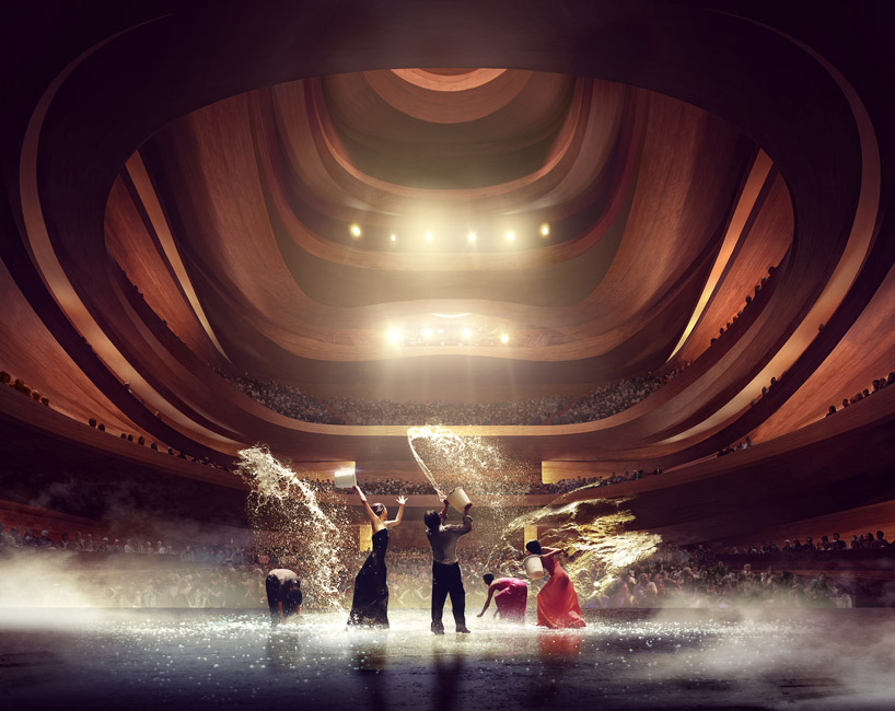
auditorium
image © snohetta
J. Mayer h. architects: schlump ONE
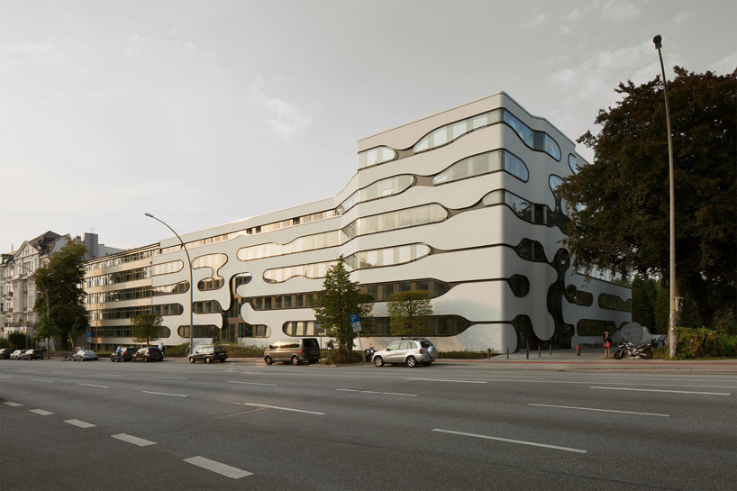
'schlump ONE' by j. mayer h. architects, hamburg, germany
image © jan bitterall images courtesy of j. mayer h. architects
berlin-based practice j. mayer h. architects have reformed a 1950's office building in hamburg, germany, with a new aesthetic identity and an expansion that holds a small university as well as four rentable office units per floor. the linear design of the original structure was broken by a very different skin with rounded windows that wrap the corners of the edifice. the same language is carried through to the interior especially in section, seen also in the design of partitions and even to the handrail spindles. a centrally located corridor services two sides of open and closed-off office spaces. in the expansion, an atrium splits the volume to bring light into the classrooms sitting above a semi-underground parking garage.
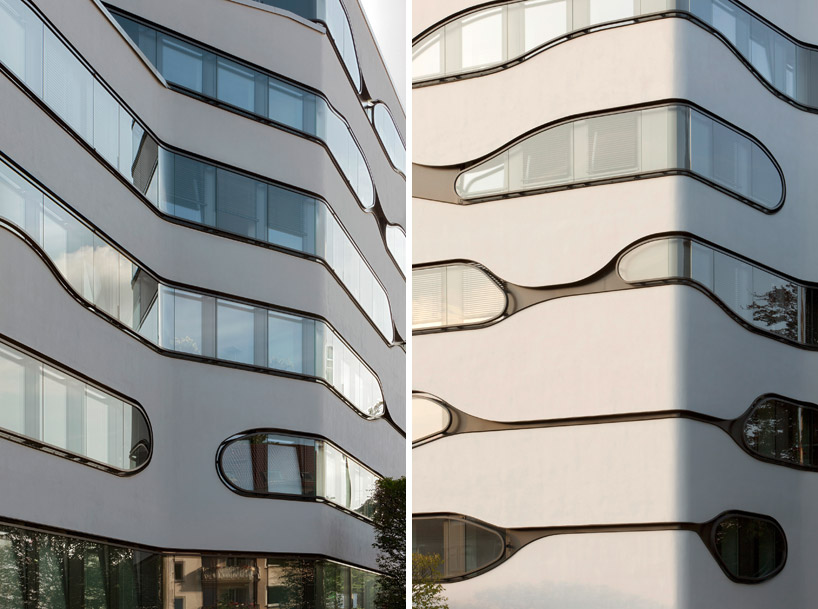
new updated skin
images © jan bitter
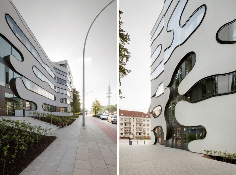
images © jan bitter
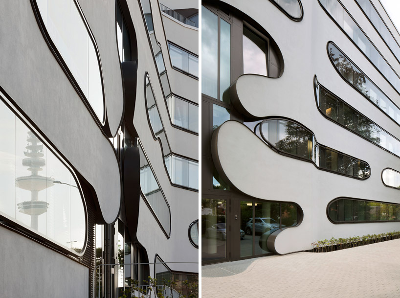
image © jan bitter
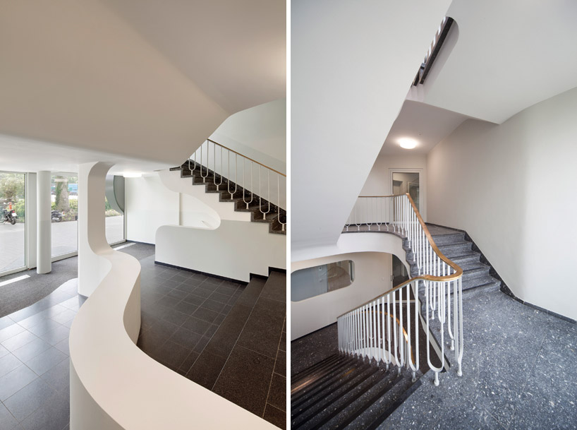
(left) entrance and lobbyimage © jan bitter
(right) staircase
image © ludger paffrath
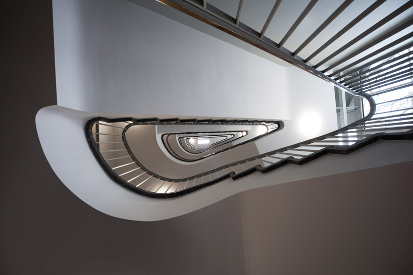
stairwell
image © ludger paffrath
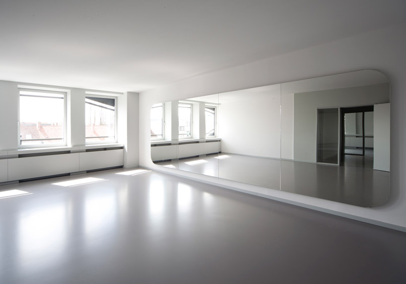
light-filled interiors
image © ludger paffrath
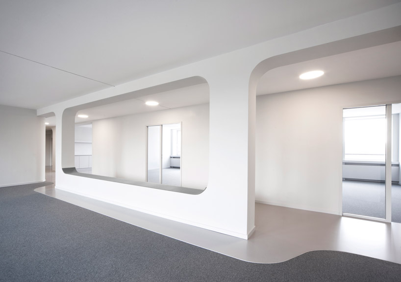
hallways between two office spaces
image © ludger paffrath
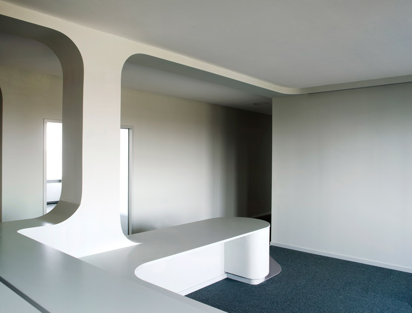
image © ludger paffrath
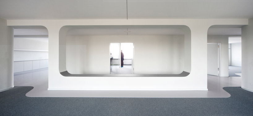
image © ludger paffrath
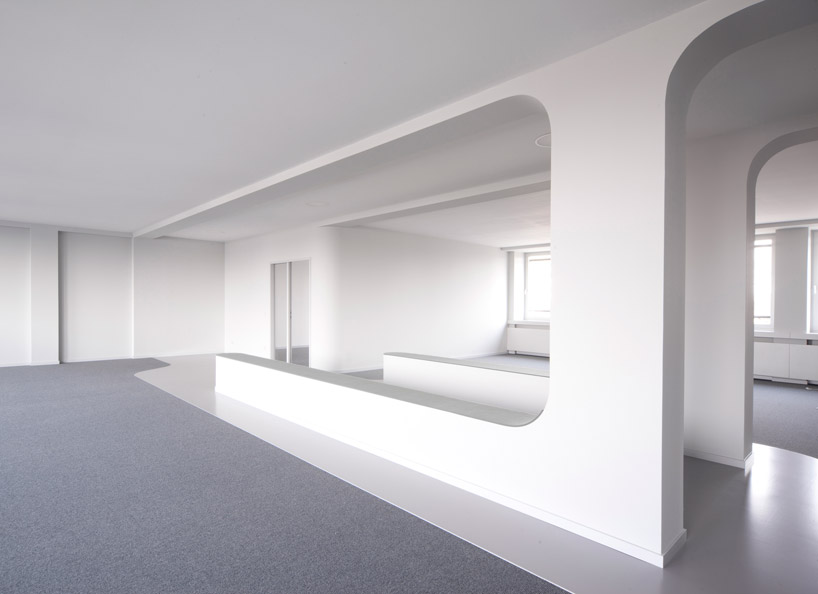
image © ludger paffrath
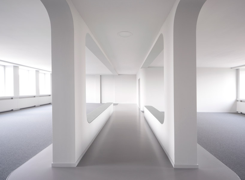
central hallway with two open office areas
image © ludger paffrath

(left) new buildingimage © jan bitter(right) original building
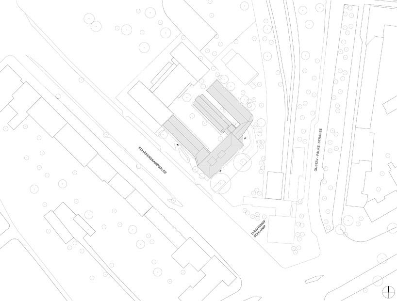
site plan
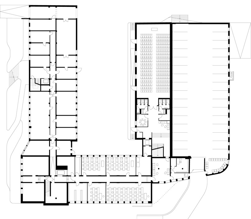
floor plan / level 0
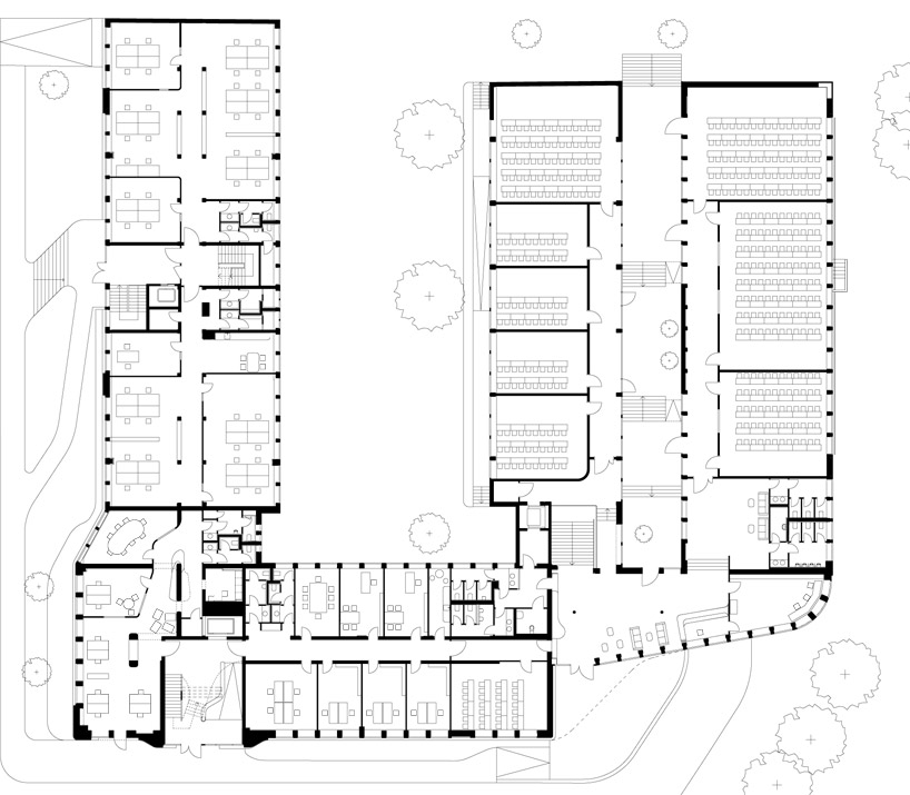
floor plan / level 1
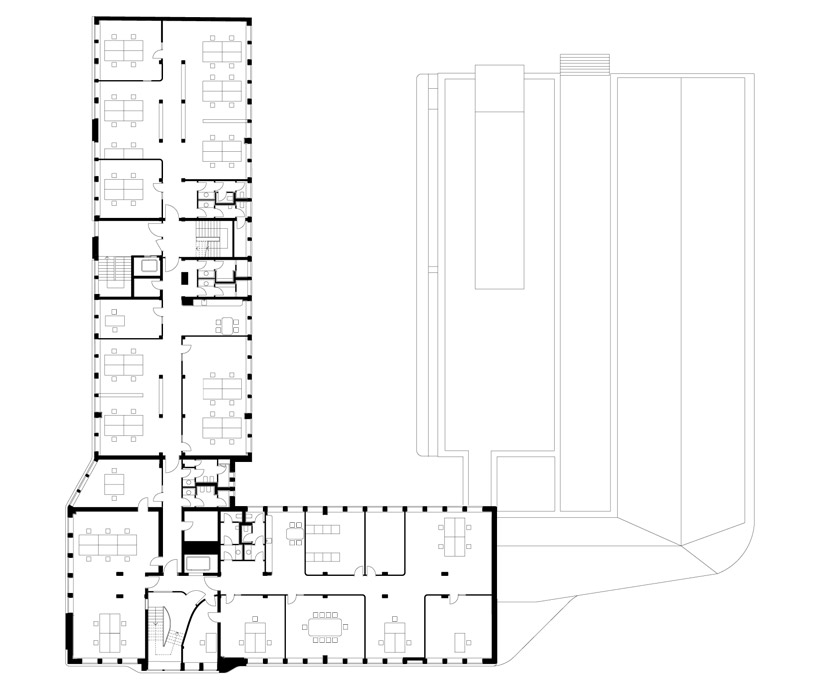
floor plan / level 2

section

section
project info:
project team: juergen mayer h., christoph emenlauer, mehrdad mashaie, jens seiffert, ana alonso de la varga
project architect: hans schneider
project: 2010 - 2012
completion: summer 2012
client: cogiton, projekt eimsbuettel gmbh, hamburg
architect on site: architekturbuero franke, hamburg
structural engineers: wtm engineers
building services: energiehaus ingenieure, sineplan, hamburg
landscape architects: breimann bruun simons, hamburg
Subscribe to:
Comments (Atom)
