By: Lidija Grozdanic | June - 26 - 2011
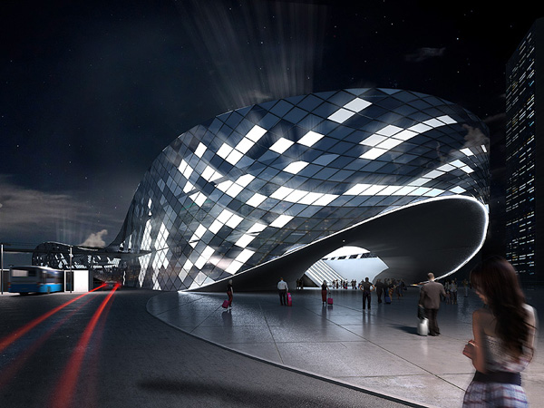
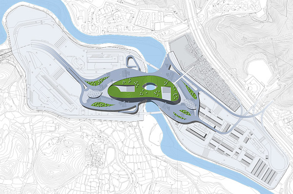
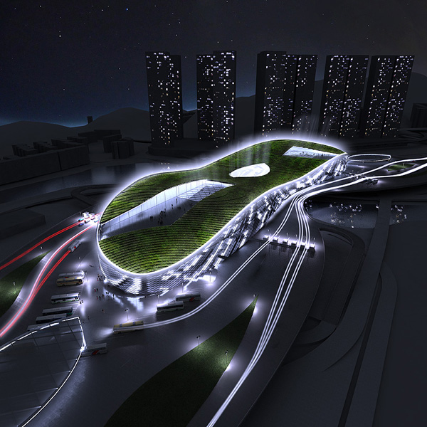
The competition for the Passenger Terminal Building connecting Hong Kong with Shenzhen City closed on 21. March 2011. The two-stage competition included an online public survey in deciding on the winners. The aim was to create an urban landmark, structurally enabling the continuation of the existing traffic flow and connecting the banks of Shenzhen River.
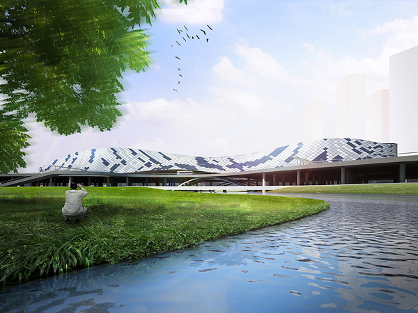
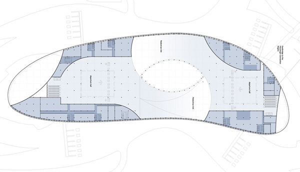
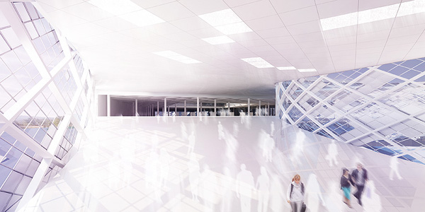
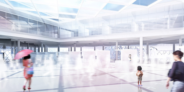
Designed by Prague-based EDIT! Architecture, the proposal attempts to reconcile the iconic character of the building with the functional requirements of the site. Fallowing the visual imperative of fluidity, immanent to transportation structures, the design uses both horizontal and vertical transformation of rounded forms. The building entrances are emphasized by lifting of the volumes, leading to arrival and departure halls on the first floor. Offices and service spaces are located on the sides of both halls and also on two floors above organized around the central atriums, which illuminate the inside of the building and allow a visual contact between the different levels. The green roof is terraced thus evoking the typical South China landscape.
The trapezoidal cladding of the façade creates an ever changing appearance and articulates the programs within the building. The panels of the same size are made in the same color grade. Part of the facade is equipped with computer controlled openings that can be opened to support the air circulation inside the building based on the current wind flow in the location.
Due to technical complication in submitting the entry package, the project was not included in the official competition. However, its strong imagery and distinct approach in creating make it a relevant.




No comments:
Post a Comment