By: Andrew Michler | September - 13 - 2011
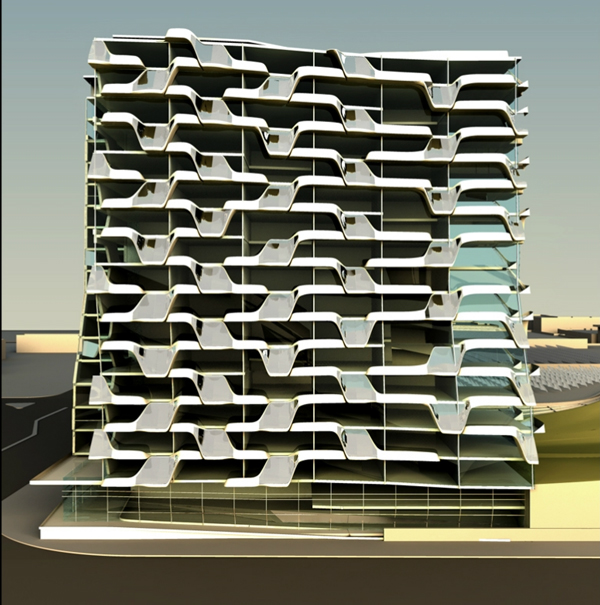
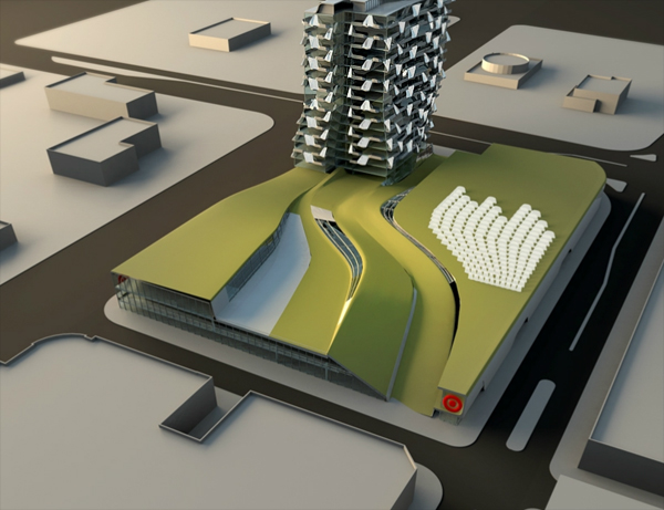
Target, the box retailer who’s appeal for quality design at low prices has not been evident in their store design commissioned the Target Tower. The concept store, unveiled by Belzburg Architects, is an attempt to reorganize the urban retail experience. A residential tower looming above is the expression of how density drives a better marketplace. The store itself spreads out in an undulating fashion with elevations rising, falling and merging to create a more naturalized effect. The multiple scales of the project are intended to provide mass and density to the city while still providing an approachable exterior that does not overwhelm the neighborhood.
This concept is a rebranding of sort, creating high design principles with integrated sustainable practices takes recent developments in Wal-Mart retail stores and adds a distinctive architectural narrative. Daylight within the store is added with large perimeter windows and slivers of skylights though the main body of the building. The perimeter is also scaled to meet street level, creating a more approachable store front.
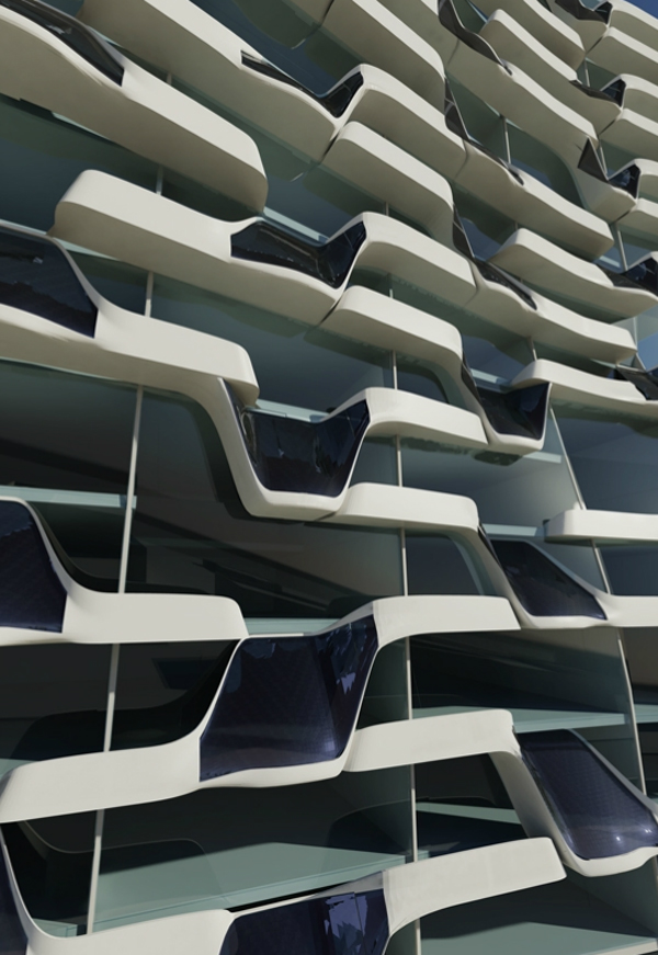
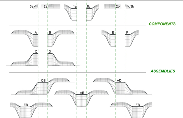
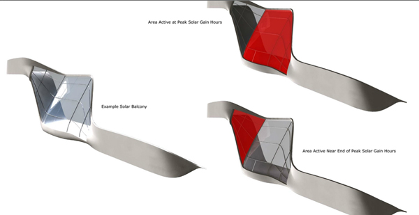
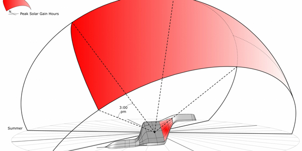
The residential tower is even more radical with its use of a “fashionable skin”, a prefabricated system which can be arranged for various exposures and patterns. Using mass produced forms, which can be rearranged to provide individuality, is a hallmark concept of contemporary retail and borrowed to create the driving facade elements. The envelope serves multiple functions beyond its distinctive shape. As a shade device the skin wraps around balconies to protect the interior from heat gain. Built in solar panels provide optimal solar exposure for energy production. Configured in different ways a simple system can create multiple looks, disrupting the patterns to add complexity to the building’s visual language.



No comments:
Post a Comment