By: Lidija Grozdanic | August - 26 - 2011
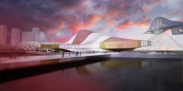
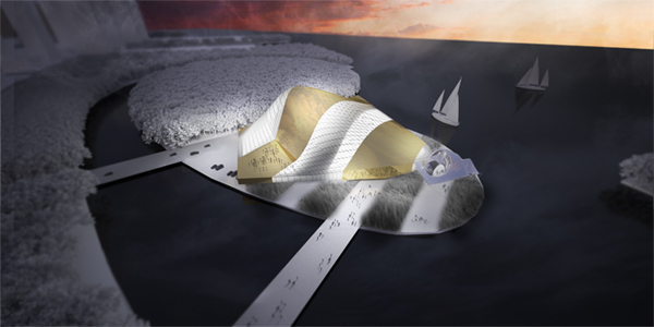
Designed for the Busan Opera House Competition in 2011 by Paul Preissner Architects, the project relies on three main ideas: to provide a strong urban statement in newly forming cultural district; to develop a clear visual strategy for the identity of the Opera which is simultaneously familiar and never-before seen; to create a unique building for the center of the cultural district with a contemporary architectural approach shaped to optimize active and passive energy use.
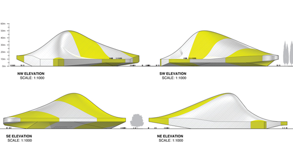
This project develops its personality by a combination of unique formal expression through the shape of the building, rational programmatic organization, and a curated graphic pattern (stripes) in order to produce a project that looks like nothing before it.
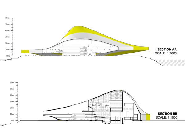
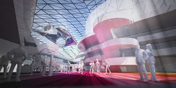
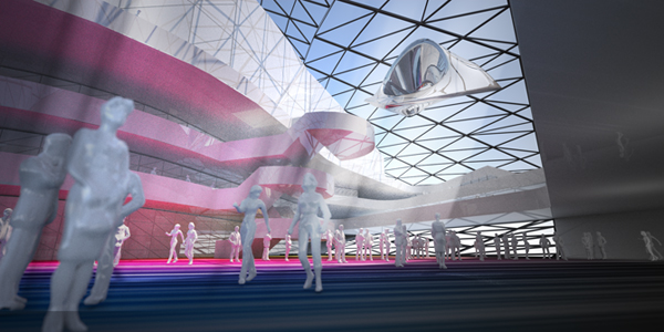
The project cantilevers its second level 5m above the entry level to allow for a very petit ground level footprint that enable the public to be welcomes by the building before even entering. This allows for a sequence from the pedestrian bridge that takes one over the creek, then onto the site, then within the buildings perimeter gallery sheltered from the elements by the cantilevered volume of the restaurant and convention spaces, to finally being within the major public lobby for the opera. The lobby is located within one of the glass stripes of the volume allowing for an impressive space and acts as the counterpart to the massive opaque volumes of the theaters.



No comments:
Post a Comment